Forms
Wiki ▸ Documentation ▸ Forms
Forms can be built using type safe builders or with FXML.
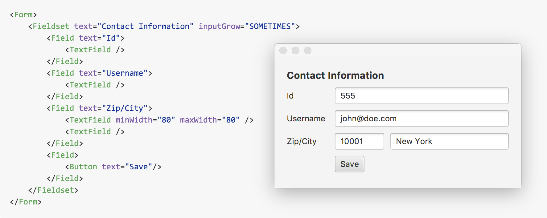
A Fieldset contains a collection of Field entries. The Fieldset can have a title and optional icon. A Field has a label and icon as well, and a container for one or more input fields, much the same way as an HTML form.
Fieldsets have a labelPosition value of HORIZONTAL by default, causing labels to appear to the left the input fields. Set the labelPosition to VERTICAL to have the label appear above the inputs.
By configuring the wrapWidth, a HORIZONTAL form will responsively fall back to a VERTICAL label layout to save space once the Form is resized to be smaller than the wrapWidth.
class CustomerForm : View() {
    override val root = Form()

    val customer = Customer()

    init {
        title = "Register Customer"

        with (root) {
            fieldset("Personal Information", FontAwesomeIconView(USER)) {
                field("Name") {
                    textfield().bind(customer.nameProperty())
                }

                field("Birthday") {
                    datepicker().bind(customer.birthdayProperty())
                }
            }

            fieldset("Address", FontAwesomeIconView(HOME)) {
                field("Street") {
                    textfield().bind(customer.streetProperty())
                }
                field("Zip / City") {
                    textfield() {
                        addClass(zip)
                        bind(customer.zipProperty())
                    }
                    textfield().bind(customer.cityProperty())
                }
            }

            button("Save") {
                setOnAction {
                    Notifications.create()
                            .title("Customer saved!")
                            .text("${customer.name} was born ${customer.birthday}\nand lives in\n${customer.street}, ${customer.zip} ${customer.city}")
                            .owner(this)
                            .showInformation()
                }

                // Save button is disabled until every field has a value
                disableProperty().bind(customer.nameProperty().isNull.or(customer.birthdayProperty().isNull)
                        .or(customer.streetProperty().isNull).or(customer.zipProperty().isNull)
                        .or(customer.cityProperty().isNull))
            }
        }
    }

}
There is an example application that showcases the above form in the TornadoFX-Samples project.
Take a look at the default CSS Stylesheet
as a starting point. The substructure of a Form is described below.
- form - VBox
- fieldset - VBox
- legend - Label
- field - Field
- label-container - HBox
- label - Label
- input-container - HBox
- arbitrary input components
- label-container - HBox
- fieldset - VBox
Next: ViewModel