Here are some snapshots of the projects we completed throughout this course.
 A simple table that sorts by specific columns if they are clicked.
 A barchart that compares the gross revenue of different themeparks, updatable by selecting the dropdown menu and filtering by specific types of themeparks (water parks, etc.)
 Our first linked elements. The first table is a summary table, the barchart shows the data for the week by date, and the bottom table shows the performance of individual pizza shops. The dropdown menus allow you to select by order type and location (Boston, Somerville, Cambridge), and all three visualizations update to show only filtered data.
 A bar chart that compares the heights of the tallest skyscrapers and when each bar is clicked, the viewing table on the right updates to show that building's stats.
 A static bubble chart where we learned how to use scales to code diameter size.
 These are static visualizations, except we learned how to use a tooltip. When you mouseover the area chart, it shows the date.
 We were learning D3s enter/update/exit pattern and implementing flexible scales as the data changes.
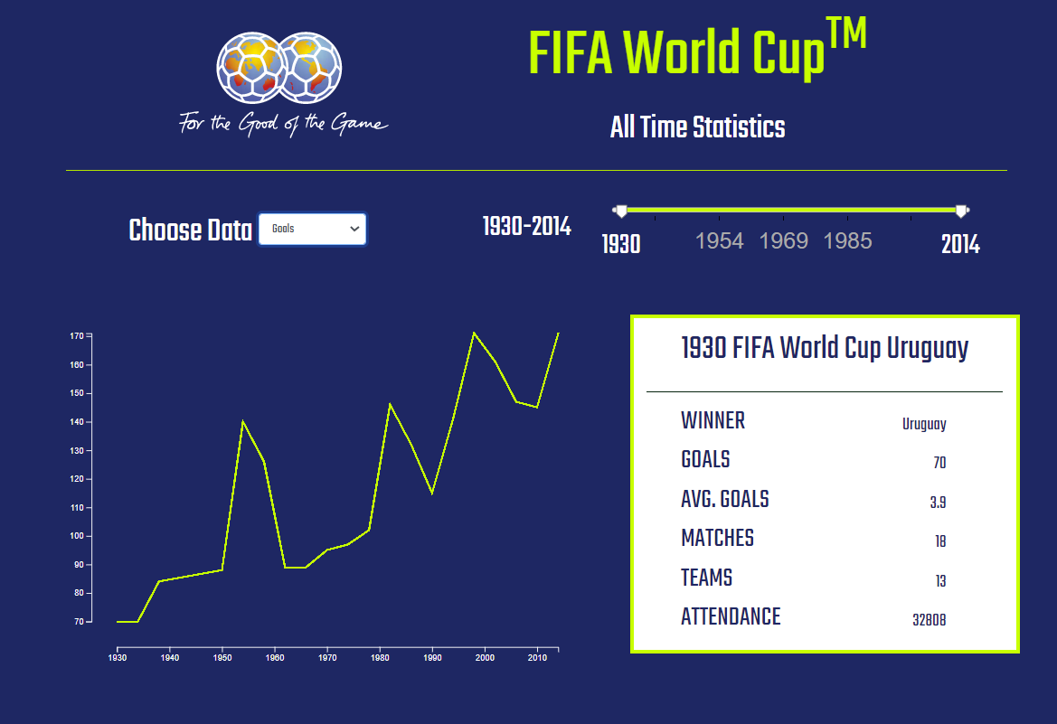 Same but with a year filter (that slider was the biggest pain of my life - took me 6 hours to get right, and i still don't understand why) and updating table.
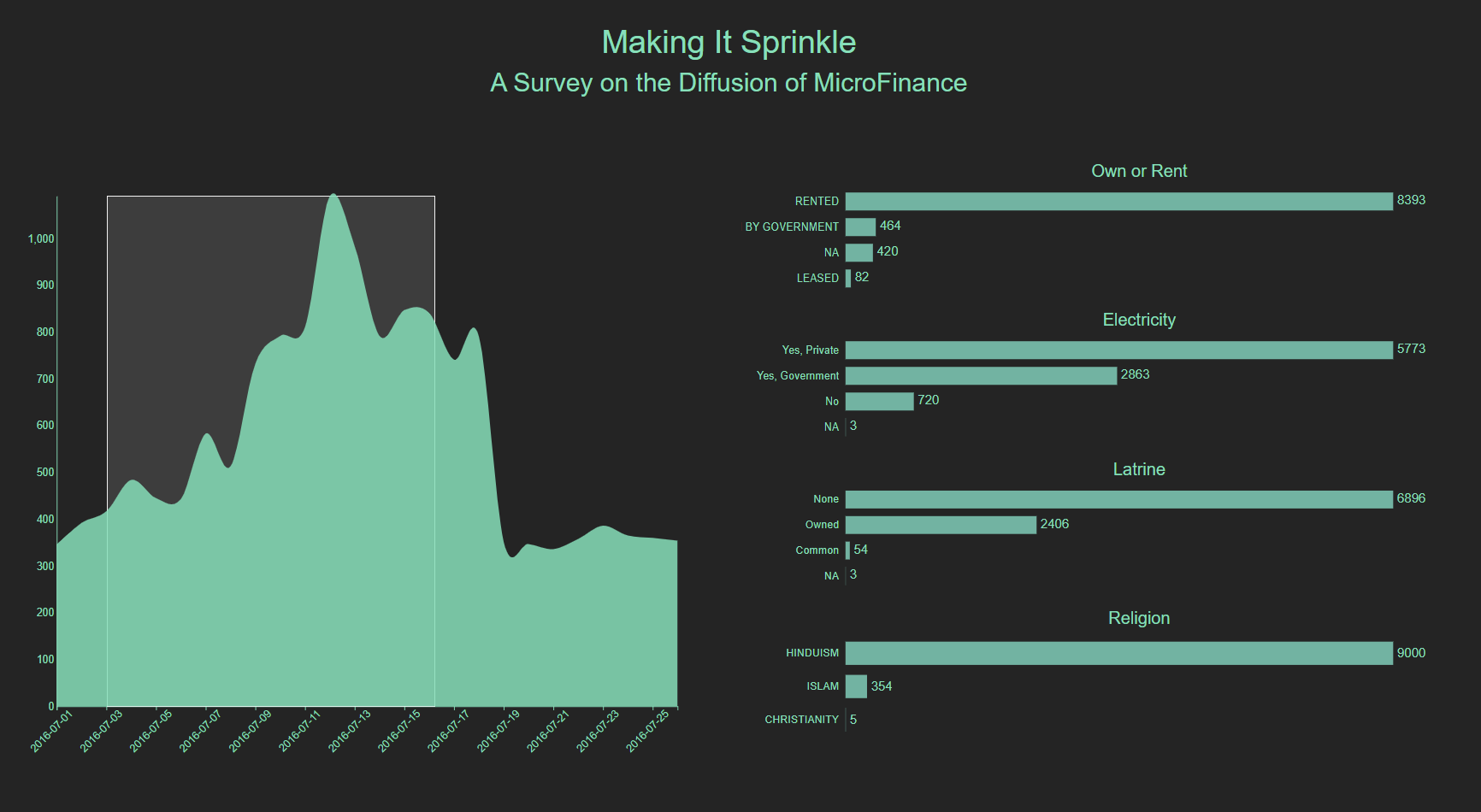
 We learned how to implement brushing as a way of selecting and zooming in on data.
 Brushing with linke barcharts instead of an area chart
 Our first map! The data was fake and hitting the update button generated new random data. I had a bit of trouble with the map in that it was....transparent? Not entirely, but the airport dots that are technically on the other side of the globe are visible, even though they really shouldn't be. Never figured that one out.
 Definitely one of my favorites, aesthetically. I normally tried to play up the theme of the data, but this one was about coronavirus and I just wanted to make it look....professional. Integrating maps, brushing, updating bar charts, tooltips, and dropdowns. This one took a while, haha.
 Our first matrix visualizing the connections (marriage, business, both) between different mafia families. Honestly this one was the most difficult for me to get the actual visualization right. I ended up going to office hours for the first time and that definitely helped, but it was still buggy at the end. It was the little interior triangles that were throwing me.
 And some united nations data with brushing and updating visualizations to round things off.