I tend to want to simplify some letters in writing while I do random notes on a tablet. Existing shorthands were invented for different purposes and I wanted some reason-based minimalism without disposing of letters or complex rules of application. It has been entertaining and exploratory/creative process with challenges in the beginning.
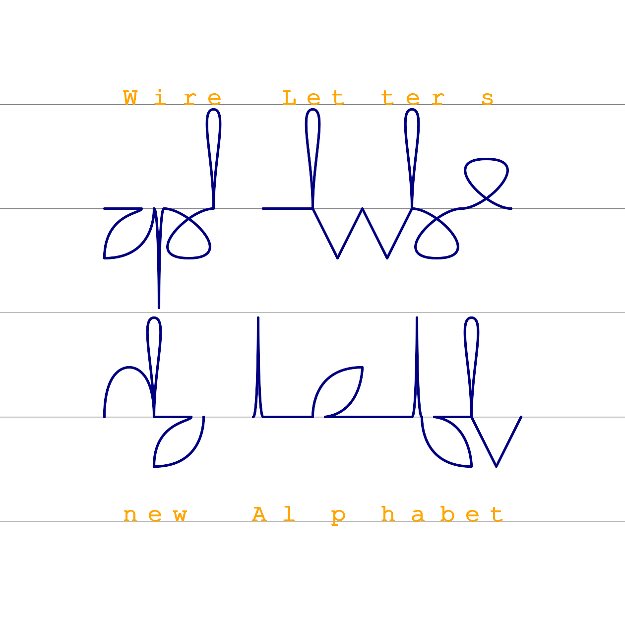
I make side notes in these blocks. For example here I can say that it is the second iteration of me making own cursive. Also I published it on 22th of July, 2023 and it was still on early stage of practical testing it at the time.

Disclaimer: interesting looks of these words are by happy accident.
Strokes shapes:
- flat/line (horizontal line or that "dot" that goes for
o, connection lines) - sharp (has line reversal or just angle by two straight lines)
- arc (is round, although I have cornered leaf-looking arcs here because why not)
- loop (line crosses itself and creates round loop)
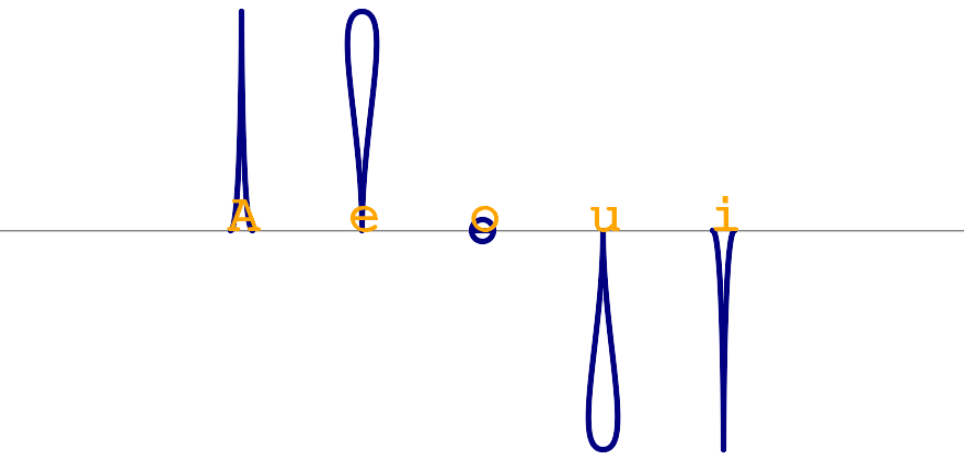
Vowels take vertical space and almost no horizontal space.
Because vowels are expected to give rhythm to speech they are conspicuous too and give some vertical rhythm in the script.
Except for o which is conspicuous as the smallest letter anyway.
a has won competition with i because it is the first letter of the alphabet and capital A resemblance can not be wasted;
i still makes sense if one considers them in pair.
e and u can be thought of as if they were stretched into this drop-like shape.
for
e, uin actual execution the shape can be loop because it is faster and more streamlined
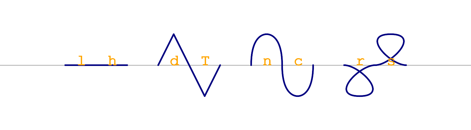
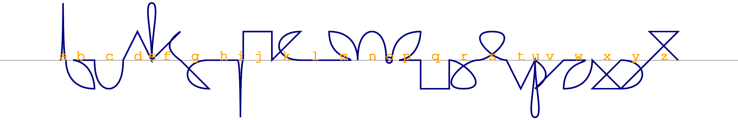
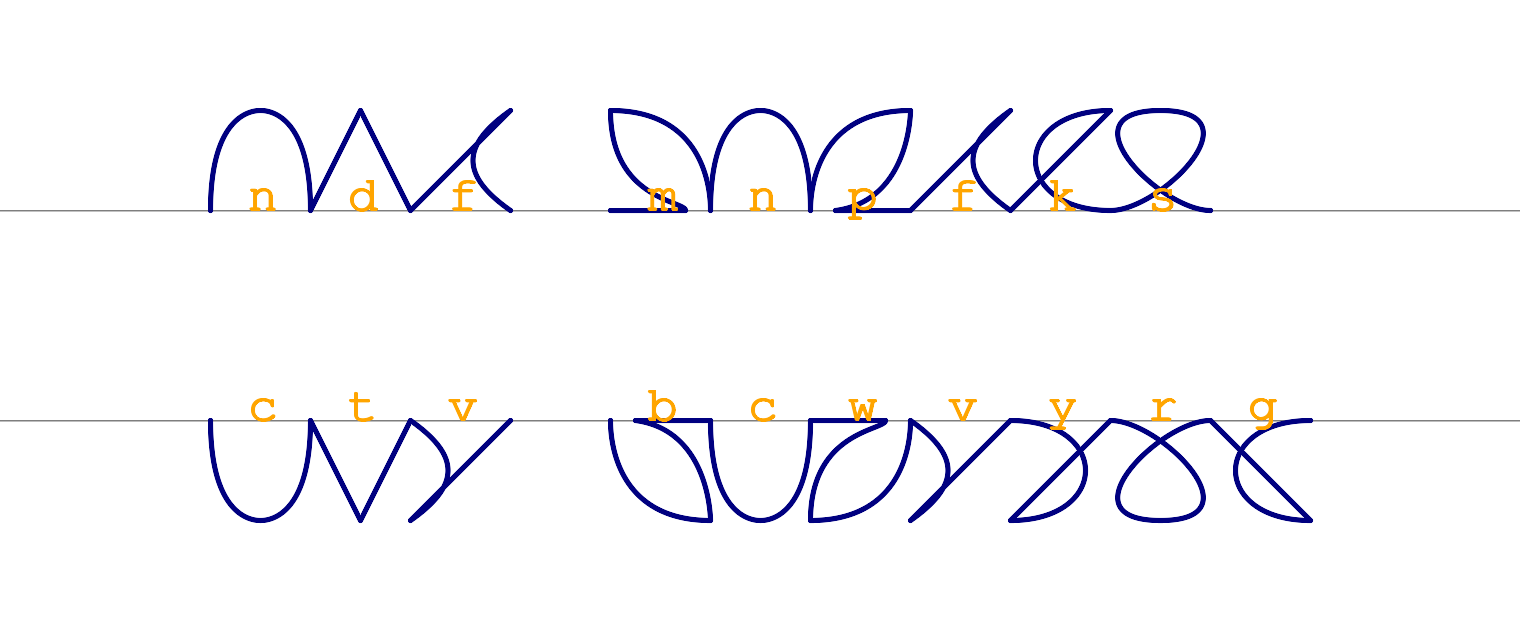
These are likely to be the most used consonants. They are symmetric and easy as vowels but take horizontal instead of vertical space.
l and h are the only two letters I joined into one symbol because I was divided on what to do with h but I didn't want to leave it out.
And it looks like the idea was not bad.
Anyway l, h are easy to remember as these tall letters while h often is not voiced at all.
d, t can be remembered as a pair where d is drawn like delta sign Δ; t also makes sense if you consider capital T shape.
n, c also should make sense while c lies on it's back.
s, r make sense by looking at the similarity at the top of shapes of Latin to this script counterparts.

These are special letters in this script because they require three angular strokes. For most of letters I target one to two distinct hand "gestures" to optimize the speed of execution. But since they are rare by frequency of use, they also got this rare exceptional feature in the script.
They are easily memorized initially by considering how capital letters look and top of letters resemblance (in case of Z, X) or where the horizontal stroke is drawn (in case of J, Q)
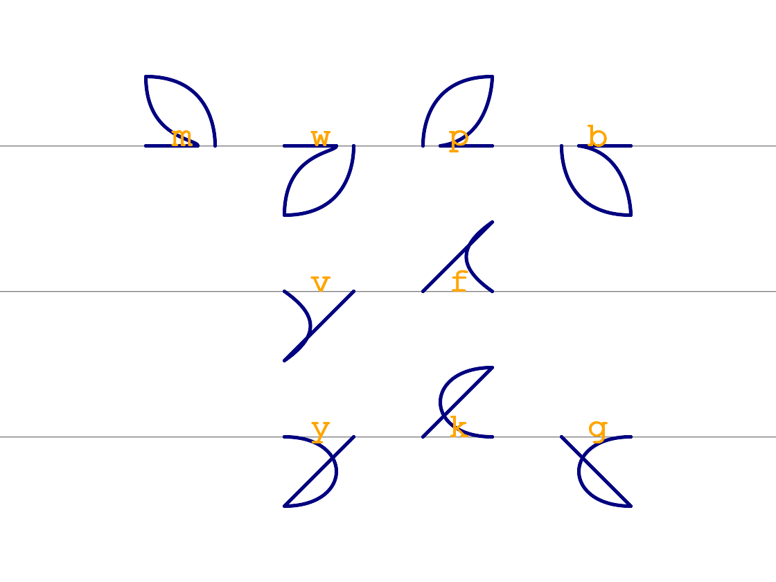
Remaining consonants that have frequency less that 20% got their space in the alphabet by having some complexity introduced. They became diagonal and thus asymmetrical. Because there is additional stroke that connects the shape to baseline, the shape can be seen as composed of two strokes: one more-round and one more-linear in different order. Also introduction of these makes letters to be directed not only up and down but actually using hexagon of directions which is likely to be the optimal way; this could be enough reason to consider scaling letters down?
Every row has the same shape name but in the direction of the different corner.
Every column tries to groups letters in sequences by similarity while positioning of columns tries to maximize neighboring similarity of letters between columns.
Matrix by rows:
- letters with sounds that are produced by use of lips have arc/round shapes (like a smile)
- letters with sounds that are produced by use of teeth have sharp shapes (like teeth)
- letters with sounds produced inside of mouth have loop shapes
Matrix by columns:
mw, v, y- can be seen as a sequence/group initially if it makes sensep, f, k- distinct unvoiced columnb, -, g- can be seen as a group initially if it makes sense
Making sense of pairs/letters:
m, wcan be seen as the same letter flipped both in Latin and in this script; if you do the second round stroke it will resemble the letter in Latinp, balso are flippable in both scripts; they resemble Latin counterparts rotated by 90 degrees whilebgoesbelowthe baselinev, fthey are not exactly flippable but are still easy to remember by themselvesv, yhave direct shape resemblancey, gare not neighbors but the only two letters in the matrix with the loop below both in Latin and in the script so they should make sense as a pairk, gflippable in this script and are related in the soundkis odd because it looks like Latinebut the association can be memorized initially by the wordkey
Hereby this script/alphabet structure has been described.
In potential confusions sequences here neighboring letters should be different-enough from each-other.
So as long as the idea of the letter is kept (like "diagonal arc to top-left" for letter m) individual choices of variations may be added to keep the visual distance between neighbors here.
For example here I have m looking like a leaf while in actual use it is more rounded to keep it simple two-strokes and not opening the three-strokes door too much.
But these variations are not decided and are subject to choice and experimentation.

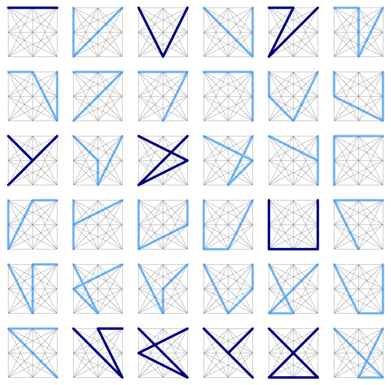
- full height has to be employed for equal letter height
- if the letter is not symmetrical then full diagonal has to be employed/implied
This table shows potential options for assymetric
Ts but these I considered before rendering the table; while it also shows that simplified shape at (2,2), I assume it is just another way to rendery
The angular/linear letters "skeleton" was extracted way later after the completion of the script while the idea of that has sneaked-in earlier in the form of rare consonants shape!
To print a short file in this script (tested on Linux only):
- have ruby and Imagemagick installed
- run: $
rake print < file_name.txt - check the file named
print.png
Ideas I kept from the previous iteration:
- minimal
- write-optimized
- not economizing space
Ideas I got form the previous iteration:
- vowels height idea
- vocal mapping
- letters frequency mapping
- partial similarity mapping that makes sense
- removal of connection strokes => single baseline
Ideas I skipped:
- optimizing based on bodies of texts and such is not in scope because I like letters the mapping to be reason-based and not data-driven
- hand anatomy would make sense for long writing considerations
Possible next ideas:
- hexagon figure as underlying structure may make sense
TODO: clean these two sections up anyway
- the second iteration of a minimalistic shorthand-like cursive script/alphabet for optimized writing of shorter notes
- this iteration also has more meaningful mapping to the alphabet and is easier to remember at no additional cost
- previous iteration simplified letters but externalized the "cost" to connection lines so this iteration has a single baseline where the pen always returns and different letters are rendered above or below of the baseline
- easy to remember because it is well-structured so is more meaningful/memorable and there is no need for Anki deck in this case
- actually single baseline and limited expressive tools moved the script into direction of resembling common letters features so they can be associated visually
- vowels take almost no width but take double height compared to consonants, no capital letters needed anyway
- digital devices are in the mind (the script does not try to economize space)
- it is cursive but low-frequency consonants have distinct "rare" angular shapes
- it is not optimized for aesthetical look of common letter combinations (vowels may sin in this regard)
- minimalism and optimizations for writing speed but will see how it works for reading, especially the height/weight vowels/consonants division may be interesting
I'll have more in depth notes in this type of boxes so they can be conveniently skipped.
- no repetitions (as in "m", "w")
- single baseline that holds all letter starts and ends
- therefore every letter consists of one stroke away from the baseline and then one stroke back to the position of the next letter start
- therefore most frequent letters are symmetrical for simplicity
- less frequent asymmetrical consonants have two different strokes but both strokes fill almost the same horizontal space to not look like two letters
- all consonants have same fixed horizontal and vertical size (I assume square space now)
- vowels take minimal to no horizontal space and double vertical space
- variations: upward, downward, vowel(2x height and minimal-to-no width), diagonal to one of corners (implies additional baseline connection line that "holds" the asymmetry)
- almost all letters take space either above or below of the baseline (except
othat takes none of both)