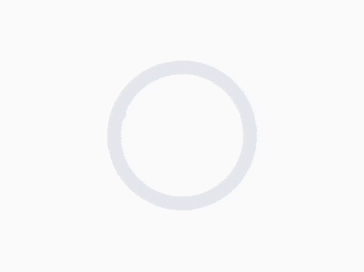
An animated check mark widget. It automatically animates when you toggle it on/off. It can also be styled.
class CheckMark extends ImplicitlyAnimatedWidget {
  const CheckMark({
    Key? key,
    Duration duration = const Duration(milliseconds: 300),
    Curve curve = Curves.linear,
    VoidCallback? onEnd,
    this.active = false,
    this.activeColor = const Color(0xff4fffad),
    this.inactiveColor = const Color(0xffe3e8ed),
    this.strokeWidth = 5,
    this.strokeJoin = StrokeJoin.round,
    this.strokeCap = StrokeCap.round,
  })
}Check the /example folder for an example of the above functionality.
Minimal example:
SizedBox(
  height: 50,
  width: 50,
  child: CheckMark(
    active: checked,
    curve: Curves.decelerate,
    duration: const Duration(milliseconds: 500),
  ),
),If you find any problems, please file an issue if one doesn't already exist.