
GnarlyDialog is a fancy little Android Dialog library I built that makes it easy to create pretty, animated dialog messages in your apps.
Download the GnarlyDialog sample app on Google Play to explore the features.


To use GnarlyDialog, make sure jcenter() is included in your project's build.gradle file
and then add the following implementation line to your app's build.gradle file. Note that with
new versions of Android Studio, jcenter() is automatically included when you create a new project.
jcenter()
implementation 'me.seandillon.gnarlydialog:gnarlydialog:1.1'
GnarlyDialog myGnarlyDialog = new GnarlyDialog(MainActivity.this);
myGnarlyDialog.setGnarlyTitleText("Title");
myGnarlyDialog.setGnarlyContentText("Content");
myGnarlyDialog.gnarlyDialogShow();There are 3 constructor options available for GnarlyDialog.
Create a simple default styled GnarlyDialog by only passing a Context.
public GnarlyDialog(Context context)
Create a GnarlyDialog of a specific style type by passing a Context and a type.
public GnarlyDialog(Context context, int gnarlyDialogType)
Create a GnarlyDialog of a specific type as well as deciding if you want to
use the color wrap layout which is enabled by default. Simply pass false as the
shouldUseColorWrapLayout parameter to use the non color wrapping layout.
public GnarlyDialog(Context context, int gnarlyDialogType, boolean shouldUseColorWrapLayout)
To show the GnarlyDialog dialogs, use gnarlyDialog.gnarlyDialogShow().
This will show the dialog with an intro animation. Do not use the available Dialog function
gnarlyDialog.show(). This will still show the dialog but it will not animate in.
Similar to showing the dialog, use gnarlyDialog.gnarlyDialogDismiss() to dismiss it.
Again, the gnarlyDialog.dismiss() function is available and will dismiss the GnarlyDialog
but it will not animate out.
Android Dialogs have an
included function called setCanceledOnTouchOutside(). If set to true,
the dialog will disappear without animation if the user touches the
screen outside the dialog.
I recommend that you always set this to false because who likes a
disappearing GnarlyDialog without its exit animation?
gnarlyDialog.setGnarlyShouldDismisOnOutsideTouch(false)
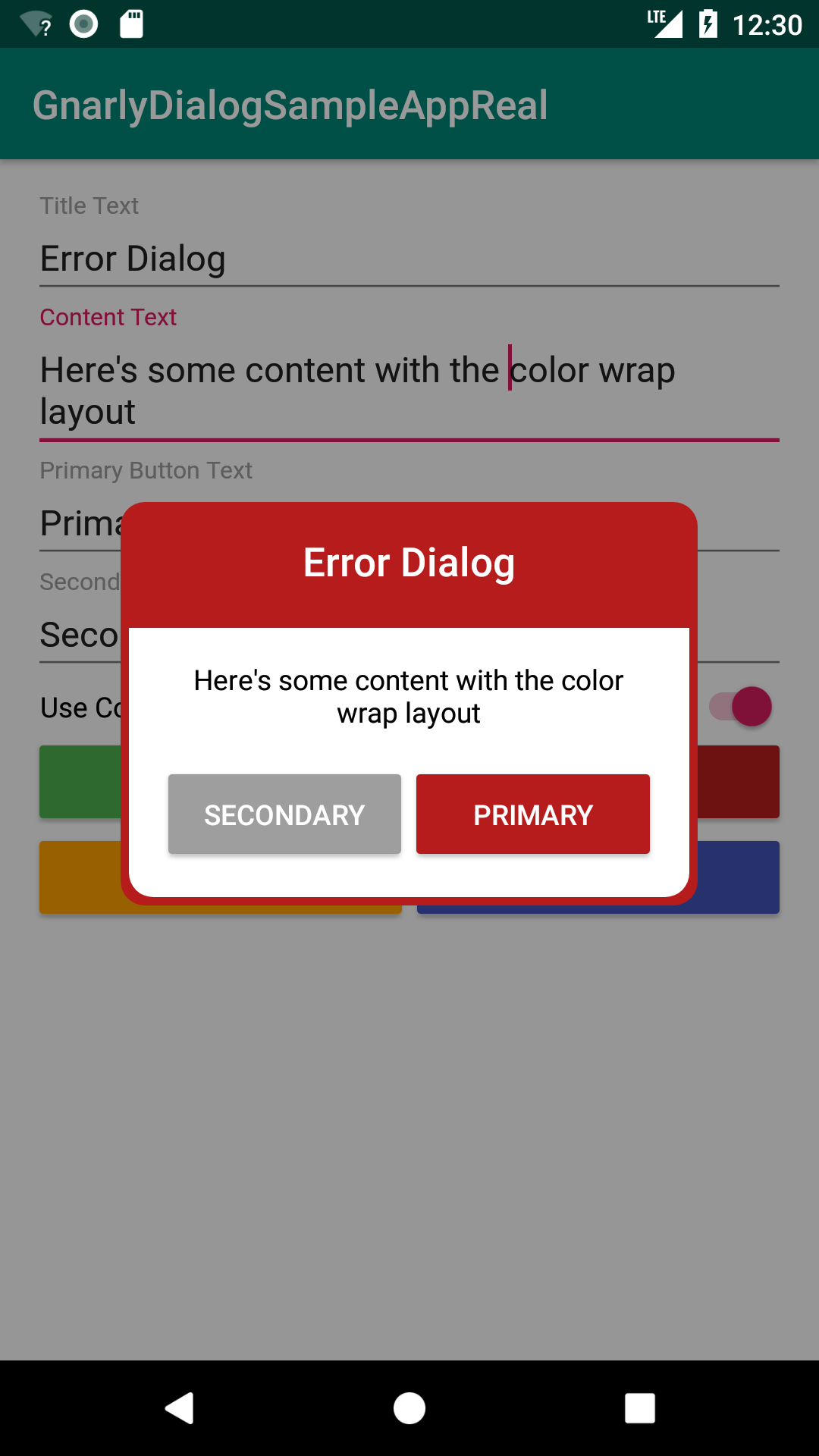
These are the current GnarlyDialog type options. Each option gives the GnarlyDialog
a different color scheme and the GNARLY_DIALOG_TYPE_DEFAULT is currently set to
GNARLY_DIALOG_TYPE_INFO
GnarlyDialog.GNARLY_DIALOG_TYPE_SUCCESSGnarlyDialog.GNARLY_DIALOG_TYPE_ERRORGnarlyDialog.GNARLY_DIALOG_TYPE_INFOGnarlyDialog.GNARLY_DIALOG_TYPE_WARNINGGnarlyDialog.GNARLY_DIALOG_TYPE_DEFAULT
The color wrap option is enabled by default unless you disable it with the appropriate constructor. The color wrap wraps the entire GnarlyDialog with a thin edge of color that matches the primary color for the dialog type.
To disable the color wrap option, pass false as the boolean shouldUseColorWrapLayout argument
to the GnarlyDialog constructor.
GnarlyDialogs will have no buttons by default but you can easily add a primary and secondary button.
The color of the primary button correlates to the primary color of the dialog type while the secondary button is a shade of gray.
To add a primary button, call gnarlyDialog.setGnarlyPrimaryButtonText(String text)
and pass a string that you want to set as the primary button text.
To add a secondary button, call gnarlyDialog.setGnarlySecondaryButtonText(String text) and pass
a string that you want to set as the secondary button text.
You can also pass a View.OnClickListener() to either button to do something on button click.
The below button example creates a basic GnarlyDialog with a title, content, and primary button and then dismisses the dialog with animation on the primary button click.
final GnarlyDialog myGnarlyDialog = new GnarlyDialog(MainActivity.this);
myGnarlyDialog.setGnarlyTitleText("Title");
myGnarlyDialog.setGnarlyContentText("Content");
myGnarlyDialog.setGnarlyPrimaryButtonText("Content");
myGnarlyDialog.setGnarlyPrimaryButtonListener(new View.OnClickListener() {
   @Override
    public void onClick(View v) {
        Toast.makeText(MainActivity.this, "Primary Button Clicked", Toast.LENGTH_SHORT).show();
        myGnarlyDialog.gnarlyDialogDismiss();
    }
});
myGnarlyDialog.setGnarlyShouldDismisOnOutsideTouch(false);
myGnarlyDialog.gnarlyDialogShow();Sean Dillon (Android Developer)
Below is a list of apps currently using GnarlyDialog.
If you use GnarlyDialog and would like to have your app listed here, send me a message or shoot me an email at [email protected].