A collection of ordered subjects and curated tutorials for learning Android development.
To develop the site locally, ensure you have docker installed, navigate in terminal to the repo, and run:
bin/start
This will build a docker container, and start webpack-dev-server. You can preview the site at:
This will hot-reload as you make changes to the code in src.
WARNING: It is not recommended to ever run any
npmoryarncommands outside of a docker container. To change dependencies, use a shell inside the container.
To get a bash shell running inside the container, run the following:
$ docker run -p 4000:4000 -v "$(pwd):/var/www/einstein" -it --rm einstein-atoe bashOnce you've made changes, you will need to restart the dev server, with bin/start as above.
The gh-pages branch is served by GitHub via GitHub Pages at https://www.androidelements.com/. Merging to the master branch will trigger a CI build of the app, in production mode, which will then be auto-deployed to this branch. You should never need to edit this branch directly.
CI is performed by GitHub Actions, and is configured in .github/deploy.yml. The build script is in bin/build_prod.sh.
The table of elements is composed of sections and subjects.
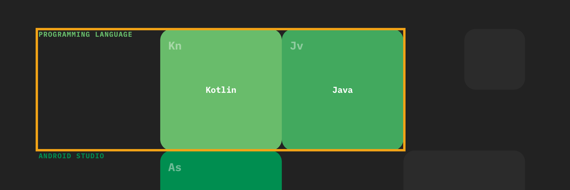
Section: A section is a grouping of subjects and represents an area of Android development eg. Programming Language, User Interface or Networking. Every section has a base color. The base color and it’s shades are used to define the subjects within a section (see the Color Guide at the end for more details).
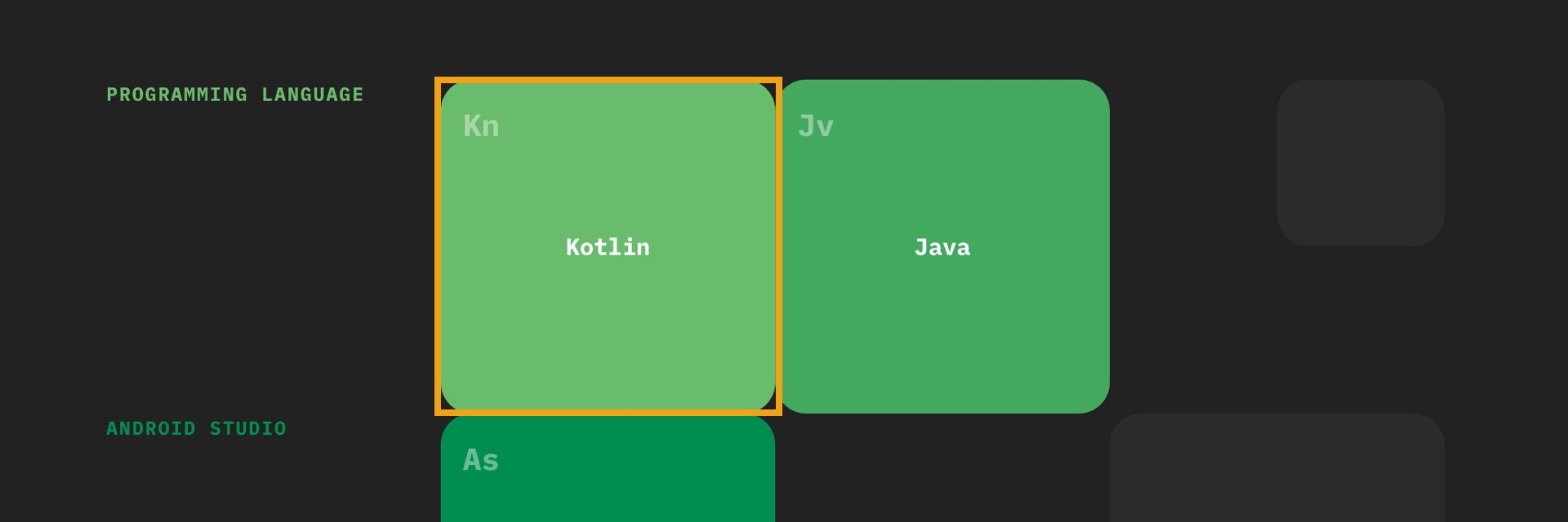
Subject: Subjects represent a well-defined topic of Android development eg. Kotlin, RecyclerView or Firebase. Subjects are organised from left to right.
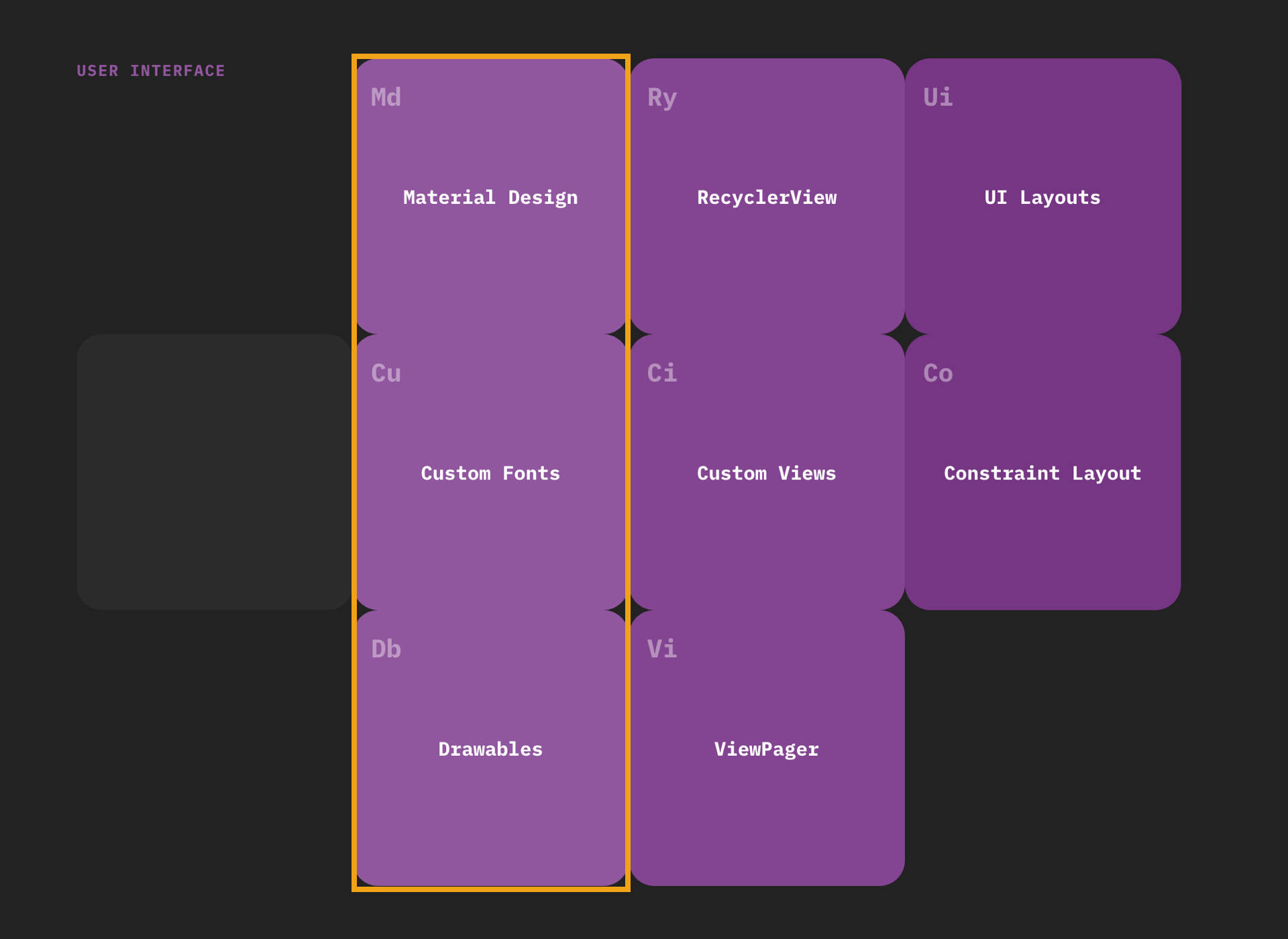
In sections with more than 4 subjects. Subjects that are closely-related should be organised vertically in a column to create a sub-section eg. Material Design, Custom Fonts and Drawables are all related to UI styling.
The table of elements is built on a 5 column square grid.
Squares on the grid are configurable through JSON objects. JSON configuration for the table: /src/data/content.json
Objects are displayed on the grid according to their object number.
To see the JSON object number of every square, use the grid-mode view when configuring content locally by clicking on the Grid View link at the top whilst running in development mode.
An object can have the following attributes:
{
  "elementClass": "",
  "elementSection": "",
  "elementName": "",
  "elementCode": "",
  "elementDescription": ""
  "elementTutorials": [ [“”, ””] ]
}

//elementClass: Classes to adapt a square for a section, subject or fill (String)
//elementSection: Anchor for a section (String)
//elementName: Display name of a section or subject (String)
//elementCode: Code in the corner of a subject (String)
//elementDescription: Description of a subject (String)
//elementTutorials: Subject tutorials and links eg. Articles, Video Courses, Books (Array)
There are three types of elements that can be placed on the grid squares:
- Section
- Subject
- Fill/Empty
An explanation and example object configuration for each element is as follows:
Section: Define the start of a group of subjects

{
  "elementClass": "light-green-1",
  "elementSection": "section-1",
  "elementName": "Programming"
}
Subject: Define a subject

{
  "elementClass": "light-green-1",
  "elementName": "Kotlin",
  "elementCode": "Kn",
  "elementDescription": "...",
  "elementTutorials": [
    [“Programming in Kotlin (Article)”, “https://www.raywenderlich.com/...”],
    [“Programming in Kotlin (Video Course)”, “https://www.raywenderlich.com/...”]
  ]
}
Fill/Empty: Fill up empty squares at the end of a row with fill (background) or empty (no background)

{
  "elementClass": "fill",
}

{
  "elementClass": "empty",
}
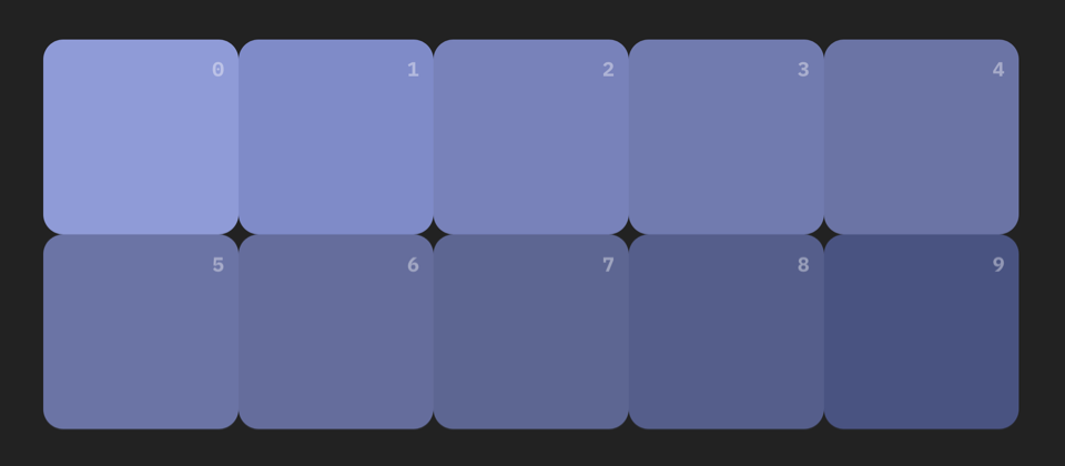
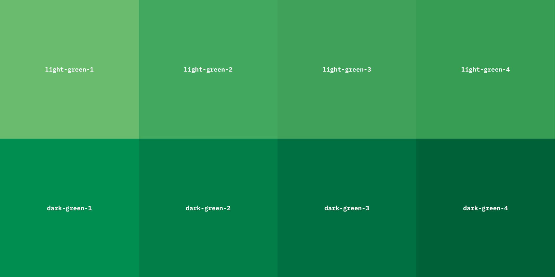
Sections and subjects on the grid are colored through special classes. To create harmony between sections, organise them vertically according to the color wheel. You can use the color page to quickly reference color class names by clicking on the Colors View link at the top whilst running in development mode.
When choosing a base color for a section start with the left-most shade. The section name and first column of subjects use the base color. Subsequent columns of subjects use the next shade of the base color. The color classes are added to the elementClass of an object. Classes color the text for the section and the background of the subject square.
