


P.S: Image is free to use
https://public.tableau.com/profile/nandini6420#!/vizhome/Final_Project1_0/Story1?publish=yes
Reference Links for Data:
https://www.zillow.com/research/data/#rental-data
http://livingwage.mit.edu/counties/48015
https://www.youtube.com/watch?v=CVVXDFEq1kU&feature=youtu.be
- Agasthya
- Garima Jain
- Nandini Rajeswaran
- Nishant Singh
- Neha Pawar
In this project, we are comparing three great cities, San Francisco, New York and Austin which have burgeoning job opportunities, great art culture, excellent food and nightlife. But which city from these provides not only the great perks mentioned above, but affordable housing as well. Of course, we took on this project with vested interests, everyone who lives in San Francisco justifies the insane cost of living and housing against the perks of being in a city which is the hub for job opportunities and such a diverse culture that everyone here feels welcomed. But we wanted to determine "Is it really worth living in San Francisco or is there a better city out there which provides all the perks of living in SF".
Buying a home has always been a sign of growing up and living the American dream, on a more practical note, it's about creating an investment that one can bank on in bad times. But the rising cost of housing in San Francisco has made it difficult for Millenials to purchase homes. The current average prices of homes in San Francisco are approximately $850,000.
With purchase prices hitting the roof, we decided to determine which city is best to live in by comparing the shining bastion of the west, 'San Francisco' against concrete jungle where dreams are made, 'New York' and the upcoming wannabe San Francisco, 'Austin'.
Why did we decide to compare San Francisco, New York and Austin? Some of the key features that people look while purchasing homes are covered by these 3 iconic cities and hence we decided to compare and contrast them to derive insights to support our claim.
- SF, NY and Austin offer a plethora of job opportunities ranging from Arts to Tech
- The all have great food, nightlife and theatre scene
- They embrace diversity
We wanted to determine if there is a city that will be a close match in San Francisco (no two cities can be the same), hence For this assignment, we have used the following datasets to derive insightful metrics for our final claim "Which city is better for buying a Home?"
- The datasets for these cities include:
- Average Home purchase price for last 8 years
- Citywise Occupation Area and their salaries
- Citywise Per sq ft prices for Home purchase
San Francisco is one of the fastest growing cities in America, with citizens flocking in from far and wide. Those who live there constantly tout its virtues to their friends in an effort to make them jealous and it is no secret that San Francisco is one of America’s most vital cultural hubs. With so much to see and do, there is very little reason not to move to “The City”, right?
(Write up excerpts taken from: https://occupytheory.org/list-of-pros-and-cons-of-living-in-san-francisco/)
- Anyone looking to purchase a home in the aforementioned 3 cities
- Anyone who is looking to relocate from another city to one of these cities
- Anyone from these 3 cities looking for a affordable home with similar perks of popular cities
Buying home is one of the most expensive purchases that an individual makes and living in a city like San Francisco does not make the decision an easy one. The audience wants a housing affordability comparative analysis between popular cities having a similar background so that they can determine what does San Francisco bring to the plate that other cities don't or vice versa so that they can make informed choices about investing in home purchases.
San Francisco residents would ideally want to live here, but with a solution to the housing crisis. Currently, there is a huge demand, supply gap in the housing market and the prices are sky high. This wishlist is not that difficult to achieve if the government focuses on missing more housing construction and provide tax reliefs to companies to move to lesser popular locations for a more even spread out of the population and which will also result in lower purchase prices and increased home inventory.
- Home purchase prices increasing further
- Increased competition for available homes
- Decreasing trend of home inventory
These metrics will allow us to compare and contrast home purchase prices across San Francisco, New York and Austin and also allow us to compare affordability of an individual based on their salaries with respect to how much sq ft of property they will be able to purchase in the aforementioned cities.
- Affordability is an individual's home purchase capacity based on the salary For eg: How much sq ft. will a person be able afford in the salary he/she earns based on their job profiles in the 3 cities
- This will give them an insight into their potential home buying capacity based on the size of the home For eg: If a person is looking to buy a one household home, which city will allow the person to buy more sq ft
This metric provides insight into the upward trend of home purchase prices
This metric determines the percent increase or decrease in the home purchase prices across the 3 cities
This metric compares the price to rent ratio for all the 3 cities against the National average. P.S: The price to rent ratio closer to the national average indicates a buyer-friendly market
This indicates the sq ft., buying capacity of individuals in particular occupational areas based on their salaries for all 3 cities
San Francisco is one of the fastest growing cities in America, with citizens flocking in from far and wide while New York is an iconic city with both dreamers and realists flocking to it and Austin is considered to be San Francisco in the making. So which city should you choose to call Home?
When deciding to buy a home, there are so many factors that one has to consider such as:
- Job opportunities
- Average salaries
- Average home purchase prices
- Ones own personal buying capacity
The premise in our storyboard is simple:
- It is comparing citywide average salaries of individuals in different job profiles and their sq ft buying capacity in that particular city
- It is also comparing the home purchase price increase trend for the last 8 years, to provide an insight of what is the price growth rate in each city to determine the affordability
- To dig deep on the growth rate we are presenting the increase or decrease in percentage of the average home price.
- It is also comparing the price to rent ratio across the 3 cities, which provides details about how friendly is the buyer's market
The information gleaned from these visualizations will enable home buyers to make an informed decision about which city would be a suitable abode for them.


To Buy or Where to buy is such a huge dilemma for every potential home buyer and living in San Francisco does not make it any easier. So to decide whether San Francisco is the place to be or should one move to any other iconic or upcoming cities.
To present our take on this matter, we have followed the below steps:
- Initially we started with a web search for datasets on home and rental prices
- After analyzing the data we realized the scope is too broad and we decided to narrow it
- After narrowing the scope and re-analyzing the dataset we narrowed our focus to couple of parameters which would best be able to support our claim
- Then we started to create visualizations, which helped us to analyze and understand the behavior of the real estate market in these cities
- First, we created the home purchase price trend chart, which helped us analyze the absolute price growth in SF, NY and Austin
- From the first visualization, we were able to determine that San Francisco behaves extremely different from New York and Austin as the home value increases exponentially from the year 2012 onwards.
- Second, we created Price to Rent ratio, this ratio is determined by dividing the home price to rent, price, which depicts the fact that if the ratio is low then it is a buyer friendly market
- Third, we created a Salary to Expense ratio and mapped it against occupational areas for each city
- But we decided to discard this visualization because the salary to expense ratio had very little difference in their values across the cities
- The main reason for this was because even though people were earning more say in SF they were spending more too
- Hence this visualization was not providing an insight to clearly determine a claim
- Because this metric wasn't providing valid compare and contrast, we decided to include the city future growth rate and use this visualization as a warrant
- After revisiting the first two visualizations, in the first viz we realized that we needed to also show year on year percentage difference in the growth rate to determine the home purchase price growth rate trend compared to the past years
- In the second viz, we compared the price to rent ratio of each city against the national average to add a layer of depth on the friendliness of the buyer's market
- Next we wanted to add more parameters that would help our claim shine through, so we decided to map the sq ft area of different households to the total home purchase price
- This metric helped us determine that to afford a single household in SF requires to pay more than double the value of the households in Austin and New York
- Though New York is not as expensive as San Francisco, it is costlier than Austin and hence Austin shines through as a clear winner
- Next we decided to compare the annual salary pay against the sq ft
- This allowed us to determine the sq ft a person can buy with the given annual salary
After analyzing all these metrics in the visualization on a storyboard, we came to the conclusion that "Austin is the better city to buy a home as compared to San Francisco and New York!!"
Visualization 1:

What's good about this Visualization:
- This visual represents average home purchase prices across the three cities
- From the visual, it's clear that living in San Fransico is a luxury that not all people can afford and in Austin, you can buy a good property for a cheap price
- New York, on the other hand, is between the two cities
What's bad about this Visualization:
- Firstly, the visual is confusing because it has the same colours for the three cities
- Secondly, the visual by itself isn't enough evidence to bolster the claim
Visualization 2:

What's good about this Visualization:
- The visual represents the price to rent ratio for the 3 cities in question and as we can see Price to rent ratio is the lowest for Austin
- The Price to rent ratio metric is an important metric to answer if it's feasible to buy a house
- Lower the Price to rent ratio the better is the buyer's market
- The visual supports the claim mentioned in the title and helps an audience to come to an understanding that it's better to rent than buy homes in cities where the ratio is high
What's bad about this Visual:
- This visualization does not offer any contrast as the national price to rent ratio hasn't been included in the viz
Visualization 3:

What's good about this Visualization:
- This visualization compares the salary of different job profiles against the area in sq ft., It helps in determining the sq. ft. one can buy based on the job profiles and salaries across all the three cities
- The visual has dual axis to better represent the data to viz ratio as it gives more information in a single visual
- The dots show salaries in different cities and the amount of area in sq ft a person working in that job category can buy
What's bad about this Visual:
- Having dual axis in a visual can be confusing and misleading
- The Audience will have to manually compare the salary and sq. ft. area to comprehend the differences across the 3 cities
- The audience prefer a direct comparison of SF premium with other two cities in order to understand the difference
Visualization 4:

What's good about this Visual:
- This visual provides insight into the amount the audience needs to pay to purchase 'X' amount of sq ft. in the three cities
- The visual shows a clear trend making the claim strong that buying a property in SF with all the expenses that come with it is not worth it.
What's bad about this Visual:
- The axes do not make sense, it should be inverted to better represent the findings
Visualization 5:

What's good about this Visual:
- This visual shows the growth rate per city combined with salary to expense ratio
- Austin shows a promising trend as it continues to grow at a higher rate as compared to New York and San Francisco
What's bad about this Visual:
- This visualization would add more value if the growth rate per job category is included in the metric rather than the growth rate per city
The actionable insight that can be inferred from the data product visualization is that the huge difference between San Francisco and Austin salaries does not necessarily translate into more luxury or space in San Francisco. When we compare and contrast, it can be seen that Austin has more to offer.
For example, a Management personnel is paid more in San Franciso than New York and Austin by USD 3180 and USD 39520 respectively but he/she can afford only 250 sq ft in SF while one can afford 550 sq ft and 700 sq ft of area in New York and Austin respectively in their given salaries. We compared the salary premium with respect to area in every city for all the job categories and the result is almost same with little margins.
In San Francisco more money does not translate into better lifestyle because the expenses are way more than Austin and one pays the price of higher cost of living to be in the heart of Silicon Valley.
Austin is best because of the following reasons:
- Lower Price to Rent ratio
- Affordable housing
- High growth rate ratio for a city
- Reasonable cost of living
- Austin home purchase prices are extremely low when compared with San Francisco and New York
Thus we conclude with enough 'evidence' that Austin is the best city to buy homes in comparison to San Francisco and New York.
Improvement: The metric should include growth rate per job for all categories instead of single growth rate citywide
- Benefit- This would help the audience analyze cities on a much realistic scale
Improvement: Include the tax rates and mortgage values data
- Benefit- This makes the visual really interesting and applicable in the real world
Improvement: Plot a quadrant graph for salary vs area in sq ft., for all job categories in the 3 cities

- Benefit- Quadrant chart and Flipping the axis can allow the audience to explore more in the visualization as they can go and select their city and see what part of the graph they fall in
Improvement: Develop more actionable insights from new data to integrate with this visual
- Benefit- Actionable insights such as comparison of growth of different job sectors(eg: Tech) over the years will bolster the claim more
Improvement: Include data on employment rate, weather conditions, traffic data, new job opportunities, average working age, business opportunities and also all the major cities in the US to give audience better and wide comparison.
- Benefit- These are the conditions people take into consideration in choosing a place to live
Improvement: Include the cost for more than one adult
- Benefit- Using a calculation for more than one adult can provide a better comparison to the audience as a large part of the population have families and the bigger picture is "Will I be able to better support my family if I move to this place?"
Rent or buy a home:
- https://www.zillow.com/research/data/#rental-data
- https://public.tableau.com/profile/guillevin#!/vizhome/IRONVIZ-TheHousingMarketRollercoaster/THEHOUSINGMARKETROLLERCOASTER
- https://www.nytimes.com/interactive/2014/upshot/buy-rent-calculator.html
- https://public.tableau.com/en-us/s/gallery/housing-market-rollercoaster?gallery=votd
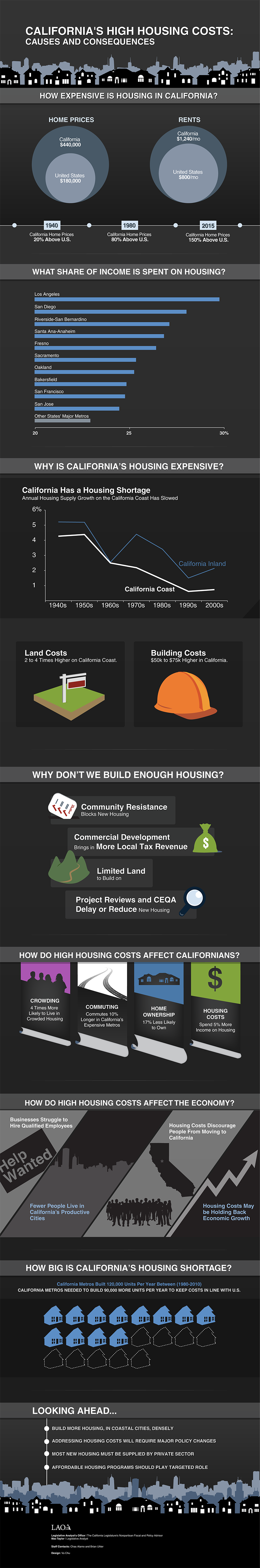
Article - Why houses are costly in CA??:
EMPLOYMENT INFORMATION:
-
https://www.bls.gov/regions/new-york-new-jersey/data/xg-tables/ro2xgcesnyc.htm
-
https://www.bls.gov/regions/new-york-new-jersey/new_york.htm
Rent information for Various Cities in US (Both for 1 and 2 bedroom aptartments):
Quarterly report of Employment and wages - Labour Department:
- https://data.bls.gov/cew/apps/table_maker/v4/table_maker.htm#type=14&year=2016&size=0,1,2,3,4,5,6,7,8,9&hlind=10&supp=1
- https://data.bls.gov/timeseries/LASST060000000000003?amp%253bdata_tool=XGtable&output_view=data&include_graphs=true
- https://data.bls.gov/timeseries/LASST360000000000003?amp%253bdata_tool=XGtable&output_view=data&include_graphs=true
New York City Salary Info:
Austin County Wages Info:
Austin vs SF Blog
http://www.careerglider.com/blog/austin-vs-sf-austin-better-spot-career/
SF vs NY
https://ww2.kqed.org/pop/2013/09/18/sf-vs-ny-which-is-better-really/
Why is Austin is better?
Pros and Cons of SF https://occupytheory.org/list-of-pros-and-cons-of-living-in-san-francisco/
- The project helped us understand the complexity of integrating data from various sources and its implications
- Apart from analyzing the data, researching about the project helped us to have a better understanding of the data
- Strictly adhering to time lines, one cannot spend too much on one part and too less on another, every aspect of finding the data, to cleaning, visualizing and documentation are integral parts of the project
- Working with a team brings diverse thinking and open minds to new possibilities

- Our thought process:
