
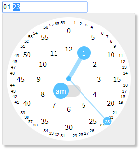
An opinionated clock-style vanilla-js timepicker.
Demo
- Keyboard and numpad friendly
- Autocomplete - e.g.
"1"->"01:00","12"->"12:00","1234"->"12:34" - Support up/down arrow key to increment/decrement
- Autocomplete - e.g.
- Mouse and touch friendly
- 3 clicks are sufficient to pick a time - am/pm, hour, minute
- Click targets often used are large enough
- No need to scroll
- Declarative usage
- Vanilla JS - no need jQuery or any other frameworks
- Lightweight (CSS + JS ~ 7kB gzipped)
$ npm install clockletimport "clocklet/css/clocklet.min.css";
import clocklet from "clocklet";<link rel="stylesheet" href="https://cdn.jsdelivr.net/npm/[email protected]/css/clocklet.min.css">
<script src="https://cdn.jsdelivr.net/npm/[email protected]"></script>
<script>/* `window.clocklet` object is available */</script>clocklet.min.css
clocklet.min.js
Place <input> elements having data-clocklet attribute (either before or after loading the clocklet script).
When these elements get focused, the timepicker popups.
<input data-clocklet>Default options can be set as properties of clocklet.defaultOptions object.
Option names must be described in camelCase.
clocklet.defaultOptions.zIndex = 9999;
clocklet.defaultOptions.format = "hh:mm a";
Element-specific options can be specified as semicolon-separated data-clocklet attribute value.
Option names must be described in kebab-case.
<input data-clocklet="class-name: my-clocklet-style; placement: top;">| Name | Type | Default | Description |
|---|---|---|---|
| class-name | string | "" | Class name to set to the root element of the popup. |
| format | string | "HH:mm" | Time format (template) of the input element. Some tokens are replaced with the selected time value. See the format tokens section below. |
| placement | "top" | "bottom" | "bottom" | Popup placement. |
| alignment | "left" | "center" | "right" | "left" | Popup alignment. |
| append-to | "body" | "parent" | "body" | The parent element into which the popup element will be inserted. |
| z-index | number | string | "" | Popup z-order. If this value is an empty string, (1 + z-index of the input element) is used. |
| Token | Range | Description |
|---|---|---|
| H | "0" .. "23" | Hour in 0-based 24-hour notation with no padding. |
| HH | "00" .. "23" | Hour in 0-based 24-hour notation with zero padding. |
| _H | " 0" .. "23" | Hour in 0-based 24-hour notation with space padding. |
| h | "1" .. "12" | Hour in 1-based 12-hour notation with no padding. |
| hh | "01" .. "12" | Hour in 1-based 12-hour notation with zero padding. |
| _h | " 1" .. "12" | Hour in 1-based 12-hour notation with space padding. |
| k | "1" .. "24" | Hour in 1-based 24-hour notation with no padding. |
| kk | "01" .. "24" | Hour in 1-based 24-hour notation with zero padding. |
| _k | " 1" .. "24" | Hour in 1-based 24-hour notation with space padding. |
| m | "0" .. "59" | Minute with no padding. |
| mm | "00" .. "59" | Minute with zero padding. |
| _m | " 0" .. "59" | Minute with space padding. |
| a | "am" | "pm" | Post or ante meridiem abbreviation in lowercase without periods. |
| aa | "a.m." | "p.m." | Post or ante meridiem abbreviation in lowercase with periods. |
| A | "AM" | "PM" | Post or ante meridiem abbreviation in uppercase without periods. |
| AA | "A.M." | "P.M." | Post or ante meridiem abbreviation in uppercase with periods. |
Following events are raised on the input element by this library.
| Type | Cancelable | event.details | Description |
|---|---|---|---|
| clocklet.opening | true | { options: {...} } | Raised before showing the clocklet popup. |
| clocklet.opened | false | { options: {...} } | Raised after showing the clocklet popup. |
| clocklet.closing | true | {} | Raised before hiding the clocklet popup. |
| clocklet.closed | false | {} | Raised after hiding the clocklet popup. |
| input | false | undefined | Raised after changing the input value. |
For example:
<input id="my-clocklet" data-clocklet>
<script>
  document
    .getElementById("my-clocklet")
    .addEventListener("clocklet.opening", function (event) {
      console.log(event.details.options);
      if (DO_NOT_NEED_TIMEPICKER) {
        event.preventDefault();
      }
    });
</script>See default options section.
Show the timepicker for the specified inputElement with the options (optional).
Hide the timepicker.
Place the timepicker into the containerElement.
The optional parameter is the binding setting for the input element.