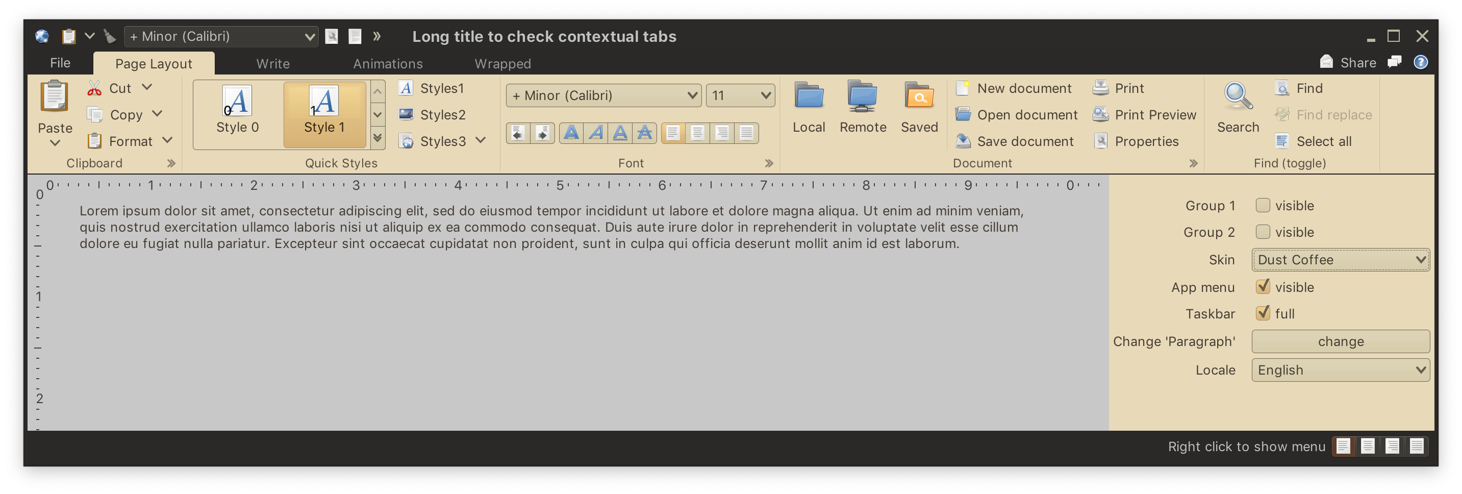
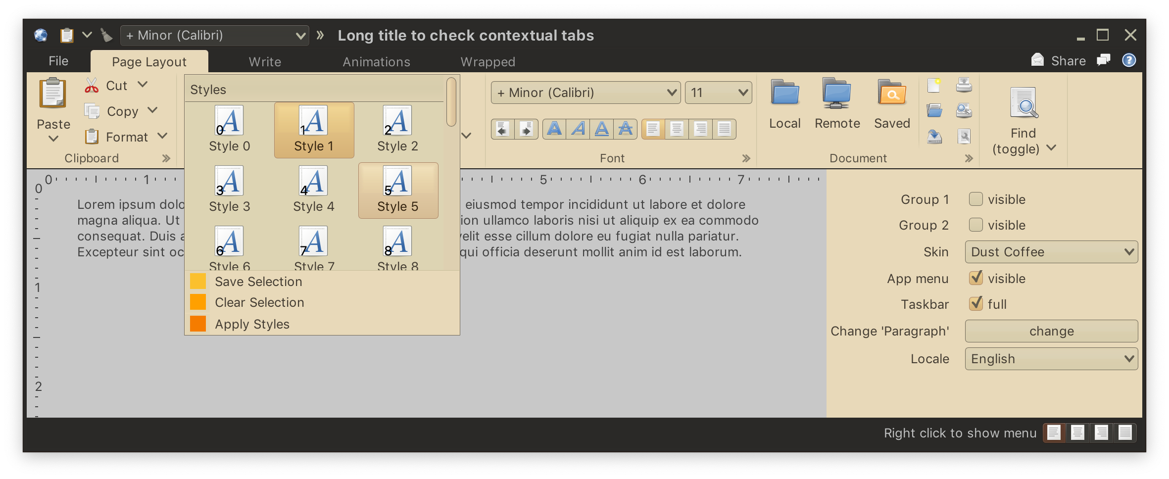
In-ribbon galleries are the third type of content that can be placed in a ribbon band. In the screenshot above the "Quick Styles" band shows an in-ribbon gallery. In-ribbon galleries are configured to display a certain (usually small) number of selections, with a vertical strip right next to them to scroll the selections inline up and down, and display the available selections in a larger popup:
Let's take a look at the various moving pieces involved in configuring an in-ribbon gallery.
We start by configuring the main gallery content - commands shown in the scrollable area of the gallery when it is shown in its ribbon band, or shown in the larger popup as in the last screenshot.
List<CommandGroup> stylesGalleryCommands = new ArrayList<>();
List<Command> stylesGalleryCommandsList = new ArrayList<>();
List<Command> stylesGalleryCommandsList2 = new ArrayList<>();

MessageFormat mfButtonText = new MessageFormat(
        resourceBundle.getString("StylesGallery.textButton"));
mfButtonText.setLocale(currLocale);

for (int i = 0; i < 30; i++) {
    final int index = i;
    RadianceIcon.Factory iconFactory = DecoratedRadianceIcon.factory(
            Font_x_generic.factory(),
            (Component c, Graphics g, int x, int y, int width, int height) -> {
                // custom painting for the command index in the bottom-left corner
                ...
            });

    Command ribbonCommand = Command.builder()
            .setText(mfButtonText.format(new Object[] { i }))
            .setIconFactory(iconFactory)
            .setToggle()
            .build();

    if (i < 10) {
        stylesGalleryCommandsList.add(ribbonCommand);
    } else {
        stylesGalleryCommandsList2.add(ribbonCommand);
    }
}

stylesGalleryCommands.add(new CommandGroup(
        resourceBundle.getString("StylesGallery.textGroupTitle1"),
        stylesGalleryCommandsList));
stylesGalleryCommands.add(new CommandGroup(
        resourceBundle.getString("StylesGallery.textGroupTitle2"),
        stylesGalleryCommandsList2));

this.styleGalleryContentModel = new RibbonGalleryContentModel(Font_x_generic.factory(),
        stylesGalleryCommands);
Here we've built a RibbonGalleryContentModel from two CommandGroups, one with 10 commands and the other with 20 commands.
These are commands shown below the expanded scrollable panel of gallery commands in the popup:
this.menuSaveSelection = Command.builder()
        .setText(resourceBundle.getString("Format.menuSaveSelection.text"))
        .setIconFactory(ColorRadianceIcon.factory(new Color(0xFFFBC02D)))
        .setAction(commandActionEvent -> System.out.println(
                "Save Selection activated"))
        .build();
this.menuClearSelection = Command.builder()
        .setText(resourceBundle.getString("Format.menuClearSelection.text"))
        .setIconFactory(ColorRadianceIcon.factory(new Color(0xFFFFA000)))
        .setAction(commandActionEvent -> System.out.println(
                "Clear Selection activated"))
        .build();
this.applyStyles = Command.builder()
        .setText(resourceBundle.getString("Format.applyStyles.text"))
        .setIconFactory(ColorRadianceIcon.factory(new Color(0xFFF57C00)))
        .setAction(commandActionEvent -> System.out.println(
                "Apply Styles activated"))
        .build();

this.styleGalleryContentModel.addExtraPopupCommandGroup(
        new CommandGroup(this.menuSaveSelection, this.menuClearSelection));
this.styleGalleryContentModel.addExtraPopupCommandGroup(
        new CommandGroup(this.applyStyles));
Here we are using RibbonGalleryContentModel.addExtraPopupCommandGroup() API to add two groups of extra popup commands.
Same as with commands and color selector popup menus, you can register listeners to be notified when the user previews and / or changes selection in the gallery content:
this.styleGalleryContentModel.setSelectedCommand(
        stylesGalleryCommandsList.get(1));
this.styleGalleryContentModel.addCommandActivationListener((Command activated) ->
        System.out.println("*** Command '" + activated.getText() + "' activated! ***"));
this.styleGalleryContentModel.addCommandPreviewListener(
        new RibbonGalleryContentModel.GalleryCommandActionPreview() {
            @Override
            public void onCommandPreviewActivated(Command command) {
                System.out.println("Preview activated for '" + command.getText() + "'");
            }

            @Override
            public void onCommandPreviewCanceled(Command command) {
                System.out.println("Preview canceled for '" + command.getText() + "'");
            }
});Now it's time to create our projection. We first start by defining the presentation priority for the gallery. It effectively defines how many (projected) commands we want to be displayed inline (not in the expanded / popup state) for every presentation priority. As the ribbon is resized, this mapping will be used to show more of fewer of the projected commands:
Map<JRibbonBand.PresentationPriority, Integer> stylesGalleryVisibleCommandCounts =
        new HashMap<>();
stylesGalleryVisibleCommandCounts.put(JRibbonBand.PresentationPriority.LOW, 1);
stylesGalleryVisibleCommandCounts.put(JRibbonBand.PresentationPriority.MEDIUM, 2);
stylesGalleryVisibleCommandCounts.put(JRibbonBand.PresentationPriority.TOP, 2);
Next we configure presentation overlays for the extra popup commands and action key tips we want to be associated with those commands:
Map<Command, CommandButtonPresentationModel.Overlay> formatMenuOverlays = new HashMap<>();
formatMenuOverlays.put(this.menuSaveSelection,
        CommandButtonPresentationModel.overlay().setActionKeyTip("SS"));
formatMenuOverlays.put(this.menuClearSelection,
        CommandButtonPresentationModel.overlay().setActionKeyTip("SC"));
formatMenuOverlays.put(this.applyStyles,
        CommandButtonPresentationModel.overlay().setActionKeyTip("SA"));
Now it's time to configure our presentation model. We use the RibbonGalleryPresentationModel and its builder to configure:
- How many commands we want to see displayed inline (not in popup) under different presentation priorities. The mapping defined above is the reason this particular in-ribbon gallery displays 2 items when there is enough horizontal space for everything.
- How many rows and columns of content we want to see in the popup. In our case we want 3 columns and at most 3 visible rows (kicking in vertical scrolling if necessary).
- Presentation state for projected commands inline, as well as in the popup. Using
SMALLpresentation state will display three rows of small buttons inline. - Key tip for the expand button of the gallery.
RibbonGalleryProjection quickStylesGalleryProjection =
        new RibbonGalleryProjection(this.styleGalleryContentModel,
                RibbonGalleryPresentationModel.builder()
                        .setPreferredVisibleCommandCounts(stylesGalleryVisibleCommandCounts)
                        .setPopupLayoutSpec(new MenuPopupPanelLayoutSpec(3, 3))
                        .setCommandPresentationState(JRibbonBand.BIG_FIXED_LANDSCAPE)
                        .setExpandKeyTip("L")
                        .build());
quickStylesGalleryProjection.setCommandOverlays(formatMenuOverlays);
quickStylesBand.addRibbonGallery(quickStylesGalleryProjection,
        JRibbonBand.PresentationPriority.TOP);
With our RibbonGalleryContentModel as the content model and RibbonGalleryPresentationModel as the presentation model, we create RibbonGalleryProjection, configure overlays for the extra popup content and call JRibbonBand.addRibbonGallery() to add the gallery at TOP presentation priority.
Continue to the keytips.

