$ meteor add sach:flow-db-admin
A fork of yogiben:admin package to work with flow-router instead of iron:router
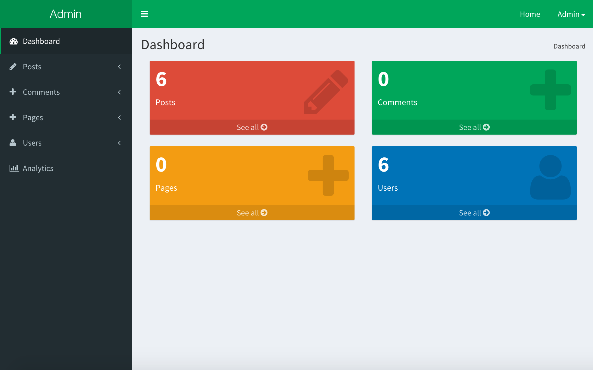
A complete admin dashboard solution for meteor built off the kadira:flow-router, kadira:blaze-layout, alanning:roles and aldeed:autoform packages and frontend from the open source admin dashboard template, Admin LTE.
This package is designed to work with certain types of projects. Your project should be using and have configured
- Flow Router -
meteor add kadira:flow-router - Blaze Layout -
meteor add kadira:blaze-layout - Collection Helpers -
meteor add dburles:collection-helpers - Collection2 -
meteor add aldeed:collection2-core - An accounts system - e.g.
meteor add accounts-base accounts-password - Roles -
meteor add alanning:roles - Bootstrap 3 - e.g.
meteor add twbs:bootstrap - Fontawesome - e.g.
meteor add fortawesome:fontawesome
Download to your packages directory and run meteor add sach:flow-db-admin then go to /admin to start
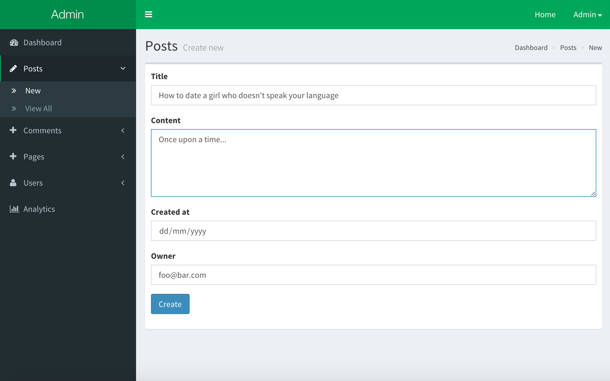
The simplest possible config with one, 'Posts', collection.
AdminConfig = {
  collections: {
    Posts: {}
  }
};
This config will make the first user admin.
You can also set the adminEmails property which will will override this.
AdminConfig = {
  name: 'My App',
  adminEmails: ['[email protected]'],
  collections: {
    Posts: {}
  }
};If you are unfamiliar with autoform or collection2 or collection-helpers you should check them out now.
You need to define and attach a schema to the collections that you want to edit via the admin dashboard. Check out the documentation.
Schemas = {};

Posts = new Meteor.Collection('posts');

Schemas.Posts = new SimpleSchema({
  title: {
    type: String,
    max: 60
  },
  content: {
    type: String,
    autoform: {
      rows: 5
    }
  },
  createdAt: {
    type: Date,
    label: 'Date',
    autoValue: function () {
      if (this.isInsert) {
        return new Date();
      }
    }
  },
  owner: {
    type: String,
    regEx: SimpleSchema.RegEx.Id,
    autoValue: function () {
      if (this.isInsert) {
        return Meteor.userId();
      }
    },
    autoform: {
      options: function () {
        return _.map(Meteor.users.find().fetch(), function (user) {
          return {
            label: user.emails[0].address,
            value: user._id
          };
        });
      }
    }
  }
});

Posts.attachSchema(Schemas.Posts)AdminConfig.collections tells the dashboard which collections to manage based on the global variable name.
AdminConfig = {
  collections: {
    Posts: {
      // collection options
    },
    Comments: {
      // collection options
    }
  }
};
It is possible to configure the way the collection is managed.
Comments: {
  icon: 'comment',
  omitFields: ['updatedAt'],
  tableColumns: [
   { label: 'Content', name: 'content' },
   { label: 'Post', name: 'postTitle()' },
   { label: 'User', name: 'owner', template: 'userEmail' }
  ]
  showEditColumn: true, // Set to false to hide the edit button. True by default.
  showDelColumn: true, // Set to false to hide the edit button. True by default.
  showWidget: false,
  color: 'red'
}
icon is the icon code from Font Awesome.
tableColumns an array of objects that describe the columns that will appear in the admin dashboard.
{label: 'Content', name:'content'}will display thecontentproperty of the mongo doc.{label: 'Post', name: 'postTitle()'}will usepostTitlecollection helper (seedburles:collection-helperspackage).{label: 'Joined', name: 'createdAt', template: 'prettyDate'}will displaycreatedAtfield usingprettyDatetemplate. Following object will be set as the context:
{
  value: // current cell value
  doc:   // current document
}
fields is an array of field names - set when the form should only show these fields. From AutoForm.
extraFields fields to be subscribed but not displayed in the table. Can be used if collection helper depends on the field which is not in the table.
omitFields hides fields that we don't want appearing in the add / edit screens like 'updatedAt' for example. From AutoForm.
showWidget when set to false hides the corresponding widget from the dashboard.
color styles the widget. See the LTE Admin documentation.
The Meteor.users collection is automatically added to the admin panel. You can create, view and delete users.
If you have attached a schema to the user, it will automatically be used for the edit form. You can disable this functionality, or customize the schema that is used.
AdminConfig = {
  //...

  // Disable editing of user fields:
  userSchema: null,

  // Use a custom SimpleSchema:
  userSchema: new SimpleSchema({
    'profile.gender': {
       type: String,
       allowedValues: ['male', 'female']
     }
  })
}The default admin templates are autoForm instances based on the schemas assigned to the collections. If they don't do the job, you specify a custom template to use for each of the new,edit and view screens for each collection.
AdminConfig = {
  // ...
  collections: {
    Posts: {
      templates: {
        new: {
          name: 'postWYSIGEditor'
        },
        edit: {
          name: 'postWYSIGEditor',
          data: {
             post: Meteor.isClient && Session.get('admin_doc')
          }
        }
      }
    }
  }
};
The /admin/Posts/new and /admin/Posts/edit will not use the postWYSIGEditor template that you've defined somewhere in your code. The edit view will be rendered with a data context (here the document being edited).
Custom templates are most used when you need to use an {{#autoForm}} instead of the default {{> quickForm}}.
AdminConfig = {
  // ...
  autoForm:
    omitFields: ['createdAt', 'updatedAt']
};
Here you can specify globally the fields that should never appear in your new and update views. This is typically meta information likes dates.
Important don't omit fields unless the schema specifies either an autoValue or optional is set to true. See autoForm.
Here you can customise the look and feel of the dashboard.
AdminConfig = {
  // ...
  dashboard: {
    homeUrl: '/dashboard',
    skin: 'black',
    widgets: [
      {
        template: 'adminCollectionWidget',
        data: {
          collection: 'Posts',
          class: 'col-lg-3 col-xs-6'
        }
      },
      {
        template: 'adminUserWidget',
        data: {
          class: 'col-lg-3 col-xs-6'
        }
      }
    ]
  }
};
homeUrl is the href property of the 'Home' button. Defaults to /.
skin defaults to 'blue'. Available skins: black black-light blue blue-light green green-light purple purple-light red red-light yellow yellow-light
widgets is an array of objects specifying template names and data contexts. Make sure to specify the class in the data context. If set, the widgets property will override the collection widgets which appear by default.
There are few things you can do to integrate your package with meteor-admin. Remember to wrap it in Meteor.startup on client.
AdminDashboard.addSidebarItem('New User', AdminDashboard.path('/Users/new'), { icon: 'plus' })AdminDashboard.addSidebarItem('Analytics', {
icon: 'line-chart',
urls: [
{ title: 'Statistics', url: AdminDashboard.path('/analytics/statistics') },
{ title: 'Settings', url: AdminDashboard.path('/analytics/settings') }
]
});This will iterate through all collection items in sidebar and call your function. If you return an object with the title and url properties the link will be added. Otherwise it will be ignored.
AdminDashboard.addCollectionItem(function (collection, path) {
  if (collection === 'Users') {
    return {
      title: 'Delete',
      url: path + '/delete'
    };
  }
});-
Version 1.0.0 - 3rd Aug 2015 Update to flow-router 2.0 and blaze-layout Updated from meteorhacks:flow-router, to kadirahq:flow-router (flow-router 2.0) Updated from meteorhacks:flow-layout, to kadirahq:blaze-layout Minor bug fixes.
-
Version 1.0.3 Update to less for working with Meteor 1.2 thanks to @CaptainN
-
Version 1.1 Updates to remove modals and fixes for Meteor 1.2