In the aftermath of Betsy DeVos’s confirmation hearing, we’ve seen a forceful reaffirmation of the public education system in popular culture. While we should celebrate the accomplishments of public education, it’s important to recognize that there's a visible gap that needs to be filled in terms of addressing inequities between and within school systems. A recent study conducted by Richard Rothstein of the Economic Policy Institute found that public schools today are more racially segregated than 40 years ago, which calls into question the practical success of Brown v. Board of Education. Racial segregation often goes hand-in-hand with economic segregation. The rich and poor within our cities have been gradually stratified into isolated enclaves. In many instances, we can trace today’s segregated schools to housing and urban planning policies of decades past. In cities ranging from Chicago to Washington, government officials willingly encouraged racist housing policies by denying mortgages to certain racial groups within, “redlined,” neighborhoods. This artificial socio-economic segregation would then be reinforced, generation after generation, through a vicious feedback loop. Schools with overwhelmingly poor students tend to perform worse and offer fewer resources, leaving students poorly-equipped to enter the job market, and thereby making escape to higher-income neighborhoods impossible. A classic case of chicken or the egg ensues? Is a school underperforming because of its students or are students underperforming due to their school?
Looking around the Fairfax County Public Schools school profile database, I started to notice a clear linkage between race, economic status, and school performance. Unfortunately, this online platform lacked tools to do any sort of meaningful analysis, so I decided to build a script of my own. It turns out the platform also lacked an API; web scraping it is! I used lxml to parse and structure the text content of the HTML pages, for which I referred to XPaths copied from Chrome. After fiddling with different school profiles, I discovered that all I needed were the information tab ID and the school code (“P0_CURRENT_SCHOOL_ID”). School IDs appeared to have no significance beyond internal database purposes, but they were all listed in the an HTML select element on the school selection page. These IDs appear to directly reference their database. I used numpy and scipy to perform to perform a linear regression, and then plotted each school as point on a scatter plot based on different variables, with the line-of-best fit and r-value overlaid. Some of the resulting correlations were strikingly strong. I know, I know, correlation doesn’t imply causation, but having this data out here in a easily comprehendible form is the first step to gleaning any insights. In today’s firehose of data, presentation and contextualization are key. In any case, it’s very difficult to determine any one underlying factor, since each is intimately tied with others, not to mention any data outside the scope of the dataset.
Web scraping, however, is a very inefficient and fragile method to go about collecting this data, so I stopped short of any advanced analysis or building a proper feature-rich web app. I hope to first work with FCPS to either implement a richer, more transparent online data platform, or at least obtain a proper API to work with this data, which would allow for future extensibility.
Install Python libraries lxml, numpy, scipy, requests, and matplotlib. Copy and paste the XPath for the data element of interest from the FCPS data platform, along with appropriate axis titles into dataviz.py. Insert correct data category numbers based on the website. Run dataviz.py.
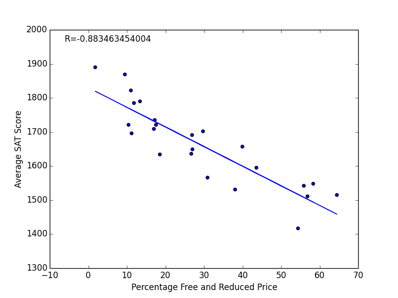
The percentage of students receiving subsidized meals tends to be a good approximation of a school's relative poverty level. Schools with higher poverty levels have lower test scores.
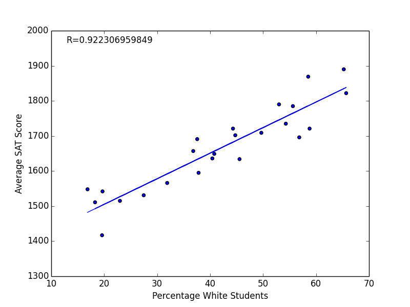
A very strong correlation here. But is race the root factor here or does race simply align with economic status?
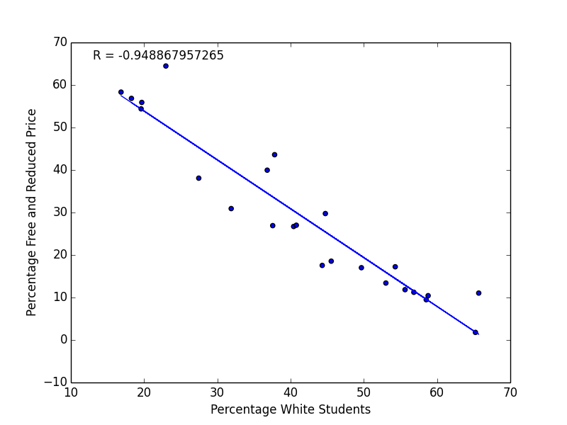
It looks like race goes hand-in-hand with economic status. The correlation between economic status and percentage white students appears to be even stronger than that between percentage white students and SAT scores. In fact, this plot shows the strongest correlation in this set.
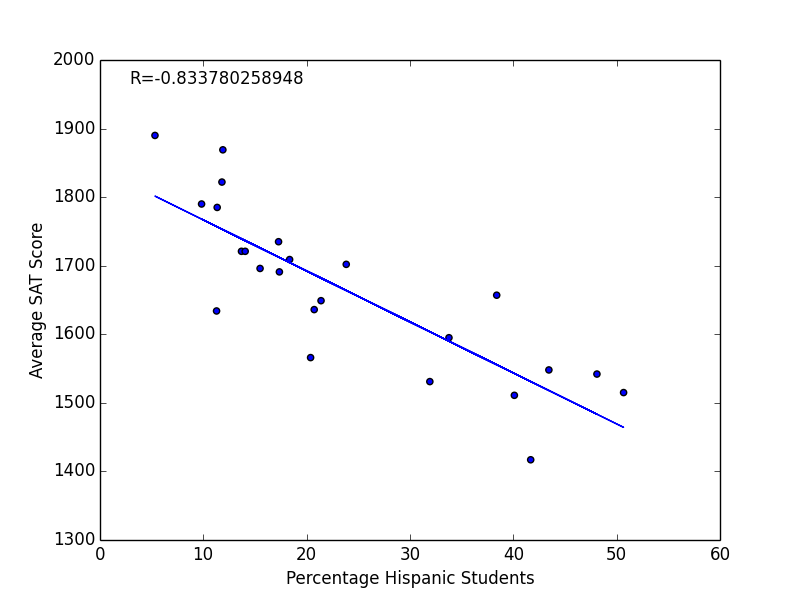
The Sample Images folder contains a few more plots, some showing weaker links than others.