


A meaningful thesaurus
Remember all the words you find when you use a Thesaurus.
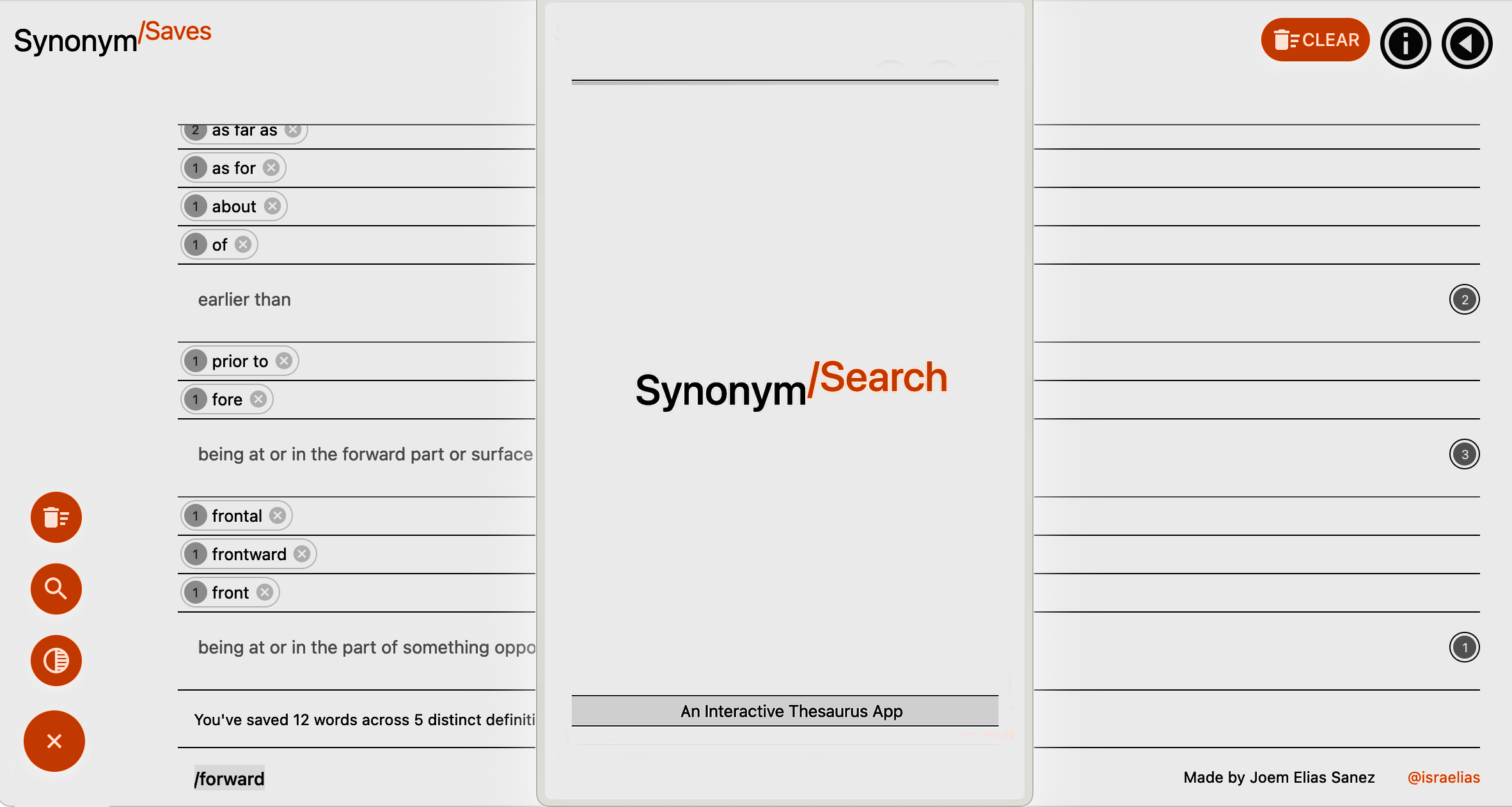
SynonymSearch helps you to review what you've just learned (and might otherwise forget) by sorting a list of all your search queries by their shared definitions as you're finding them.
SynonymSearch lets you test the similarity of synonymous words by injecting them into a sentence whose meaning depends on the definition they share. The app helps you actively make sense of a definition and then review it against a repository of synonyms.
This project is developed as part of MS2 Interactive Front End module at Code Institute. It is written to work with Merriam-Webster's Collegiate® Thesaurus's JSON response format, and is developed with React via Next.js, bootstrapped with create-next-app and deployed with Vercel.
Please visit the project here: synonyms.vercel.app
Note for reference: Earlier scheme was named 'synonym-chaser'
- As a new visitor, I want to have a good understanding of what the application does within a few seconds.
- As a new visitor, I want to intuitively understand how to navigate the site without additional instructions.
- As a new visitor, I want to access valuable content from any device, with minimal wait time and with a minimal amount of clicks.
- As a new visitor, I want to understand the source of the site's content.
- As a Returning Visitor, I want to use a thesaurus to find groups of words with the same or similar meanings.
- As a Returning Visitor, I want the ability to see a history of my searched words grouped by their synonymous definitions.
- As a Frequent Visitor, I want to have the option to preview how a word and its synonyms might be used in a sentence.
- As a Frequent Visitor, I want to understand if I am looking at results for a definition that I have already seen before.
- As a Frequent Visitor, I want to know that I can delete my search history.
The React App's core functionality can be understood as a Products List with products fetched from a store and a Shopping Cart with a list of items added that can be removed and/or cleared


This approach helped break-down the project scope, and, most importantly, afford a benchmark for references for development and troubleshooting.
see Thinking in React (Docs)
Lifecycle of a Result Instance


Working with the API


Results Scope (products)

{Results} => {Root} => {Sense} => {Option}
(See results Directory)
Selections Scope (cart)

{Saves} => {Selection}
(See saves Directory)
Display Scope (product preview)

{Results} =>{Root} => {Sense} via {ReplaceSubStringNode} (see string.helper.js).
Now broken down to {Saves} => {Selection}
(See Display)

{Sense} => {Option} in Results tree (See results Directory)
-
A consistent top and bottom border is applied to all nodes with dynamic content. These discrete borders are designed to convey the material scale of a note pad as a familiar touchpoint to a user. These
wordBoxesonly vary in spacing and are responsible for visually conveying hierarchy in a the list of list of lists.


- Material-UI's
ThemeProviderwraps the app in order to pass styles down the component tree. See Material-UI Theming.
-
The font family is set to an array of system fonts in order to adapt to device/platform/user configuration and avoid depending on an explicit typeface. A
commonSettingsobject intheme.context.jscontains a list of these overrides, which is merged with Material-UI's theme provider. See Material-UI Global-csscommonSettings
    export const commonSettings = {
     typography: {
       fontFamily: [
         '-apple-system',
         'BlinkMacSystemFont',
         '"Segoe UI"',
         'Roboto',
         '"Helvetica Neue"',
         'Arial',
         'sans-serif',
         '"Apple Color Emoji"',
         '"Segoe UI Emoji"',
         '"Segoe UI Symbol"',
       ].join(','),
     },
 }
-
The app features two sets of primary and secondary colors for a light theme and a dark theme configured via Material UI's palette configuration. Behaviors and states of colors rely on properties defined in Material-UI's Default Theme object. Secondary colors are set to neutral tone, while primaries are rendered as the singular "feature color". The minimal approach to color sets is to enhance a notepad
lightTheme instance
const lightTheme = createMuiTheme({
        palette: {
        type: 'light',
        primary: {
         main: '#ff3200',
       },
   secondary: {
         main: grey[900],
       },
   },
 ...commonSettings,
 });
darkTheme instance
const darkTheme = createMuiTheme({
 palette: {
   type: 'dark',
   primary: {
     main: lightblue[500],
   },
   secondary: {
     main: '#fafafa',
   },
   background: {
     default: '#151515',
   },
 },
 ...commonSettings,
});
-
The website is modeled as a progressive web application to render a single-page-app's functionality without full page reloads and optimized to perform like a native app. Its framework ensures flexibility across browsers.
-
The website takes advantage of large floating action buttons (FAB) to quickly navigate between its three remote views: "Search", "Info", and "Saves". Visual metaphors are utilized to represent these view modes discretely and efficiently.
-
A floating "speed dial" button persists across views to quickly access the app's core actions: querying a term, clearing the saved history, and toggling light or dark mode.
-
The app features a custom launch screen on initial page load to succinctly describe its purpose: "An interactive thesaurus app".
- The website offers an info section to credit brands, namely, Merriam-Webster's Collegiate Thesaurus, and supply information about the app.
- The application is written to return lists of Synonyms, Related Words, Synonymous Phrases and Similar Words for any queried word in the english language via Thesaurus API. Each word is presented as an option to query.
- Ability to see if and how many times a word has been queried before.
- Ability to see if and how many words have been queried with the same definition.
- Ability to see if and how many definitions queried share the same root.
- Ability to match definition in a string (See Verbal Illustration).
- The website features the ability to view all previous queries, grouped by their sense definition, accessible via the Saves tab.
- Ability to remove individual words from the list.
- Ability to clear the list.
- If a definition contains an example sentence, the website displays this as verbal illustration to feature how a particular word might be used in context.
- On scroll and/or on hover, the word used in the sentence changes to the next word in the list of synonyms.
- Ability to see a word in a sentence by touch/mouse/scroll event.
- Ability to deep-merge from a localStorage and/or Apollo Client.
- Ability to manage user search history after browser session.
- Show Anyonyms feature.
- Call random word on initial load from Word Of The Day API.
- "Feeling Lucky" random word query.
- Prevent default refresh on browser refresh.
- Make installable.
- Node.js: The runtime environment that allows the app to run asynchronous server-side scripts and events.(Bootstrapped with Nextjs)
- Webpack: The static module bundler that builds a dependency graph mapping every module the project requires. (Bootstrapped with Nextjs)
- React 17.0: JavaScript Library for building user interfaces.
- Babel: The toolchain compiler that transforms syntax to ensure all evolved code function, namely between
jsx,jssjs. (Bootstrapped with Nestjs) - Nextjs 5.8.2: React Framework for Production. Nextjs is a toolkit for universal, server-rendered React.js applications. This framework leverages Webpack and Babel so that our interface is straightforwardly:
nextto develop,next buildto prep for production andnext startto serve. - Material UI 4.11.1: React component for faster and easier web development. Includes Material UI Icons, Material UI Lab, Material UI System
- PropTypes: The Typechecking tool to handle bugs as components are composed.
- React Intersection Observer: The react module that implements Intersection Observer API to spy on elements as they enter and leave the viewport
- Axios: The promise-based HTTP client for the browser and node.js that handles calls to Thesaurus API.
- clsx::Tiny utility for constructing classnames conditionally
- WebStorm: WebStorm 2020.3.2 by JetBrains is the web development IDE used to locally construct the project
- Git: Git is used as the version control system and is utilized via the WebStorm terminal to
committo Git andpushto GitHub. - GitHub: GitHub is used to store the project's code and directory upon concurrent
pushes via Git. - Adobe InDesign: Adobe InDesign is used to mock wireframes.
-
Styles are written in jss syntax and follow the spec for Material-UI to play nicely with Nextjs Server-side rendering, which includes this logic of customizing
pages/_documentto to inject server-side rendered styles into the markup right before it's used. Note that this is an unofficial recommendation, and should be refactored if/when MUI releases an official plugin for Nextjs similar to the one for MUI/Gatsby. -
All style objects are created with MUI's
makeStyleshook and follow guidelines in MUI style Docs for theming. This includes CSS overrides and media queries. Style objects for main components are separated by scope in the styles Directory and imported in modules as required. However, some components, namely,Launcher, have all style props declared in the component file itself. Note that all styles should eventually be exported from one directory for consistency. -
The
resultstree rendersjsxcomponents on every API call without initializing constants. Props and conditional expressions control the iteration of the response schema from MW-Thesaurus API. Note that values and Prop-Type verifications are specifically written to get the right data from this schema:Mapping conditionals down the tree
- Each query has several headWords
("about" as preposition, as adverb...):
- Each headWord has several definitions
("about" as in to be, "about as in to...):
- Each headWord defined in a particular sense:
- has A definition.
- may have A string that uses the word in a sentence (see Verbal Illustration)
- may have A list of Synonyms
- may have A list of Related words
- may have A list of Synonymous Phrases
- may have A list of Similar Words
- Each headWord defined in a particular sense:
- Each headWord has several definitions
("about" as in to be, "about as in to...):
- Each query has several headWords
("about" as preposition, as adverb...):
-
Each saved word instance retains properties of the Results family it is "taken" from -- such as the word's particular definition, label, root word -- to increment values of duplicates and group words by sense definitions while ensuring each instance, no matter identical at name value, is distinct if the definition and sense is different
-
React hooks
useReducer,useContext,createContextare assembled together incontext/words.context(see HistoryProvider) to provide a context wrapper for components to share and consume the same data. Note that this logic is directly modeled from the example set in next.js/examples/with-context-api. -
Following what is achieved by
HistoryProvider's exported context wrapper hooksuseHistoryanduseDispatchHstory-- which are utilized across higher-order components, shared components and helper functions inhelpers/*to radically manipulate the DOM -- the same logic is repurposed to ride multiple hooks along a custom wrapper with MUI's ThemeProvider the (see ThemeProvider). In this case, setting the the view value, allows any component to change the page from anywhere, to name a few. Note that the catch-all nature of this Context layout provider.All layout states in a Context Theme
  export const ThemeContextProvider = ({ children }) => {
  // Sets the theme for MUI ThemeProvider to use
  const [darkMode, setDarkMode] = useState(false);
  // Sets the current view
  const [value, setValue] = useState('launch');
  // Hooks to set warning colors for searchText input
  const [meta, setMeta] = useState(true);
  const [root, setRoot] = useState('');
  // Rides an MUI hook to set a memoized theme
  const prefersDarkMode = useMediaQuery('(prefers-color-scheme: dark)');

  useMemo(
    () => (prefersDarkMode
      ? setDarkMode(true)
      : setDarkMode(false)),
    [prefersDarkMode],
  );

  // Provides all values and the hooks that control them

  return (
    <ThemeDispatchContext.Provider
      value={{
        darkMode,
        setDarkMode,
        value,
        setValue,
        meta,
        setMeta,
        root,
        setRoot,
      }}
    >
        <ThemeProvider
        theme={
            darkMode
              ? darkTheme
              : lightTheme
          }
        >
          {children}
        </ThemeProvider>
    </ThemeDispatchContext.Provider>
  );
};

// All state/hooks are accessible by importing
// a catch-all export below
// Example:
// // anyFile.js
// import { useDispatchTheme } from './../theme.context'
//
// const dispatch = useDispatchTheme()
//
// Change any/all states from any component
// dispatch.setDarkMode(false)
// dispatch.setValue('search')
//

export const useDispatchTheme = () => useContext(ThemeDispatchContext);
-
Using MW-Thesaurus is free for non-commercial and/or educational purposes. Featured brand logos in the info tab is to follow branding guidelines requested by but not limited to Merriam-Webster's Development center.
-
The registered Thesaurus API key linked to this project is currently public. Following this discussion, the effort to protect API calls on the client side is aimless as the private key will always be exposed. Further configuration to have an internal endpoint in
/pages/apishould be considered following Nextjs API routes. Note that the key has been exposed from.env.localfor the reasons above and for the educational purposes of the project.mwThesaurusService.js
    const axiosConfig = { baseURL: 'https://dictionaryapi.com/api/v3/references/', };

    function searchThesaurus(searchText, selection) {
        const query = selection || searchText;

        // Key is processed from ignored env.local
        // use this method if API endpoint is set up in /pages/api/*
        const key = process.env.MW_THESAURUS_KEY;
        // @note Key is explicitly declared otherwise
        // for Production/submission

      return axiosGetCancellable(
        `/thesaurus/json/${query}?key=${key}`,
        axiosConfig,
      );
    }
Note: All descriptions of atypical methods can be found within comment blocks that follow jsDoc standards.
-
A user expects to see a description within a few seconds of arriving at the site
- Describe
Launcher: useEffectwith no dependencies allowsLauncherto run once on initial page loaduseContextallowsLauncherto set the current page viewvalueto 'search' after a timeout.- Review:
- User sees heading "
Synonym Search An Interactive Thesaurus App" for two and a half seconds upon arriving at the site.
Launcher
  import React, { useEffect, useState } from 'react';
  import { useDispatchTheme } from '../../context/theme.context';

  const Launcher = () => {
  const classes = useStyles();
  const viewDispatch = useDispatchTheme();
  const [open, setOpen] = useState(true);
  const [showOpen, setShowOpen] = useState(true);

  useEffect(() => {
    setTimeout(() => {
      setShowOpen(false);
      setTimeout(() => {
        setOpen(false);
        viewDispatch.setValue('search');
      }, 350);
    }, 2500);
  }, []);

  return (
    <>
      <Backdrop
        className={classes.backdrop}
        open={open}
      />
      <Grow
        in={showOpen}
        unmountOnExit
      >
        <Box className={classes.launch}>
            {... excerpt ...}

              Synonym

              /Search

              An Interactive Thesaurus App

            {... excerpt ... }
        </Box>
      </Grow>
    </>

  );
};
- Describe
-
A user wants to expediently navigate between views
- Describe
Speed (Dial): - A persistent 'on-the-go' button with sub-buttons containing the app's most-used actions.
- Opens
onClick. FixedBottom(forked from FixedBottom) allows bottomSpeed Dialto responsively move above the bottom bars on mobile when scrolling.useScrollTriggerallowsSpeed Dialto swap visibilities withScrollTop, a floating action button that, when clicked, scrolls the window back to the top of the page via an anchor withid="back-to-top".- Props for
Searchare passed toSpeed Dialto activateonSearchTextChange, a function that sends queries to the Thesaurus API. useStateallowsuseEffectto always closeSpeedDialwhenever the pagevalueviauseDispatchchanges, except whenSearchisactive.- Children:
ToggleTheme,Search,Clear- Scenario:
- User is in
SavesView- User clicks
SpeedDial- The
SpeedDialis open - User clicks the
ToggleThemeaction- The theme changes to
notthis<mode>
- The theme changes to
- The
SpeedDialis closed
- The
- User is still in
SavesView - User clicks
SpeedDial- The
SpeedDialis open - User clicks the
Searchaction- The search input expands to focus
- The
SpeedDialis still open
- The
- User is in now in
SearchView - User scrolls down
- The
SpeedDialdisappears - The
ScrollTopbutton appears- User clicks
ScrollTop
- User clicks
- The
SpeedDialappears
- The
- Window scrolls user back to top
- User clicks
- User continues
- Review:
- User is able to navigate in in the
xandydimensions (up/down in views, left/right between views) quickly by clickingSpeedDialactions for the views they represent. Additionally, button navigation per view is accessible in the page header. The other two views areSavesandInfo, which are of the same floating-action-button family as the actions withinSpeedDial. The consistency and singularity of theme, color and UI plays to a user's impulses and familiarity with the conveyed persistent touchpoint.
Speed Dial
  import React, { useEffect, useState } from 'react';
  import { useDispatchTheme } from '../../context/theme.context';

  const Speed = ({
      children,
      value,
      index,
      searchText,
      loading,
      onSearchTextChange,
      ...other
    }) => {
  const trigger = useScrollTrigger();
  const classes = useStyles();
  const [open, setOpen] = useState(false);
  const [direction, setDirection] = useState('up');
  const matches = useMediaQuery('(min-width:600px)');
  const viewDispatch = useDispatchTheme();
  const view = viewDispatch.value ? viewDispatch.value : null;

  const handleClick = (event) => setOpen(!open);

  open && trigger ? setOpen(false) : null;

  useEffect(() => {
    setTimeout(() => {
      if (viewDispatch.value !== 'search') {
        setOpen(false);
      }
    }, 10);
  }, [view]);

  return (
    <Slide appear direction="up" in={!trigger}>
      <FixedBottom offset={matches ? 16 : 48}>
        <SpeedDial
          ariaLabel="actions"
          className={classes.speedDialGroup}
          FabProps={{
            className: clsx(classes.speedDial, classes.bottom),
            size: matches ? 'medium' : 'small',
            style: { padding: matches ? '12px' : '8px' },
          }}
          onClick={handleClick}
          open={open}
          direction={direction}
        >

        { ... Search action}
        { ... Toggle theme action}
        { ... Clear cache action}


          />
        </SpeedDial>

      </FixedBottom>
    </Slide>
  );
};

export default Speed;
- Describe
-
A user wants to see reliable sources
- Describe
Brands(Material-UIAvatarGroup): - A set of logos of developer and/or open-source institutions without which the project would not exist.
- Represented with negative margins that allow icons to overlap.
useEffectallowsuseStateto flip margins when the page value is set to the currentview=>Info, which animates the avatars to expand as if to welcome a user to the info desk, while a short paragraph is featured to describe the "SynonymStory" behind "SynonymSearch"- Children:
- Five
Logoinstances, one for each:React,NextJS,MaterialUI,CodeInstituteandMerriam-Webster. - Scenario:
- User is in
SearchView- User clicks
Info
- User clicks
- User is in
InfoView- The avatar of
Brandsappear- User clicks
Merriam-Webster - A new tab opens to
Merriam-Webster Developer Center website
- User clicks
- The app view keeps User in
Info
- The avatar of
- User continues
- Review:
- A User sees reliable sources to attribute the content to as well as the open-source nature of the information shared.
Brands
import React, { useEffect, useState } from 'react';
import { useDispatchTheme } from '../../context/theme.context';

  const Brands = ({ children }) => {
  const classes = useStyles();
  const viewDispatch = useDispatchTheme();
  const [active, setActive] = useState(false);
  const { value } = viewDispatch;

  useEffect(() => {
    if (value === 'info') {
      setTimeout(() => {
        setActive(true);
      }, 750);
    }
  }, []);

  return (
    <AvatarGroup
      className={
        clsx(
          classes.avatarGroup, active
            ? classes.active
            : classes.inactive,
        )
      }
    >
      <Logo
        name="React"
        url="https://react.org/"
        path="/images/reactLogo.png"
      />
      <Logo
        name="Next JS"
        url="https://nextjs.org/"
        path="/images/nextJSLogo.svg"
      />
      <Logo
        name="Material UI"
        url="https://material-ui.com/"
        path="/images/materialUILogoLight.png"
        darkImage="/images/materialUILogoDark.png"
      />
      <Logo
        name="Code Institute"
        url="https://codeinstitute.net/"
        path="/images/codeInstituteLogo.png"
      />
      <Logo
        name="Merriam-Webster"
        url="https://dictionaryapi.com/"
        path="/images/merriamWebsterLogoLight.png"
      />
    </AvatarGroup>
  );
};
- Describe
-
A user wants to search synonyms
- Describe
Search: - A higher-order-component tree that handles feedback pertaining to changes a user makes within a text input.
- A collection of dispatch functions to check the values of three states to conditionally render a warning color with a warning icon, an error color with an error icon and a success color with a success icon. These variables are:
loading: whether results are loading,meta: whether a user's input produces a valid result,root: whether the first item in an array of result matches what the user has typed.useStateallows these conditions to change dynamically.useRefis attached to the input component, and allow key and mouse events to conditionallyfocusthe input prompt based on the above conditions.- Children:
Field,Input.- Scenario:
- User is in
SearchView- User clicks
Searchaction in header- The search input expands to focus
- User types in <enter
immediately successful word>
- Results update with synonyms of
immediately successful word- The search input is closed
- User clicks
Searchaction in header- The search input expands to focus
- User types <enter
incomplete word> - The icon adornment updates to a warning icon
- The search input background color updates to the warning color
- User types <enter
real word> - The icon adornment updates to a success icon
- The search input background color updates to the success color
- Results update with synonyms of
real word- The search input is closed
- User clicks
Searchaction in header- The search input expands to focus
- User types <enter
a word with no matches> - The icon adornment updates to an error icon
- The search input background color updates to the error color
- User types <enter
good word> - The icon adornment updates to a success icon
- The search input background color updates to the success color
- Results update with synonyms of
new word- The search input is closed
- User clicks
- User continues
- Review:
- A user is able to search for synonyms.
- A user is able to understand when and if there is a result for a search for synonyms.
Search(HOC), Field, Input
const Field = ({
  label,
  onChange,
  placeHolder,
  helperText,
  loading,
}) => {
  const theme = useTheme();
  const trigger = useScrollTrigger();
  const [active, setActive] = useState(false);
  const textInput = useRef(null);
  const metaDispatch = useDispatchTheme();
  const { meta, root } = metaDispatch;

  const handleSearchButton = () => {
    setActive(true);
    setTimeout(() => {
      textInput.current && textInput.current.focus();
    }, 100);
  };

  const handleClickAway = () => setActive(false);

  const handleBackDrop = () => setActive(false);

  const onKeyPress = () => setActive(false);

  const match
      = textInput.current
      ? textInput.current.value === root
      : false;

  active && trigger ? setActive(false) : null;

  useEffect(() => {
    if (active && match) {
      setTimeout(() => {
        setActive(false);
      }, 2000);
    }
  }, []);

return (
    <ClickAwayListener
      onClickAway={handleClickAway}
    >
      <>
        <Backdrop
          open={active}
          onClick={handleBackDrop}
        />
        <Fab
          size="small"
          color="primary"
          aria-label="search"
          onClick={handleSearchButton}
          variant={active ? 'extended' : 'round'}
          style={active ? {
            backgroundColor:
                            loading
                              ? theme.palette.warning.main
                              : !meta
                                ? theme.palette.error.main
                                : meta && match
                                  ?theme.palette.success.main
                                  : theme.palette.primary.main,
          } : null}
        >
          <Input
            label={label}
            placeHolder={placeHolder}
            helperText={helperText}
            active={active}
            match={match}
            meta={meta}
            loading={loading}
            textInput={textInput}
            onKeyPress={onKeyPress}
            onChange={onChange}
          />
        </Fab>
      </>
    </ClickAwayListener>
      );
    };
- Describe
-
A user wants to see searched history
- Describe Saves:
- A list of words that a user has queried.
useHistoryis a Context hook to access the values stored inHistoryProvider.useReducerallowsHistoryProverto group queried words by the definitions they share.- Children:
Selection- Requires:
- See HistoryProvider
- Review:
- A user is able to see an overview of all previously queried words along with their definitions and their synonymous siblings.
-
A user wants to see a word used in a sentence
- Describe
Display: - Represents an example sentence or phrase that uses the word in its particular sense definition.
- A stateless component, used by
Senseto pass asampleStringandoptionWordprop, which activates anIntersection Observerand mouse events to dynamically change theoptionWordprop. - Helper functions are used for this component to return a clean string from the JSON response, whose original string is wrapped in
{it} {/it}and{lquo} {rquo}nodes. As they are open and close tags, regex replace functions prove reliable in consistently cleaning the example string when a definition happens to have it. (See example response from Theaurus API) - Requires:
- See Sense, Display, ReplaceSubStringNode
- Review:
- A user is able to see all words used in their respective contextual sentences.
- A user is able to update the sentence by scrolling (mobile) and/or hovering a word (mouse/desktop).
- Describe
-
A user wants to see a tag next to repeat results (a.k.a words already saved)
- Describe
useReducerinHistoryProvider: - A reducer that increments the value property of a saved word object if it is the same as the new word being queried.
- Word objects stored in
HistoryProviderare saved with properties that allow verification by comparing these properties against new words: - Describe Word Type checks in
Counters: - Type definitions as Helper functions to reduce, sort, and group saved words in
History - Contains functions to:
- Check if a term already exists in history.
- Check if a sense definition already exists in history.
- Check if a headword already exists in history.
- Return the sum of the value property of word objects in an array.
- Return the length of the array of Word objects sharing the same sense definition.
- Return arrays of objects grouped by shared sense definition(s).
- Requires:
- See type functions in Counters, HistoryProvider
- Review:
- A user is able to see a badge with a count next to a word that is already saved in session.
- Additionally, the same functions are used in
Savesview so a user can view the 'repeats' a.k.a. a user's saved words by the property definitions they share. - Modeled after nextjs/examples/with-context-api
Reducer Action/Type in HistoryProvider
  const [savedWords, dispatch] = useReducer((state, action) => {
    switch (action.type) {
      case 'add':
        const wordIndex = state.findIndex((word) => word.uuid === action.uuid
                    || word.name === action.name
                    && word.sense === action.sense);
        if (wordIndex !== -1) {
          return state.map((word, i) => ({
            ...word,
            value: word.value + (wordIndex === i ? 1 : 0),
          }));
        }
        return [
          ...state,
          {
            id: state.length,
            name: action.name,
            value: 1,
            root: action.root,
            label: action.label,
            uuid: action.uuid,
            sense: action.sense,
          },
        ];

      case 'remove':
        return state.filter((word) => word.id !== action.id);
      case 'clear':
        return [];
      default:
        return state;
    }
  }, []);
- Describe
-
A user wants to delete the saved search history
- Describle
Clear: - A button with a
DeleteForevericon that is adispatchfunction ofuseReducerfromHistoryProviderwhich deletes everything from Context. - Review:
- A user is able to delete his/her search history.
- Additionally, a user is able to delete individual words via a
Deleteicon represented by a Material-UIChipcomponent.
Clear
    // clear.button.js
    // excerpt

  const wordsDispatch = useDispatchHistory();

  const handleClick = (event) => {
    wordsDispatch({
      type: 'clear',
    });
  };

  // words.context.js
  // excerpt from reducer
  // the above handler calls case 'remove'

  case 'remove':
    return state.filter((word) => word.id !== action.id);
- Describle
-
Lighthouse via Vercel is used to test performace, which produces unique results on every
git push. lighthouse-badges is used to generate new badges for every deployment by installingnpm i -g lighthouse-badgesand pushing the new hashed url to the array of urls:lighthouse-badges -o docs/badges -r -u https://synonyms.vercel.app/ [... all other urls] # Output to docs/badges # Badges will contain the respective average score(s) of all the urls supplied, combined -
Lighthouse's metrics, namely Accessibility and Performance generate specific flags on each audit. Adjustments are made on each push that specifically address any issues.
- ChromeVox Extension was used to ensure that screen-reader accessibility standards are met. This was done by walking through the entire project with the screen-reader plugin enabled. Various adjustments were made following these tests. Notably, the tab-index order of nav elements, and changing refining HTML5 semantic elements for
roleclarity.
- Throughout the development of the project, in-browser dev tools were used to test for consistency across browsers. The browsers themselves were equally used for general use-case testing. The following browsers' per-device applications were accessed with an iPhone 11 Pro, MacBook Pro 15" and iPad Pro 12.9":
- Chrome Version: 83
- Firefox 82
- Opera 72
- Safari 14
- The project is developed with React via Next.js, bootstrapped with
create-next-appand deployed with Vercel, which I achieved with the following steps: commitandpushthe code from my local IDE to Github via Git and my MacBook Pro's iTerm terminal.- Log in to Vercel and click the New Project CTA.
- Access "Import Git Repository" via the
selectinput, located at the top-left of the immediate prompt. - Click "Import" on the repository named "synonym-chaser"
- Select the default "Personal Account" along with the default "master" root directory.
- Click "Deploy"
- Barring errors, await the prompt for:
- Clone this repo by running:
git clone https://github.com/israelias/synonym-chaser- at the jump,
cdto the name of this repo:
cd synonym-chaser- install the package and deps:
npm install - and run the development server:
npm run dev
# or
yarn dev
open your browser to localhost:3000
useful: Next JS Docs
- Vlad Guleaev's tutorial on React, NextJS and working with an API with his Github repos search app.
- NextJS with-context-api example was benchmarked for context API composition
- Material-UI with-nextjs example was benchmarked for optimized styling with Next.
- All content outside of the short description in
infois via Merriam-Webster's Collegiate Thesaurus.
- The site's favicon was generated via Real Favicon Generator.net following Philippe Bernard's comprehensive summary on favicons.
- The development of this README.md takes precedent from various templates and samples throughout Code Institute's course. The development of the UX section and Jesse Garret's Five Planes of UX equally take direct inspiration from Code Institute's course.
- The Slack community at Code Institute, namely the senior leads, for being generous and quick to offer endless assistance and advice.
- Tutor Support at Code Institute for offering invaluable technical support.
- My mentor Aaron Sinnott for his support, time investment and for helping to push this project to be the best that it can be.