Home
Welcome to the globalbioticinteractions.github.io wiki!
This page describes some web tools to help explore species interaction data that is available through Global Biotic Interactions. It should be noted that the focus of GloBI lies on the integration of existing interaction datasets. The provided web apps are simply basic tools to give a glimpse into the richness of the datasets that are available through GloBI. Hopefully, these examples inspire others to build better, faster, more user friendly tools to better disseminate the vast amount of data available today.
A color and icon scheme provide by Taxa Prisma is used to visually highlight taxa of specific group.
The source code is available here and is based on npm modules like globi, globi-data, d3 and built using browserify.
Other species interaction exploration tools are available through Gulf of Mexico Species Interactions (GoMexSI) project at http://gomexsi.tamucc.edu and the GloBI Explorer.
Note Due to performance reasons, only the first 4096 of matching interactions are imported into the tool. If you'd like to access more, please refer to https://globalbioticinteractions.org/data for alternate data access.
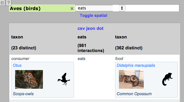
Restrict your interactions of interest by specifying the focal taxa and interaction you are interested in. Once one or more criteria are provided, an updated list of interactions is shown in the table and associated visualization widgets. These show all given interaction types known between each pair of taxa. The area picker can be used to geographically constrain the area of interest. Additionally, the selected data can be downloaded in the form of csv, json and/or dot files. The download contains raw records, which may include multiple reports of the same interaction between the same partner taxa (eg: bumblebees visit flowers of Border Privet) from several different studies or sources; so you may get more records in the download than were displayed in the list.
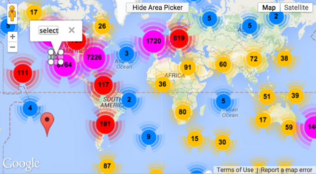
The map allows to select a spatial area of interest using the area picker. When the area picker is shown the results shown in the other panels are updated to include only the interactions that were reported to occur within the selected area. The circles and numbers represent the number of locations for which interaction data are present. In order to avoid visual clutter, individual markers are grouped into circles.
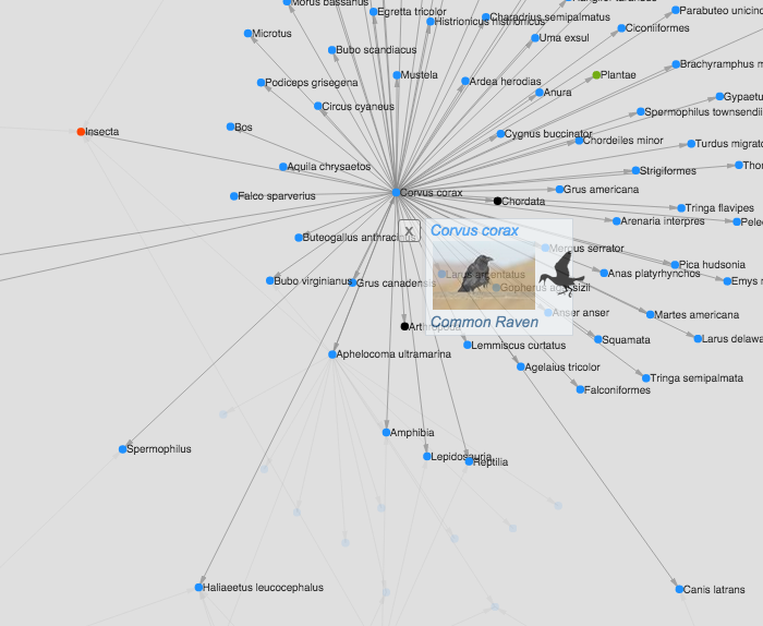
Taxa are represented by nodes (circles). The connections between nodes indicate the directed interaction between the nodes. Hover over the node or click on them to learn more about the taxon and associated taxa. To help organize the data, a force-directed algorithm is applied to structure the diagram. When many nodes and interactions are present, the visualization often resembles a hairball, ball of yarn or the result of leaving a cat alone in a room with a roll of toilet paper. The direction of the arrows is from customer (e.g. predator) to resource (e.g. prey). The colors of the nodes use the color scheme of https://github.com/jhpoelen/taxaprisma .
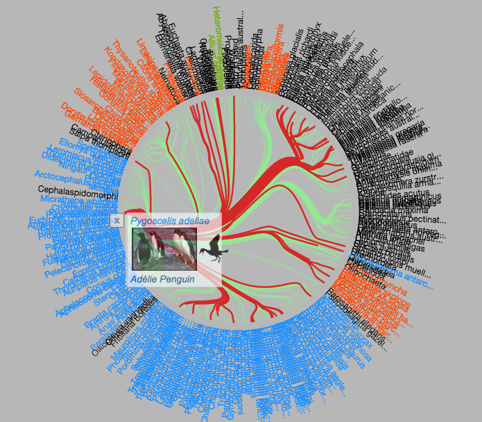
Taxa are laid out in a circle and sorted by taxon hierarchy, so that similar taxa are grouped. Lines connecting the taxa are subjected to an algorithm that bundles similar interactions to facilitate to detection of patterns in the web. The color of the text along the circle indicates the taxonomic group that the taxon belongs to.
The colors of the taxon names use the color scheme of https://github.com/jhpoelen/taxaprisma#colors-and-silhouettes . Names appear black if a taxon name classification does not (yet) have an assigned color or if the name did not yet link to a taxonomic hierarchy.
The lines (or bundles) between taxa are colored red whenever a consumer name is selected. If a resource name is selected the links are colored green.