Add new InputGroup compound component with Addon, Suffix, and Button support#249
Open
pedromenezes1 wants to merge 7 commits intocloudflare:mainfrom
Open
Add new InputGroup compound component with Addon, Suffix, and Button support#249pedromenezes1 wants to merge 7 commits intocloudflare:mainfrom
pedromenezes1 wants to merge 7 commits intocloudflare:mainfrom
Conversation
 pedromenezes1
force-pushed
the
feat/input-group-addon
branch
from
pedromenezes1
force-pushed
the
feat/input-group-addon
branch
from
b348d28 to
86e9d5d
Compare
pedromenezes1
changed the title
pedromenezes1
changed the title
pedromenezes1
changed the title
pedromenezes1
force-pushed
the
feat/input-group-addon
branch
17 times, most recently
from
1f88e51 to
ca11f35
Compare
commit: |
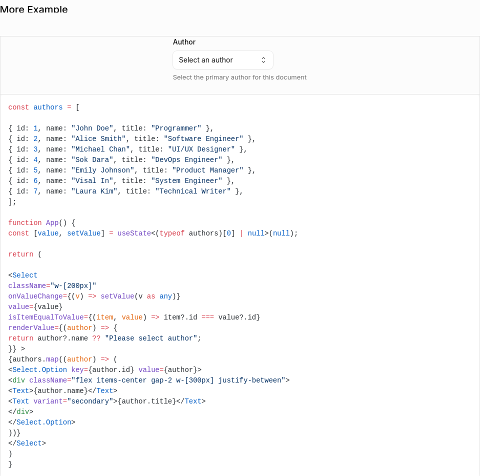
…on support

New InputGroup compound component for building inputs with icons, addons, inline suffixes, and action buttons.

Features:
- Field Integration — Accepts label, description, error, required, and labelTooltip props
- Addons — Place icons or text before/after the input using align="start" or align="end"
- Compact Button — Small button inside an Addon for secondary actions
- Action Button — Full-height flush button as a direct child for primary actions
- Inline Suffix — Text that flows seamlessly next to the typed value
- Size Variants — xs, sm, base, lg sizes cascade to all children via context
- Error State — Error flows through context; InputGroup.Input auto-sets aria-invalid
- Disabled State — disabled prop disables all interactive children

Sub-components:
- InputGroup — Root container; provides context and accepts Field props
- InputGroup.Input — Styled input; inherits size, disabled, error from context
- InputGroup.Addon — Container for icons, text, or compact buttons
- InputGroup.Button — Full-height button (direct child) or compact button (inside Addon)
- InputGroup.Suffix — Inline text suffix with automatic width measurement

Includes comprehensive documentation page with demos and unit tests.
pedromenezes1
force-pushed
the
feat/input-group-addon
branch
from
ca11f35 to
5c4d6f2
Compare
Contributor
Docs PreviewCommit: |
Contributor
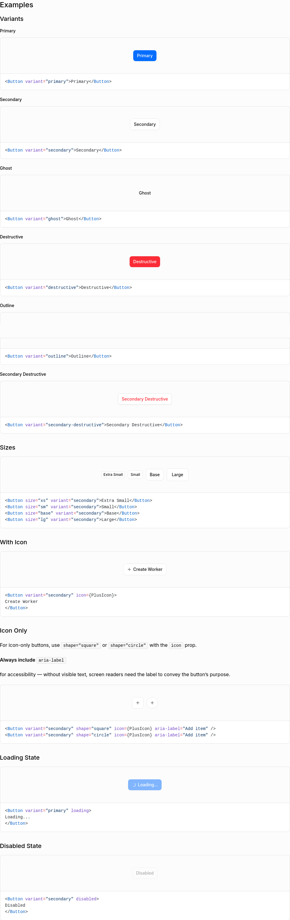
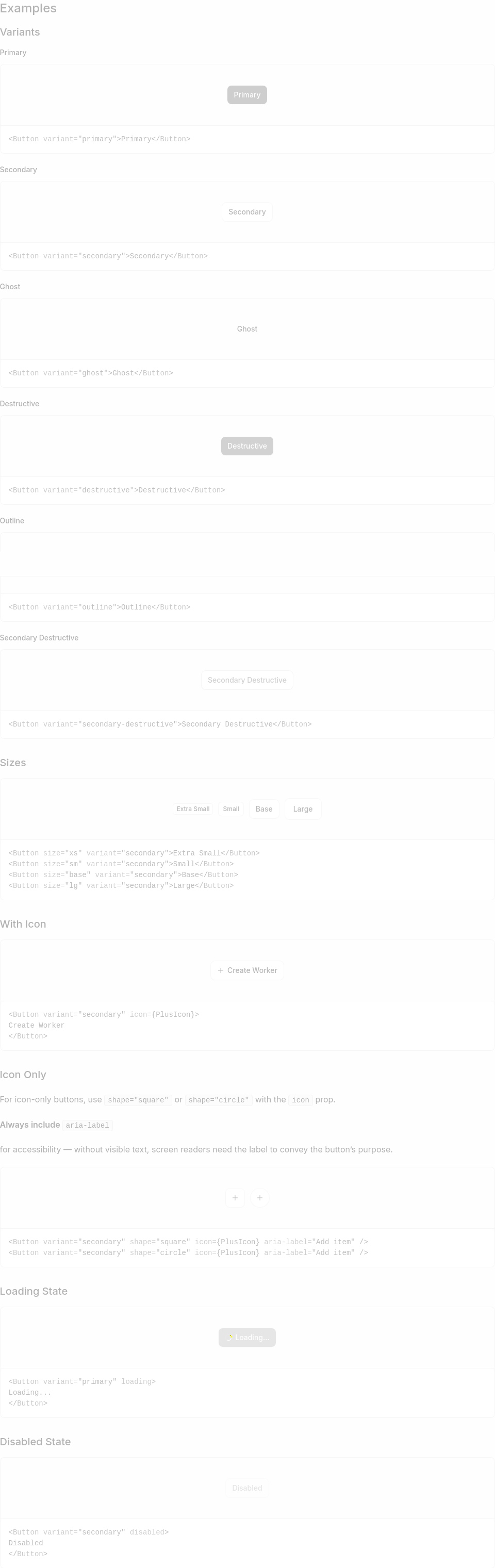
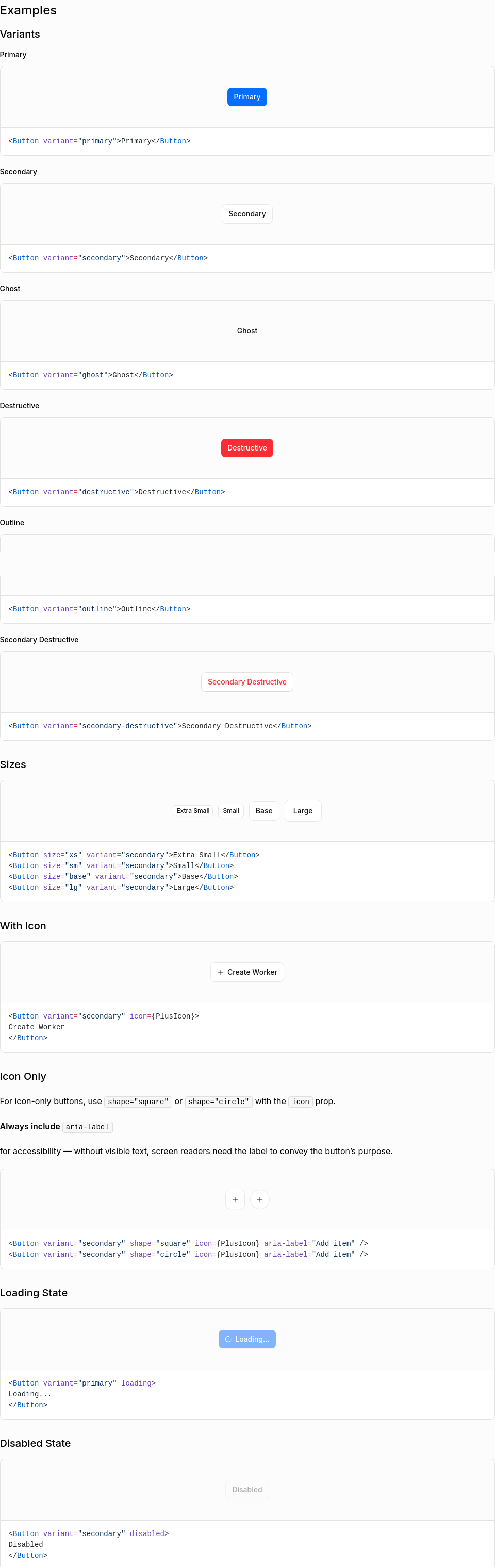
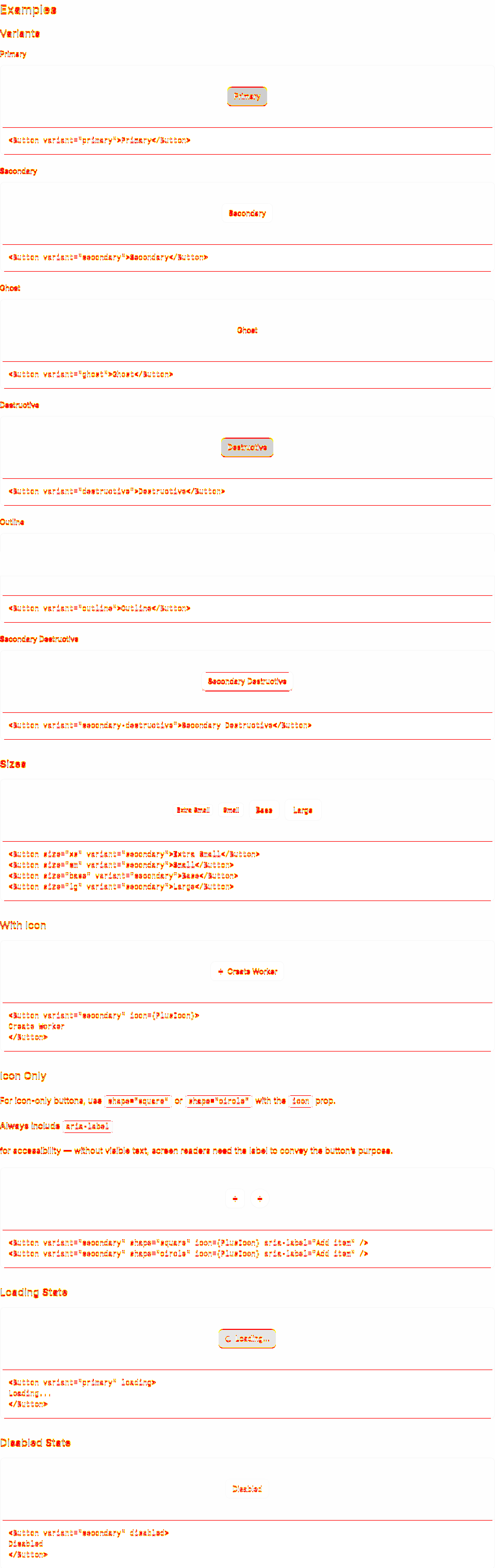
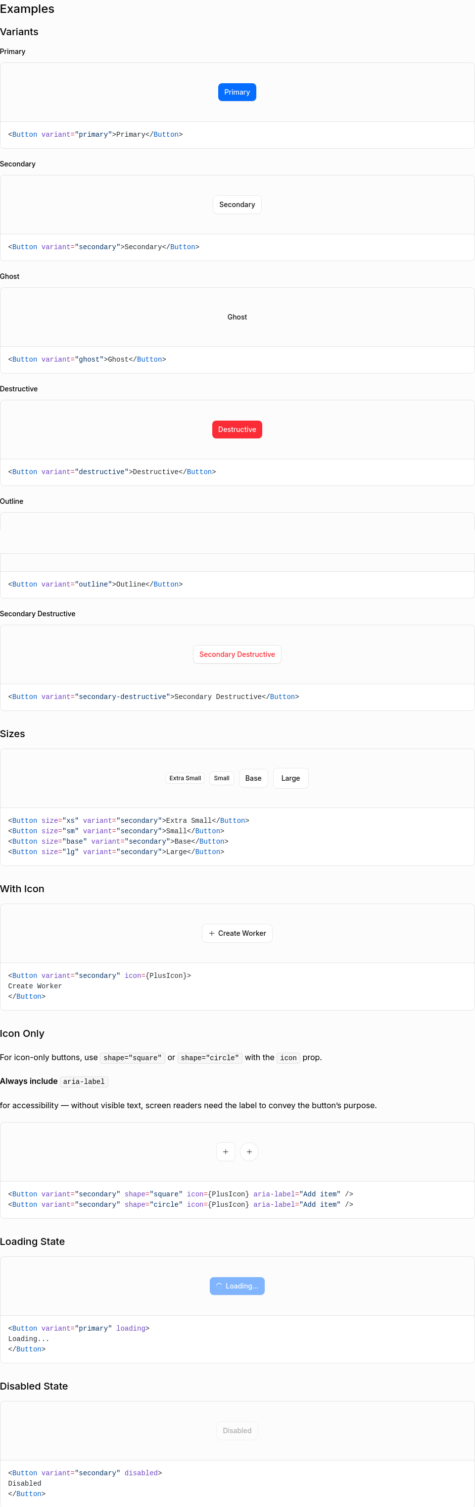
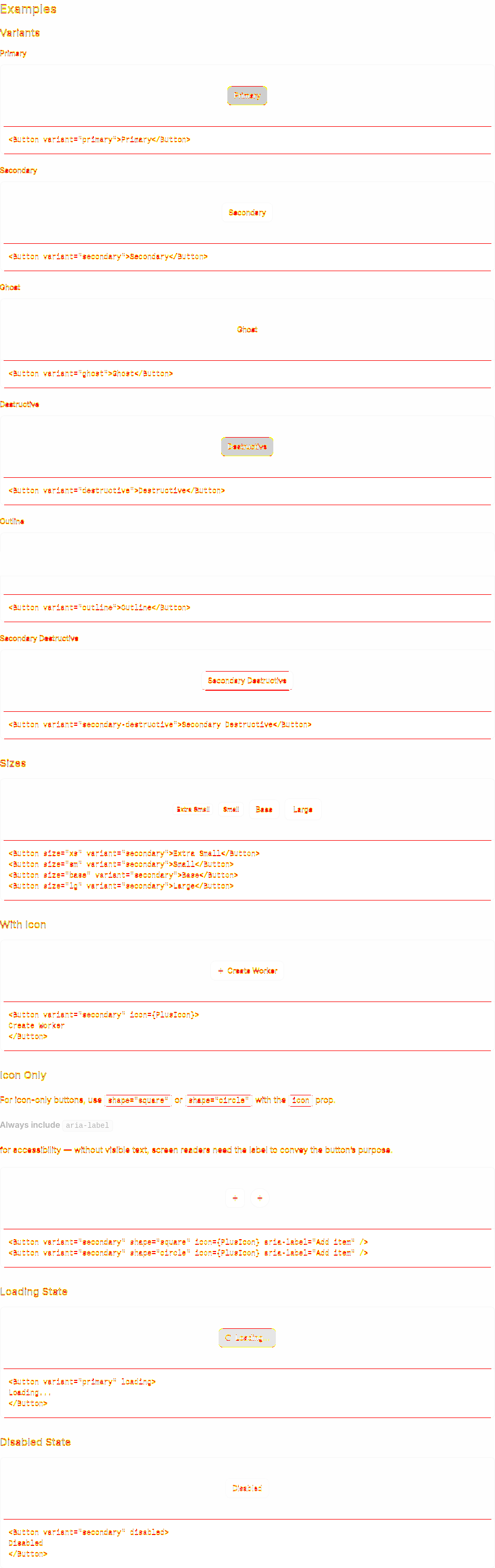
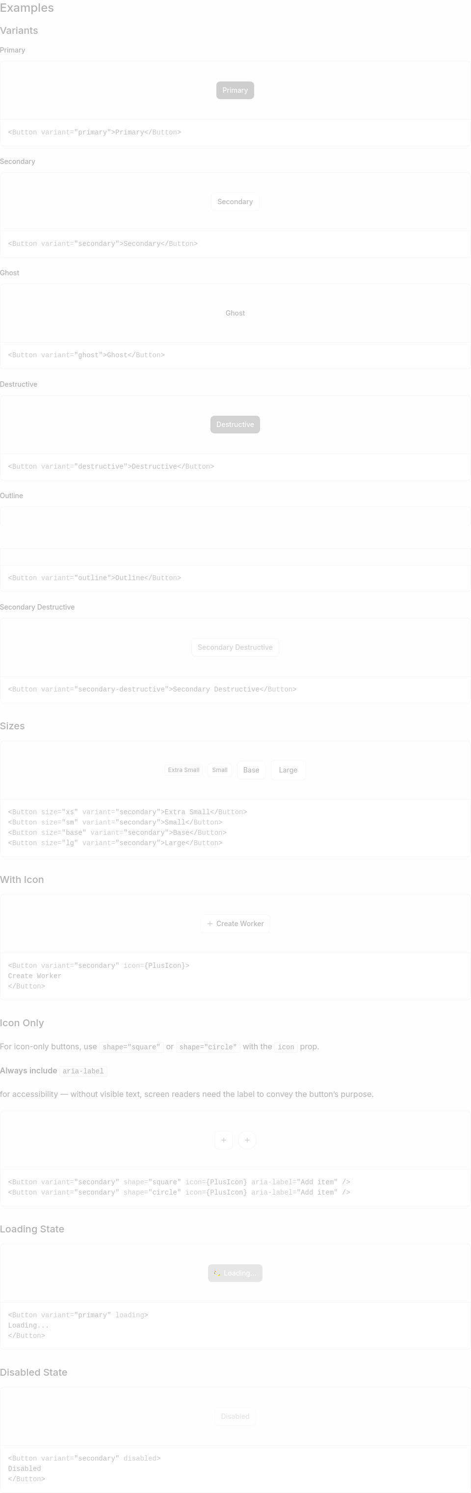
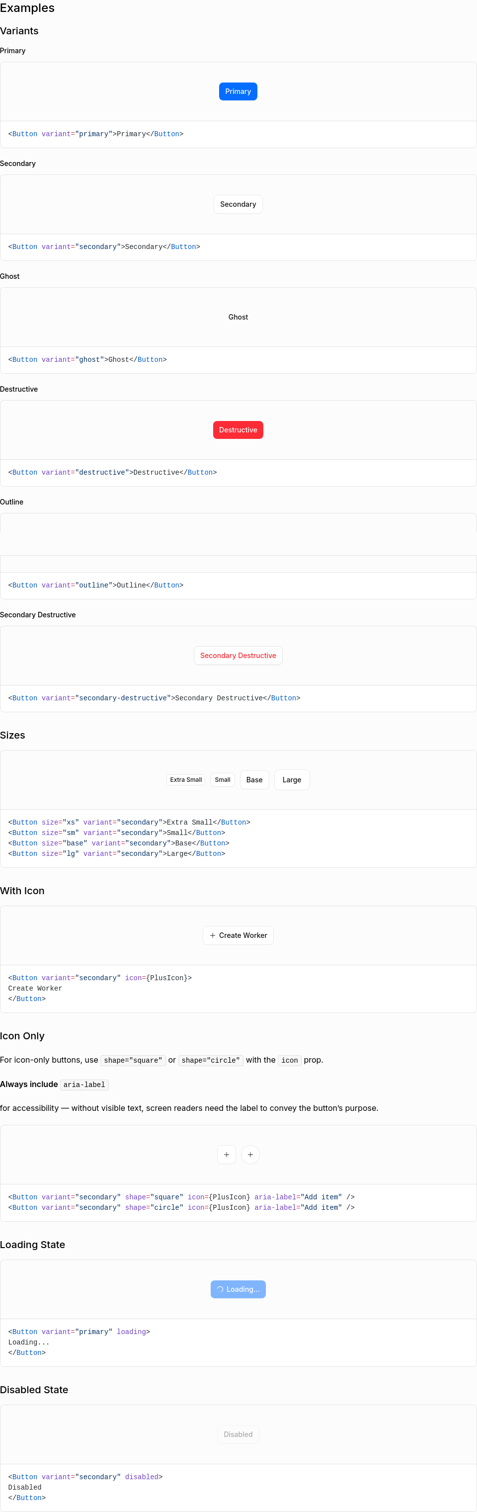
Visual Regression Report23 screenshot(s) with visual changes: Button / Variants1 px (0%) changed
Button / Sizes52,939 px (1.81%) changed
Button / With Icon40,226 px (1.38%) changed
Button / Icon Only4 px (0%) changed
Button / Loading State58,790 px (2.01%) changed
Button / Disabled State64,597 px (2.21%) changed
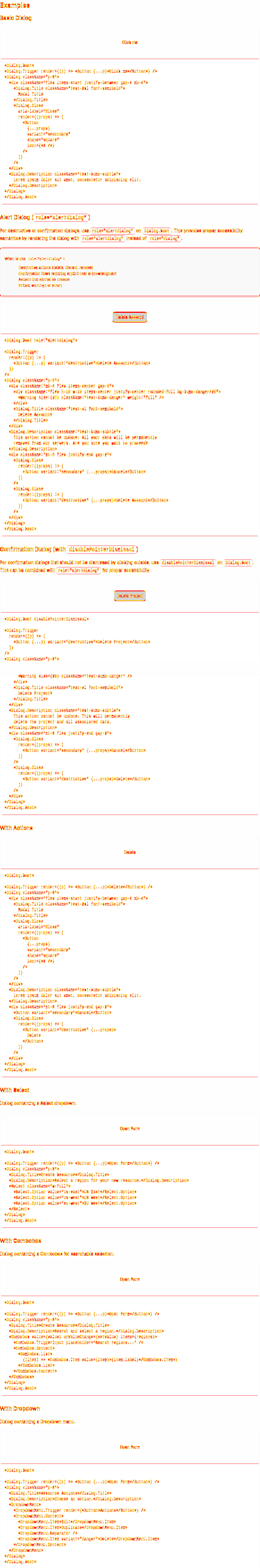
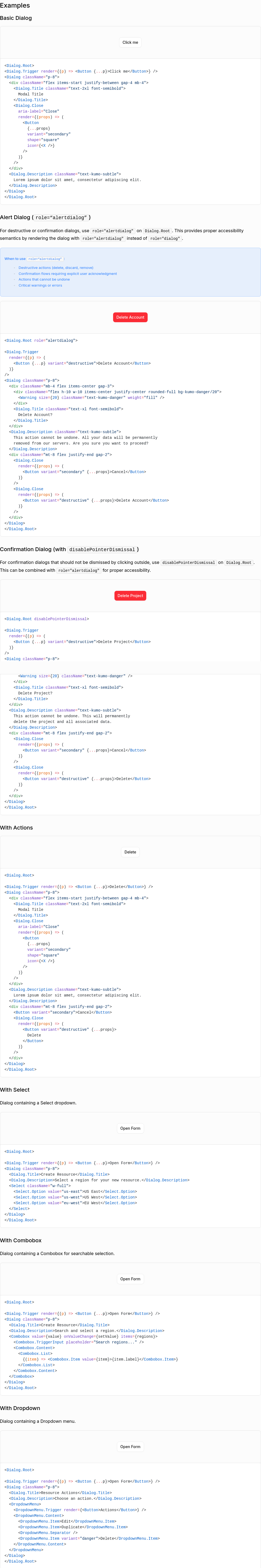
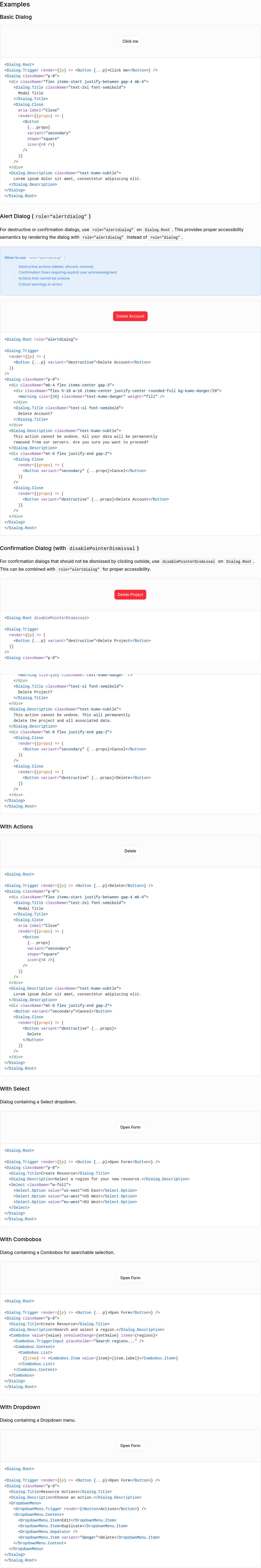
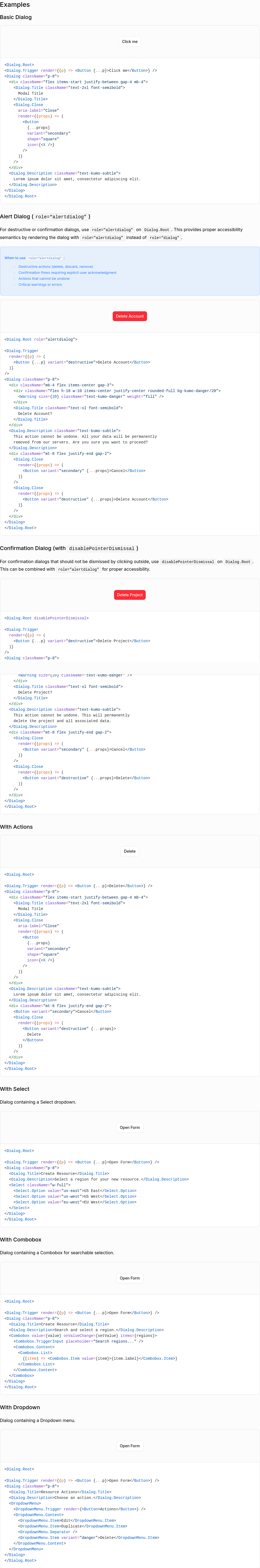
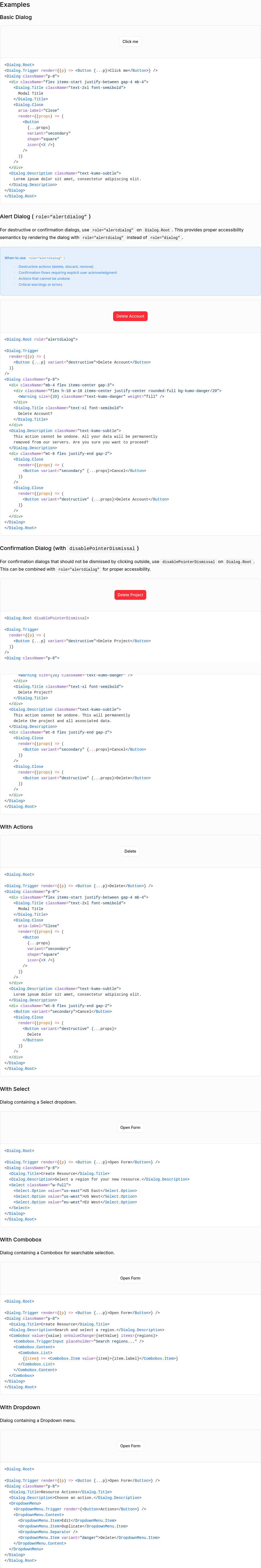
Dialog / Basic Dialog127,440 px (2.3%) changed
Dialog / Alert Dialog (role=“alertdialog”)125,071 px (2.26%) changed
Dialog / Confirmation Dialog (with disablePointerDismissal)20,300 px (0.37%) changed
Dialog / With Actions146,027 px (2.64%) changed
Dialog / With Select136,436 px (2.46%) changed
Dialog / With Combobox137,423 px (2.48%) changed
Dialog / With Dropdown4,137 px (0.07%) changed
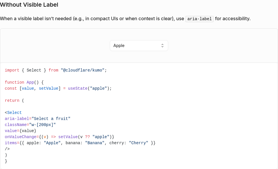
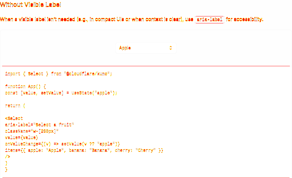
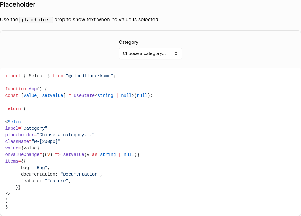
Select / Without Visible Label9,532 px (1.69%) changed
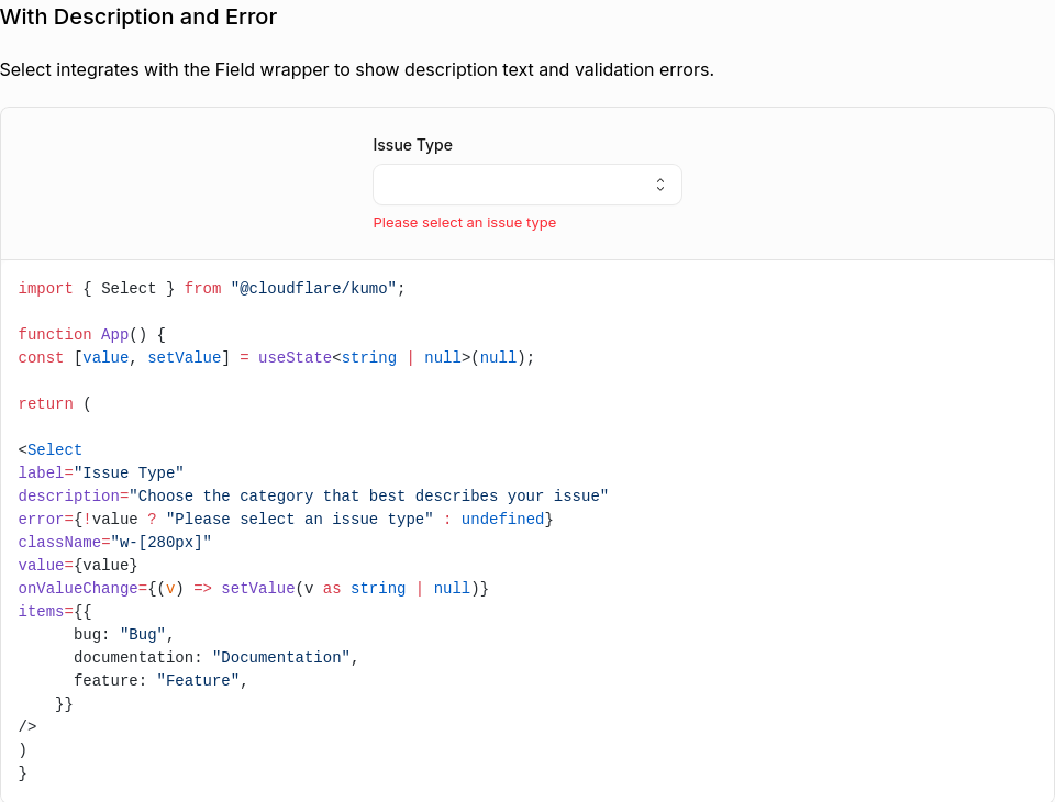
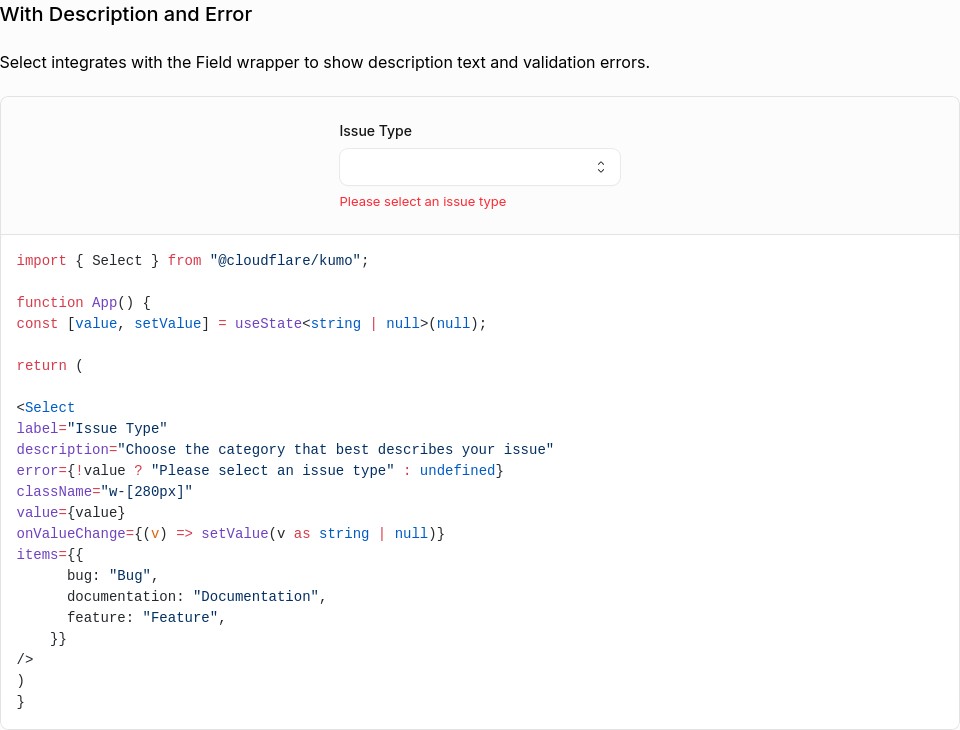
Select / With Description and Error13,041 px (1.86%) changed
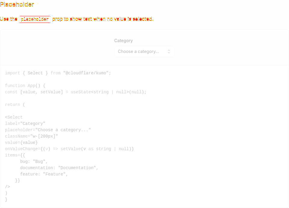
Select / Placeholder1,428 px (0.22%) changed
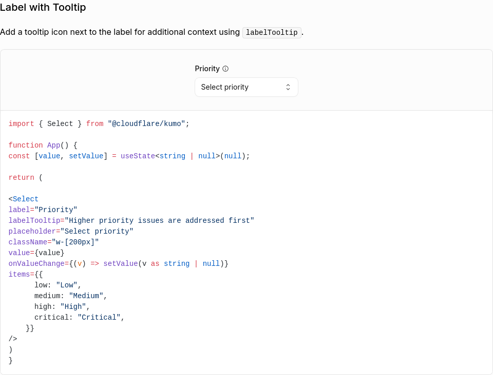
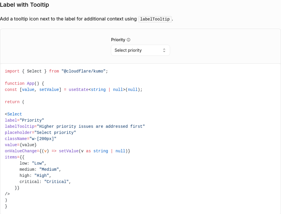
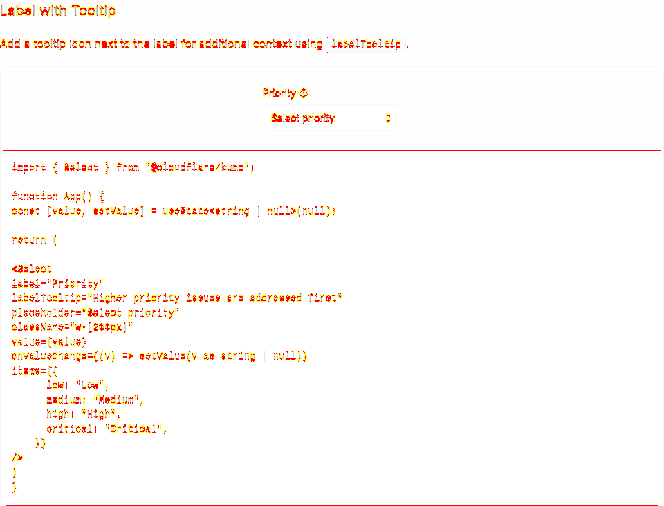
Select / Label with Tooltip12,894 px (1.83%) changed
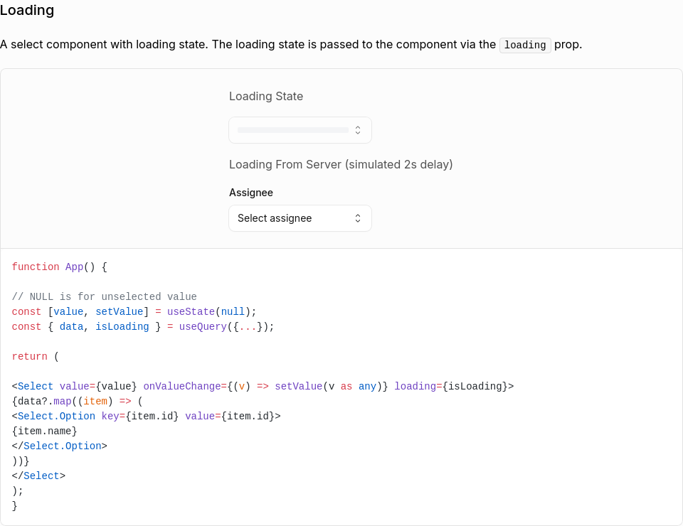
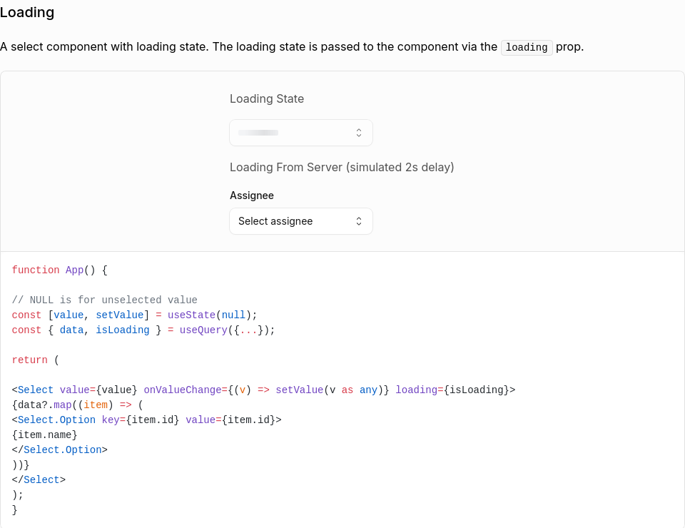
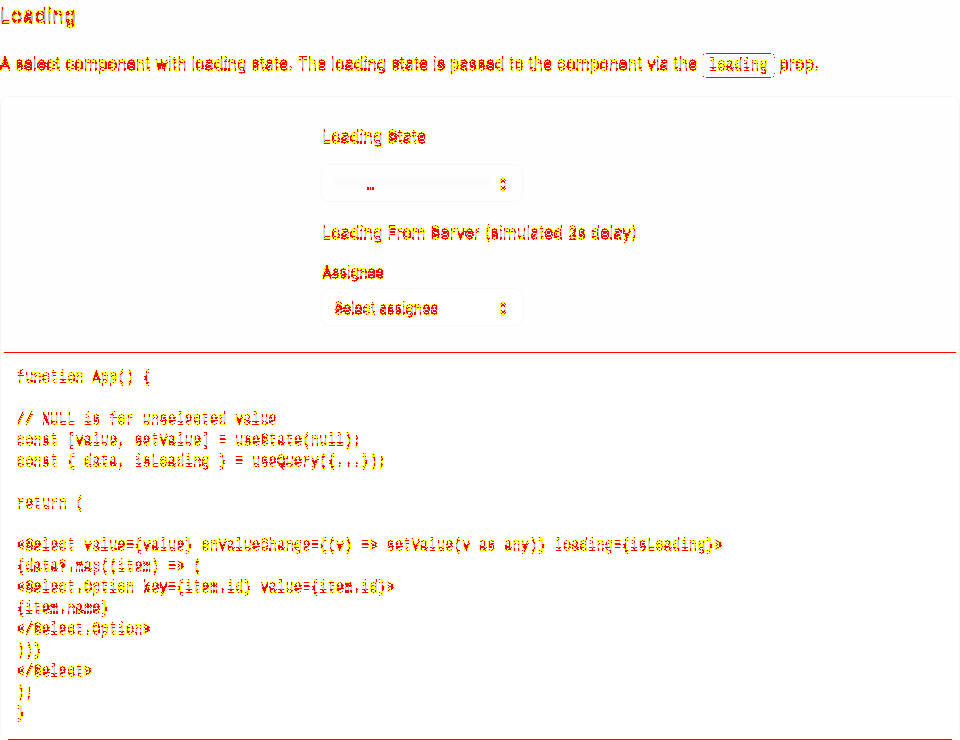
Select / Loading12,828 px (1.81%) changed
Select / Multiple Item19,371 px (2.3%) changed
Select / More Example23,445 px (2.57%) changed
Select / Select705 px (0.08%) changed
Select / Select.Option23,306 px (2.72%) changed
Select (Open)0 px (0%) changed
3 screenshot(s) unchanged
Generated by Kumo Visual Regression |


…on support

New InputGroup compound component for building inputs with icons, addons, inline suffixes, and action buttons.

Features:
- Field Integration — Accepts label, description, error, required, and labelTooltip props
- Addons — Place icons or text before/after the input using align="start" or align="end"
- Compact Button — Small button inside an Addon for secondary actions
- Action Button — Full-height flush button as a direct child for primary actions
- Inline Suffix — Text that flows seamlessly next to the typed value (uses CSS field-sizing)
- Size Variants — xs, sm, base, lg sizes cascade to all children via context
- Error State — Error flows through context; InputGroup.Input auto-sets aria-invalid
- Disabled State — disabled prop disables all interactive children

Sub-components:
- InputGroup — Root container; provides context and accepts Field props
- InputGroup.Input — Styled input; inherits size, disabled, error from context
- InputGroup.Addon — Container for icons, text, or compact buttons
- InputGroup.Button — Full-height button (direct child) or compact button (inside Addon)
- InputGroup.Suffix — Inline text suffix with CSS-based automatic width sizing

Includes comprehensive documentation page with demos and unit tests.
 mattrothenberg
force-pushed
the
feat/input-group-addon
branch
from
mattrothenberg
force-pushed
the
feat/input-group-addon
branch
from
0caf233 to
5bbecc8
Compare
- Suppress outline on inner input with outline-none!
- Add has-[:focus-visible]:outline-auto to container in grouped mode
- When inner input receives keyboard focus, the native focus ring appears on the entire InputGroup container
- Uses browser's native -webkit-focus-ring-color for consistent appearance
This file contains hidden or bidirectional Unicode text that may be interpreted or compiled differently than what appears below. To review, open the file in an editor that reveals hidden Unicode characters.
Learn more about bidirectional Unicode characters
Sign up for free
to join this conversation on GitHub.
Already have an account?
Sign in to comment
2 participants
Add this suggestion to a batch that can be applied as a single commit.This suggestion is invalid because no changes were made to the code.Suggestions cannot be applied while the pull request is closed.Suggestions cannot be applied while viewing a subset of changes.Only one suggestion per line can be applied in a batch.Add this suggestion to a batch that can be applied as a single commit.Applying suggestions on deleted lines is not supported.You must change the existing code in this line in order to create a valid suggestion.Outdated suggestions cannot be applied.This suggestion has been applied or marked resolved.Suggestions cannot be applied from pending reviews.Suggestions cannot be applied on multi-line comments.Suggestions cannot be applied while the pull request is queued to merge.Suggestion cannot be applied right now. Please check back later.
New
InputGroupcompound component for building inputs with icons, addons, inline suffixes, and action buttons.Includes comprehensive documentation page with demos and unit tests.
Features
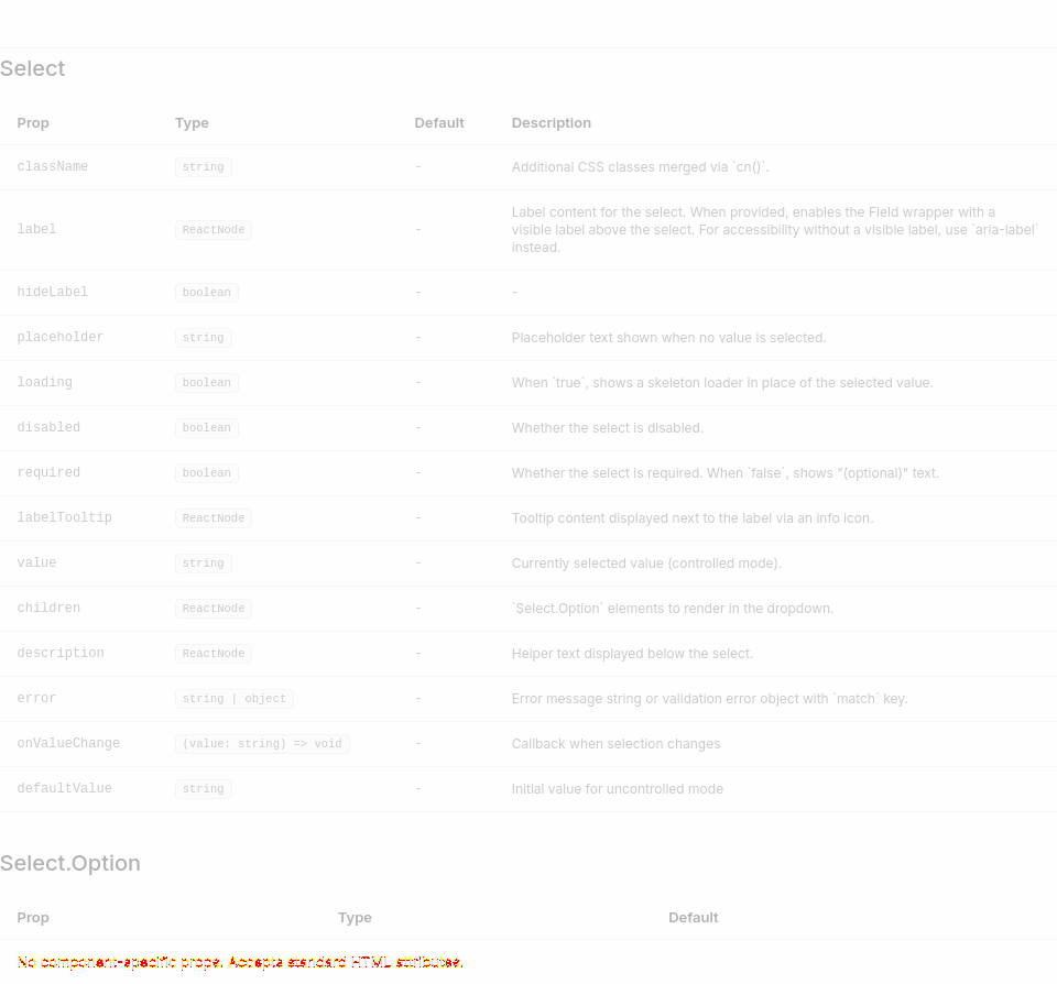
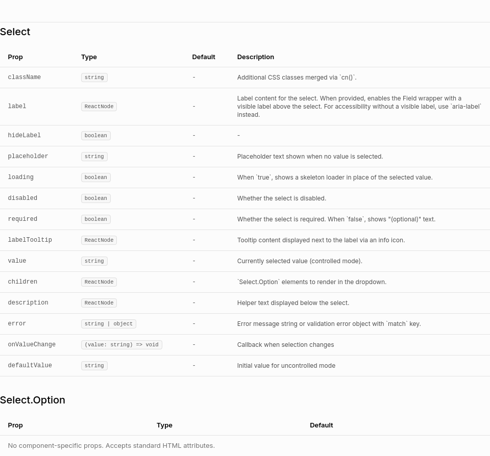
label,description,error,required, andlabelTooltipprops directly; automatically wraps in Field when label is providedalign="start"oralign="end".workers.dev); input width adjusts automatically as user typesxs,sm,base,lgsizes cascade to all children via contextInputGroup.Inputauto-setsaria-invalid="true"when error is presentdisabledprop disables all interactive childrenSub-components
InputGroupInputGroup.Inputsize,disabled,errorfrom contextInputGroup.Addonalign="start"(default) oralign="end"InputGroup.ButtonInputGroup.SuffixUsage Examples
Caveats
InputGroup.Inputomitslabel,description,error,size, andlabelTooltipprops — these are handled by the parentInputGroupInputGroup.Suffix, the input width is measured dynamically via a hidden ghost elementInputGroup.Buttonrenders differently based on placement: full-height flush when direct child, compact when insideAddonScreenshots