Themes
Themes allow you to create custom sets of formatting settings for your posts. The Publish to Apple News plugin creates a set of default themes for Apple News. You can choose one of the example themes as a starting point, and can customize individual component settings so you can create your own unique design for your Apple News content.
To get started, click the Themes submenu under Apple News.
Apple News automatically adds a Default theme as well as several example themes. If you were using the plugin prior to version 1.2.2 when themes were introduced, your current Formatting settings will automatically be imported into the Default theme. If you were using the plugin prior to version 1.3.0 when additional example themes were introduced, you can load them by using the Load Example Themes button on the Themes page.
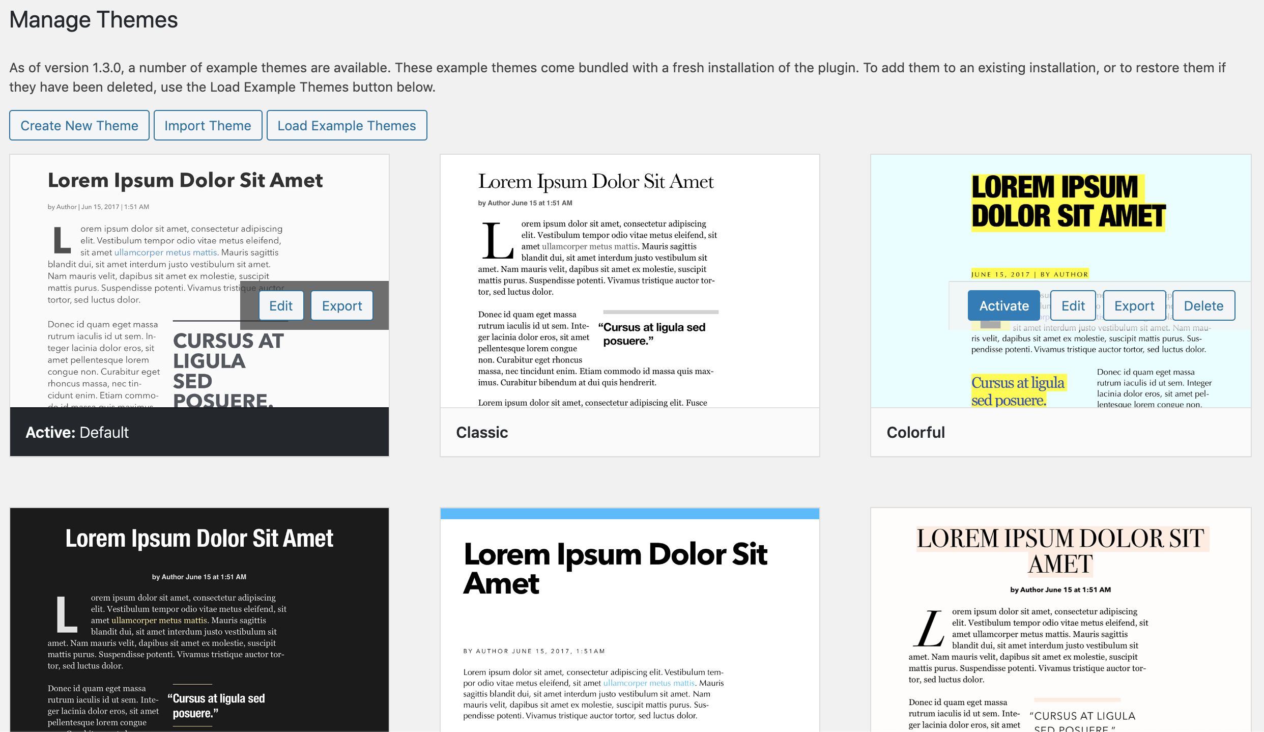
To create a new theme, simply click the Create New Theme button at the top of the theme list and follow the instructions under Editing Themes.
- All sizes are in points. Please enter only the number. Note that Apple does automatically adjust some font sizes automatically for different device screen sizes and orientations and therefore font sizes may not always be exact. If you want to test settings, please download Xcode and the News Preview tool.
- Colors can be selected using the WordPress color picker or by entering the HTML color code in
#123456format. - Font dropdowns show a live preview of the font on macOS only.
- Starting with version 1.2.0, we've also introduced a live web preview that shows an approximation of what your content will look like in Apple News. If you're on macOS, you can also see a live preview of all fonts that you select.
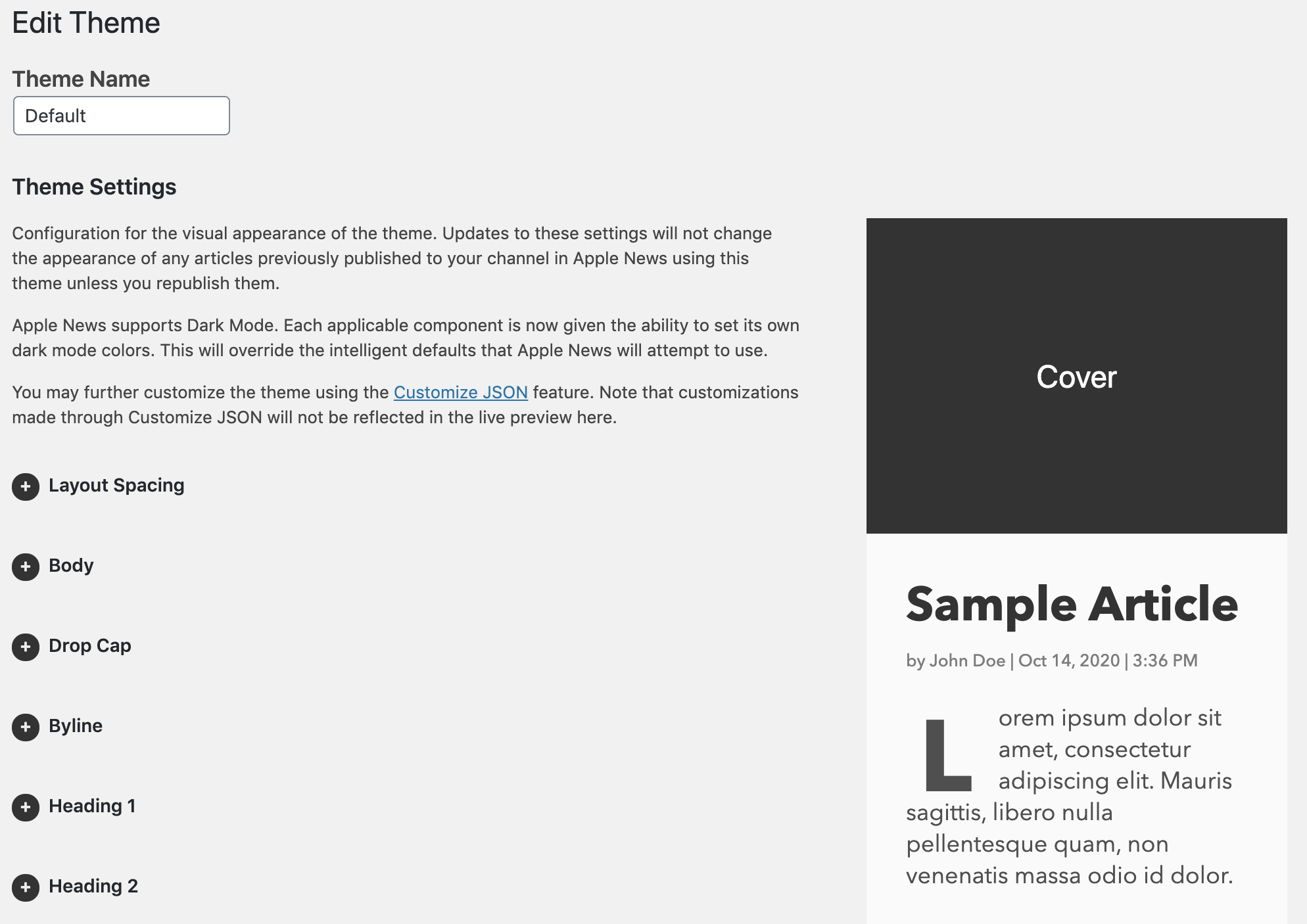
Add or edit the name for the theme.
- Layout margin: The left and right margins for components that aren't full width, such as the cover.
- Layout gutter: The spacing between columns of components.
More about layout options in the Apple News Format Reference.
The slug is an optional word or phrase that appears near the title at the top of your article. You can enable or disable or change the position of the slug component using the Component Order configuration parameter (more on this later).
- Slug font face
- Slug font size
- Slug line height
- Slug tracking: Percentage of font size.
- Slug font color
- Dark Mode: Slug font color: The color to be used if a user has enabled Dark Mode on their device.
The body corresponds to the main paragraphs of text in your content. Anything enclosed in a <p> tag gets converted to a body component. You can format the body with the following options:
- Body font face
- Body font size
- Body line height
- Body tracking: Percentage of font size.
- Body font color
- Body font hyperlink color
- Body background color
- Body orientation: Can be left, right or center. Controls margins on larger screens. Left orientation includes one column of margin on the right, right orientation includes one column of margin on the left, and center orientation includes one column of margin on either side.
- Dark Mode: Body font color: The color to be used if a user has enabled Dark Mode on their device.
- Dark Mode: Body font hyperlink color: The color to be used if a user has enabled Dark Mode on their device.
- Dark Mode: Body background color: The color to be used if a user has enabled Dark Mode on their device.
More about Body in the Apple News Format Reference.
The first letter at the beginning of your post can be converted to a drop cap, which is a large letter that spans multiple lines. It's a nice visual touch for your readers, though not required. You can format the drop cap with the following options:
- Use initial drop cap: Turns the drop cap on and off.
- Drop cap background color
- Drop cap font color
- Drop cap font face
- Drop cap number of characters
- Drop cap number of lines: Must be an integer between 2 and 10. Actual number of lines occupied will vary based on device size.
- Drop cap number of raised lines
- Drop cap padding
- Dark Mode: Drop cap background color: The color to be used if a user has enabled Dark Mode on their device.
- Dark Mode: Drop cap font color: The color to be used if a user has enabled Dark Mode on their device.
More about DropCapStyle in the Apple News Format Reference.
The byline displays the article's author and publish date.
- Byline font face
- Byline font size
- Byline line height
- Byline tracking: Percentage of font size.
- Byline font color
- Byline format: Two tokens can be present: `author# to denote the location of the author name and a PHP date format string also encapsulated by #. The default format is "by #author# | #M j, Y | g:i A#". Note that byline format updates only preview on save.
- Dark Mode: Byline font color: The color to be used if a user has enabled Dark Mode on their device.
More about Byline in the Apple News Format Reference.
Headings are used for <h1> through <h6> tags that are present in your content. The following settings are available for every heading level from 1-6.
- Header # font face
- Header # font color
- Header # font size
- Header # line height
- Header # tracking: Percentage of font size.
- Dark Mode: Header # font color: The color to be used if a user has enabled Dark Mode on their device.
More about Heading in the Apple News Format Reference.
- Enable caption on the Cover component: Whether to display a caption below the cover image. Defaults to "no." Only applies if you have the Cover component active in your theme.
- Caption font face
- Caption font size
- Caption line height
- Caption tracking: Percentage of font size.
- Caption font color
- Dark Mode: Caption font color: The color to be used if a user has enabled Dark Mode on their device.
More about Caption in the Apple News Format Reference.
Pull quotes are a block of text that can appear in the middle of your article to highlight an important quote or concept. These can be added when you publish.
- Pull quote font face
- Pull quote font size
- Pull quote line height
- Pull quote tracking: Percentage of font size.
- Pull quote color
- Pull hanging punctuation: If set to "yes," adds smart quotes (if not already present) and sets the hanging punctuation option to true.
Pull quotes also have a top and bottom border to make them stand out from the content.
- Pull quote border style: can be none, solid, dashed or dotted.
- Pull quote border color
- Pull quote border width
- Pull quote transformation: this can automatically uppercase the pull quote content.
- Dark Mode: Pull quote color: The color to be used if a user has enabled Dark Mode on their device.
- Dark Mode: Pull quote border color: The color to be used if a user has enabled Dark Mode on their device.
More about Pullquote in the Apple News Format Reference.
Blockquotes are a block of text that can appear throughout your article to highlight an important quotes. They are created using the <blockquote> tag in WordPress.
- Blockquote font face
- Blockquote font size
- Blockquote line height
- Blockquote tracking: Percentage of font size.
- Blockquote color
Blockquote also have a left border and background to make them stand out from the content.
- Blockquote border style: can be none, solid, dashed or dotted.
- Blockquote border color
- Blockquote border width
- Blockquote background color
- Dark Mode: Blockquote color: The color to be used if a user has enabled Dark Mode on their device.
- Dark Mode: Blockquote border color: The color to be used if a user has enabled Dark Mode on their device.
- Dark Mode: Blockquote background color: The color to be used if a user has enabled Dark Mode on their device.
More about Quote in the Apple News Format Reference.
- Table border color
- Table border style
- Table border width
- Table body background color
- Table body font color
- Table body font face
- Table body horizontal alignment
- Table body line height
- Table body padding
- Table body font size
- Table body tracking: (Percentage of font size)
- Table body vertical alignment
- Table header background color
- Table header font color
- Table header font face
- Table header horizontal alignment
- Table header line height
- Table header padding
- Table header font size
- Table header tracking: (Percentage of font size)
- Table header vertical alignment
- Dark Mode: Table border color: The color to be used if a user has enabled Dark Mode on their device.
- Dark Mode: Table body background color: The color to be used if a user has enabled Dark Mode on their device.
- Dark Mode: Table body font color: The color to be used if a user has enabled Dark Mode on their device.
- Dark Mode: Table header background color: The color to be used if a user has enabled Dark Mode on their device.
- Dark Mode: Table header font color: The color to be used if a user has enabled Dark Mode on their device.
More about HTMLTable in the Apple News Format Reference.
- Monospaced font face
- Monospaced font size
- Monospaced line height
- Monospaced tracking: Percentage of font size.
- Monospaced font color
- Dark Mode: Monospaced font color: The color to be used if a user has enabled Dark Mode on their device.
- Gallery type: Can either be a standard gallery, or mosaic.
More about Gallery in the Apple News Format Reference.
More about Mosaic in the Apple News Format Reference.
- Enable advertisements
- Ad Frequency: A number between 1 and 10 defining the frequency for automatically inserting Banner Advertisement components into articles. For more information, see the Apple News Format Reference.
- Ad Margin: The margin to use above and below inserted ads.
More about AdvertisementAutoPlacement in the Apple News Format Reference.
Drag these to change the order of the cover image, slug, title, intro, and byline at the top of the article. Note that if you don't specify a cover image in the Apple News settings for your article, your article's featured image will be used. If you do not specify a cover image or a featured image, Apple News will automatically promote the first image in your post content to this location. If you want to remove any or all of these components, drag them to the Inactive column on the right.
You can optionally provide a URL to a screenshot of your theme. The URL can be to an image in the media library of your site, but does not need to be. Screenshots should be 1200x900 in PNG format.
From the main theme list, click the Delete button on any theme to remove it. Please note that you cannot delete the active theme. To delete the active theme, you must first switch to another theme. If there is only one theme installed, it cannot be deleted.
From the main theme list, click the Export button on any theme to download a JSON file of your theme settings. The name of the theme is stored within the file, so it's safe to rename this file as you wish. This file can be shared with other sites to import the theme settings.
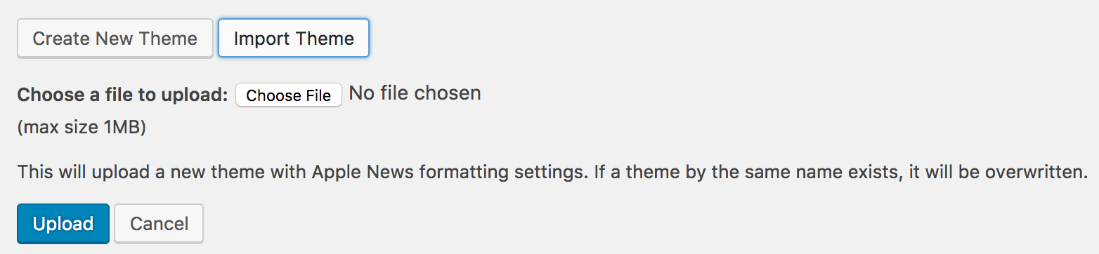
To import a theme from a JSON file, click the Import Theme button at the top of the main theme list. This will display a form where you can select the file to upload from your computer. Click the Upload button to import it.
The new theme will then appear in the list and will be available for selection. Note that if you import a theme that has the same name as an existing theme, it will be overwritten.