Customizing JSON
For advanced users, the Apple News plugin allows you to customize JSON. Each Apple News component that is handled by the plugin has one or more JSON specs for the main component JSON, layouts and/or styles. Some components have multiple specs for each of those if they have different visual appearances in different contexts. Editing these specs allows you to implement more advanced features from Apple News Format than can be handled via theme settings.
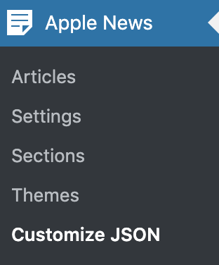
To get started, go to Customize JSON from the Apple News menu:
Select the theme for which you want to customize JSON.
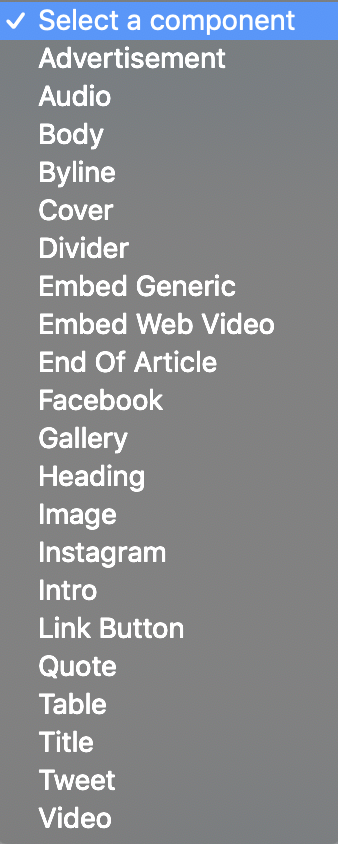
Next, select the component you wish to edit from the dropdown:
You will then see a form that shows the editable JSON specs for that component.
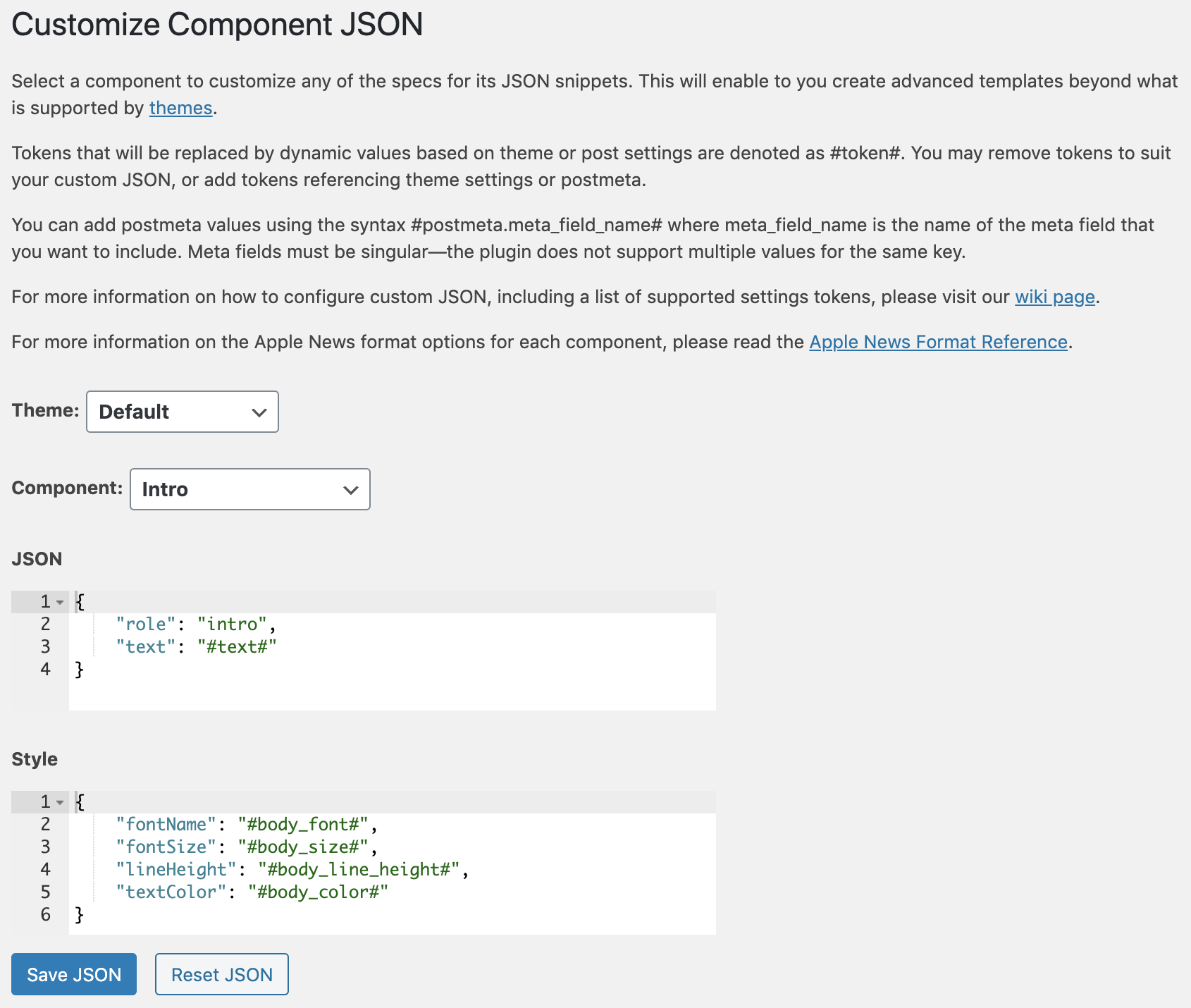
Some specs will include values in the format #token#. These are tokens that represent dynamic values that will be inserted into the JSON when the post is published to Apple News.
There are three types of tokens:
- Spec-specific: These will be included with the default spec, and can be removed, but cannot be added to different specs. They are computed at the time that the spec is translated to JSON, and are specific to a particular spec.
- Postmeta: You can include postmeta values by including a token in the format
#postmeta.meta_key#wheremeta_keyis the key of the postmeta that you want to include. Note that this only works on single postmeta values (get_post_metais called with the$singleparameter set totrue). - Settings: All of the theme settings are available to be included in custom JSON specs. To include a value for a theme setting, simply use
#setting_name#wheresetting_nameis the name of the setting you wish to include. The full list of available theme settings for use in tokens is as follows:ad_frequencyad_marginblockquote_background_colorblockquote_background_color_darkblockquote_border_colorblockquote_border_color_darkblockquote_border_styleblockquote_border_widthblockquote_colorblockquote_color_darkblockquote_fontblockquote_line_heightblockquote_sizeblockquote_trackingbody_background_colorbody_background_color_darkbody_colorbody_color_darkbody_fontbody_line_heightbody_link_colorbody_link_color_darkbody_orientationbody_sizebody_trackingbyline_colorbyline_color_darkbyline_fontbyline_formatbyline_line_heightbyline_sizebyline_trackingcaption_colorcaption_color_darkcaption_fontcaption_line_heightcaption_sizecaption_trackingcover_captiondropcap_background_colordropcap_background_color_darkdropcap_colordropcap_color_darkdropcap_fontdropcap_number_of_charactersdropcap_number_of_linesdropcap_number_of_raised_linesdropcap_paddingenable_advertisementgallery_typeheader1_colorheader1_color_darkheader1_fontheader1_line_heightheader1_sizeheader1_trackingheader2_colorheader2_color_darkheader2_fontheader2_line_heightheader2_sizeheader2_trackingheader3_colorheader3_color_darkheader3_fontheader3_line_heightheader3_sizeheader3_trackingheader4_colorheader4_color_darkheader4_fontheader4_line_heightheader4_sizeheader4_trackingheader5_colorheader5_color_darkheader5_fontheader5_line_heightheader5_sizeheader5_trackingheader6_colorheader6_color_darkheader6_fontheader6_line_heightheader6_sizeheader6_trackinginitial_dropcaplayout_gutterlayout_marginlayout_widthmonospaced_colormonospaced_color_darkmonospaced_fontmonospaced_line_heightmonospaced_sizemonospaced_trackingpullquote_border_colorpullquote_border_color_darkpullquote_border_stylepullquote_border_widthpullquote_colorpullquote_color_darkpullquote_fontpullquote_hanging_punctuationpullquote_line_heightpullquote_sizepullquote_trackingpullquote_transformtable_body_background_colortable_body_background_color_darktable_body_colortable_body_color_darktable_body_fonttable_body_horizontal_alignmenttable_body_line_heighttable_body_paddingtable_body_sizetable_body_trackingtable_body_vertical_alignmenttable_border_colortable_border_color_darktable_border_styletable_border_widthtable_header_background_colortable_header_background_color_darktable_header_colortable_header_color_darktable_header_fonttable_header_horizontal_alignmenttable_header_line_heighttable_header_paddingtable_header_sizetable_header_trackingtable_header_vertical_alignment
When you have finished editing, click the Save JSON button. The new specs will now be used for that component when publishing posts to Apple News using the selected theme moving forward.
The following components and JSON specs are supported:
The main component JSON.
The default component layout.
The main component JSON, which is used when a caption is present.
The main component JSON.
The main component JSON.
The default component layout.
Layout settings for the last body component only.
The default component style.
The style for the first body component when drop caps are enabled.
The main component JSON.
The default component style.
The default component layout.
The main component JSON.
The main component JSON, which is used when a caption is present.
The default component layout.
The default component layout, which is used when a caption is present.
The component layout to use when the cover is positioned below text.
The main component JSON.
The default component layout.
The main component JSON.
The default component layout.
The main component JSON.
The default component layout.
This is a special component that is automatically inserted at the end of each article rendered by this theme. You can add whatever content you like, as long as it is valid Apple News Format. Typical use cases here would be calls to action for things like subscribing to newsletters.
The main component JSON. Defaults to nothing, in which case no End of Article module will appear. You may insert whatever you like here.
The default component layout. Defaults to nothing, in which case there will be no layout applied. You may insert whatever you like her.
The main component JSON.
The main component JSON.
The default component layout.
The main component JSON.
The default component layout.
The style for level 1 (H1) components.
The style for level 2 (H2) components.
The style for level 3 (H3) components.
The style for level 4 (H4) components.
The style for level 5 (H5) components.
The style for level 6 (H6) components.
Main component JSON for images without captions.
Main component JSON for images with captions.
Layout for images that are anchored to another component.
Layout for images that are not anchored to another component.
Layout for images that are not anchored to another component when full bleed images are enabled.
The main component JSON.
The main component JSON.
The default component style.
The main component JSON.
The default component style.
Styles for the button itself.
Styles for the text in the button.
Main component JSON when borders are not enabled for blockquotes in the theme.
Main component JSON when borders are enabled for blockquotes in the theme.
The default blockquote layout.
The default blockquote style.
Main component JSON when borders are not enabled for blockquotes in the theme.
Main component JSON when borders are enabled for blockquotes in the theme.
The default blockquote layout.
The default blockquote style.
The main component JSON.
The main component JSON, which is used when a caption is present.
The default component layout.
The default component style.
The main component JSON.
The default component style.
The default component layout.
The main component JSON.
The default component layout.
The main component JSON, which is used when a caption is present.
The main component JSON.