Remember to git add && git commit && git push each exercise!
We will execute your function with our test(s), please DO NOT PROVIDE ANY TEST(S) in your file
For each exercise, you will have to create a folder and in this folder, you will have additional files that contain your work. Folder names are provided at the beginning of each exercise under submit directory and specific file names for each exercise are also provided at the beginning of each exercise under submit file(s).
| My Tu Verras | |
|---|---|
| Submit directory | . |
| Submit file | my_tu_verras.ipynb |

House price is a recurring subject nowadays. In this project, you will build a model to predict the price base on predefined criteria.
We are providing a dataset, the Boston housing prices.
This project is divided into two parts: 1# Understand the data 2# Build a linear regression prediction model.
Let's get down to the brass task.
From a quick look, we know what is inside our dataset, like the different attributes:
• CRIM per capita crime rate by town • ZN proportion of residential land zoned for lots over 25,000 sq.ft. • INDUS proportion of non-retail business acres per town • CHAS Charles River dummy variable (= 1 if tract bounds river; 0 otherwise) • NOX nitric oxides concentration (parts per 10 million) • RM average number of rooms per dwelling • AGE proportion of owner-occupied units built before 1940 • DIS weighted distances to five Boston employment centers • RAD index of accessibility to radial highways • TAX full-value property-tax rate per $10,000 • PTRATIO pupil-teacher ratio by town • B 1000(Bk - 0.63)^2 where Bk is the proportion of blacks by town • LSTAT PERCENT lower status of the population • MEDV Median value of owner-occupied homes is $ 1000's
Now that we loaded the data let's peek at it.
→ Load the data in a data frame and print the first rows.
def load_dataset(): ...boston_dataframe = load_dataset()
def print_summarize_dataset(dataset): print("Dataset dimension:") print(XXXXXXXX) print(" First 10 rows of dataset:") print(XXXXXXXX) print(" Statistical summary:") print(XXXXXXXX)
print_summarize_dataset(dataset)
hint: Panda is cool.
We should see something similar to:

Now that we have loaded the data frame, it is easier to see and investigate the data. Play around a bit and print some more values. The data frame table is excellent but is hard to read. Can you tell from it what attributes have the most influence on the MEDV target?
From a quick sneak peek, we feel the MEDV decreases as the AGE increases. The correlation between MEDV and AGE is just a supposition, and we will try to corroborate it. Do you see any other relationship between attributes?
Just like we did with Mr Clean, cleaning is one of the first steps after receiving a dataset to explore. Here the dataset was made to be very clean, but just to be sure, let's look for any missing values.
→ Make a function that cleans the dataset from lines which any missing values.
def clean_dataset(boston_dataframe):
	...
After this function, we should have zero missing values in the dataset.
Now we are ready to cut to the chase. We will see if our supposition was correct by visualizing the data.
Visualization is critical to understanding the relationship between the target and the other features.
A great way to get a feel of the data we are dealing with is to plot each attribute in a histogram.
→ Plot each attribute in a histogram.
Hint: You can use matplotlib, panda, seaborn or any other libraries.
Here is the result for some of the attributes:

→ Make a function that prints all the histograms.
def print_histograms(boston_dataframe):
	...
So far, we have only taken a quick peek to get a general understanding of the kind of data we are manipulating. Now the goal will be to investigate deeper again.
The size of our dataset is not too large, so we can try to analyze linear correlations between every pair of attributes.
→ Write a function compute_correlations_matrix to compute Pearson's correlations between every pair of attributes.
The output of compute_correlation should be a dictionary. For example, print(correlations['MEDV']) should show the different correlation coefficients between the median value and other attributes.
def compute_correlations_matrix(boston_dataframe): ...correlations = compute_correlations(boston_dataframe)
print(correlations['MEDV'])
When the coefficient is close to 1 (in absolute value), there is a strong correlation between the two variables. If it is positive, it means the linear correction is positive. If it is negative... you get it. Coefficients close to zero mean there is no linear correlation between the attributes.
→ What is the correlation coefficient between the median value and the number of rooms?
This coefficient is positive and is the biggest. It means that the median value increases when the number of rooms increases. Well, that makes sense; we expect a house with many rooms to be more expensive than a single-room apartment.
→ Analyse the correlations between the median value and the other attributes. Which attribute is the most negatively correlated with the median value? Does it make sense to you?
Mathematically, all this information can be seen in an object, the covariance matrix. The covariance matrix tells us a lot about our data's relationship and distribution. For example, it can be used in Principal Component Analysis to try and understand the most useful and relevant dimensions. But that's for another day.
Numbers are cool, but we, as human beings, love colors, pictures, and visual representations. We can easily spot correlations by visualizing the relationship between attributes on graphs.
→ Plot every attribute against each other.
hint: Visualizing every component against each other is usually done with a scatter matrix.
Here is an example:
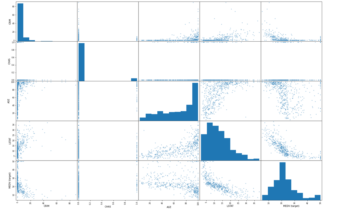
Instead of representing straight lines, the main diagonal displays a histogram of the attributes.
→ Make a function that prints the scatter matrix.
def print_scatter_matrix(boston_dataframe):
	...
Since the most linearly correlated feature is the average number of rooms, let's focus on the plot of MEDV as a function of RM.
→ Plot MEDV in function of RM
We should see what the numbers told us before. We clearly see an upward trend. A strong positive linear correlation exists between the number of rooms and the median value. Ok, now let's explore the influence of other attributes.
→ Plot the correlation scatter plot of the median value against LSTAT, AGE, and CRIME.

→ What can you observe? What can you say?.
→ Does the age seems to have any influence on the MEDV?
Well, not so fast! the MEDV / AGE scatterplot does not show an apparent correlation between these attributes. But we can see that the LSTAT feature DOES influence MEDV. The more LSTAT increases, the lower the MEDV value. We can see another correlation to be between LSTAT and MEDV. It is valuable information itself. Can we not go further?
Let's step back a minute. If LSAT influences MEDV, it means that if another attribute affects LSTAT itself, it actually circles back to influence MEDV!
→ Plot the scatter matrix or print the correlation coefficients for LSTAT. What are the attributes which are the most linearly correlated with LSAT?
Here is an example, LSTAT against AGE:

Again, we clearly see a trend here. Points are not too dispersed and have an upward trend. LSAT seems to be positively linearly correlated with AGE. So, all in all, AGE seems to influence (negatively) the median value. We could already observe this result on the graph of MEDV / AGE. Varying AGE cascades down (or back-propagates) to make MEDV varies.
You can go on experimenting with trying and finding more relationships between attributes to understand more deeply how they influence de MEDV target values.
After exploring the data and gaining more insights, the next step is to do another round of data cleaning and find a model to predict the MEDV.
We are going to use a linear regression algorithm from sklearn.
from sklearn.linear_model import LinearRegression
→ Make a function that return a Fitted Estimator.
import sklearndef boston_fit_model(boston_dataframe):
model_dataset = boston_dataframe[["RM","MDEV"]] regressor = sklearn.linear_model.LinearRegression()
x = model_dataset.iloc[:, :-1].values
y = model_dataset.iloc[:, 1].values
regressor.fit(x, y) return regressor
→ Make a second function that will receive the Fitted Estimator and return a prediction.
# predict?
def boston_predict(estimator, array_to_predict):
 	...
data = [1, 2, 3]
estimator = boston_fit_model(dataset)
print(boston_predict(estimator, data))
You will have to implement multiple functions:
load_dataset()print_summarize_dataset(dataset) clean_dataset(dataset) print_histograms(dataset) compute_correlations_matrix(dataset) print_scatter_matrix()
boston_fit_model(dataset) boston_predict(estimator)
Gandalf will not accept any pip install XXXX inside your file.
Additional resources We like to print the evaluation prediction with this function:
def print_model_prediction_evaluator(base_test, prediction):
  print('Mean Absolute Error:', metrics.mean_absolute_error(base_test, prediction))
  print('Mean Squared Error:', metrics.mean_squared_error(base_test, prediction))
  print('Root Mean Squared Error:', np.sqrt(metrics.mean_squared_error(base_test, prediction)))