-
-
Notifications
You must be signed in to change notification settings - Fork 354
UI Guidelines
Consistency within the Rock UI is critical. We'd like to keep a consistent look and feel in custom Rock Blocks as much as possible. The guidelines and standards below have been put in place to help provide patterns for developers to use as they add new features to the system.
Rock uses the Twitter Bootstrap CSS Framework (currently version 2.0.3) as a starting point for all style guidelines. Always start with the Bootstrap documentation when deciding how to write your HTML / CSS.
- Use appropriate Bootstrap CSS classnames whenever possible. This will make it easier for others to apply their own styles to your custom
and will make your Blocks fit in nicely with existing and third party Rock Themes.
- The internal theme for Rock uses the responsive rows in Twitter Bootstrap. Be sure to use the 'row-fluid' class on row divs.
The color map below should be used to help reduce the number of colors used within the UI. If you need to implement a new UI widget consider pulling from one of the colors in the image below.
[ ][img1]
[img1]: Attachments/UI-Guidelines/colors.jpg
There will be times when you need to provide administrators the ability to choose between a stacked layout and horizontal layout. Since we're using Bootstrap, what this means is you'll want to allow the insertion of additional row-fluid divs in your markup so that instead of this...
    <div class="row-fluid">
        <div class="span6">AAA</div>
        <div class="span6">BBB</div>
    </div>

...you actually need it to look like this (based on a "stacked" layout configuration):
    <div class="row-fluid">
        <div class="span12">AAA</div>
    </div>
    <div class="row-fluid">
        <div class="span12">BBB</div>
    </div>

Assuming your block has a boolean Block Field Attribute called UseStackedLayout, you can achieve this with a little inline if trickery like this:
    <% var spanClass = ( UseStackedLayout ) ? "span12" : "span6"; %>

    <div class="row-fluid">
        <div class="<%= spanClass %>">AAA</div>
    <% if (  UseStackedLayout ) { %>
    </div>
    <div class="row-fluid">
    <% } %>
        <div class="<%= spanClass %>">BBB</div>
    </div>
Use left-aligned labels on top of form controls as shown in the Boostrap Forms document. When necessary for added syntactic sugar you can also include placeholder's to illustrate the desired input.

When using a Rock Grid you should always display ALL items initially by default until the user has set user preferences using the grid filter.
Use a dropdown list instead of radio buttons when you want to give a choice such as (show all, show only active, show only inactive).
There is a very common list-to-view/edit pattern for many UI scenarios where you have a page with a list of items that are clickable. Clicking on an item takes you to another page where a different block handles the view and edit of the item.
Attachments/UI-Guidelines/s_list-detail-pattern.png
The typical page and block structure for this pattern will be the following -- a page which has the List block and a child page that has the Detail block.
    \--- Page for the List
        +--- <Item>List.ascx BlockType
        |
        +--- Page for the Detail
            \---<Item>Detail.ascx BlockType
The list is built by a <Item>List block that has a DetailPage attribute which is set by the administrator. Clicking on an item should take you to the page with the detail block. Use the NavigateToDetailPage( string itemKey, int itemKeyValue) method.
NavigateToDetailPage( string itemKey, int itemKeyValue )
- itemKey - (string) This is item's querystring key (example: "siteId")
- **itemKeyValue ** - (int) The item's Id (use 0 to represent the need to create a new item).
This block should handle both view and edit for the item via two panels wrapped in a standard UpdatePanel.
Initially a 'detail view' of the item is shown. If the current person is authorized to edit (i.e., IsUserAuthorized("Edit")) then an edit button is shown. Pressing that button would cause the view panel to hide and the edit panel to appear (without causing a full postback) with the appropriate save and cancel buttons.
When appropriate, to return back to the parent page with the list use the NavigateToParentPage() method.

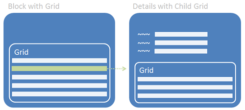
Place the initial list/grid in one block and use a secondary block for the details and its list/grid. On the secondary block use a standard UpdatePanel.