Angular-Material based color picker with no jQuery or other DOM/utility library dependencies.

Try out the demo here: GitHub Page
- Download tinycolor.js 1.2.1 or higher. Other versions may work, though 1.2.1 was used to develop this.
- Install
md-color-picker.
npm install md-color-pickerbower install md-color-picker- Angular Material
- ngCookies (optional)
The only other dependency is tinycolor.js which is an exceptional color manipulation library.
- Include the css.
<link href="path/to/md-color-picker/dist/mdColorPicker.min.css" rel="stylesheet" />- Include the javascript.
<script src="path/to/tinycolor/dist/tinycolor-min.js"></script>
<script src="path/to/md-color-picker/dist/mdColorPicker.min.js"></script>- Add dependencies to your application (ngCookies is optional)
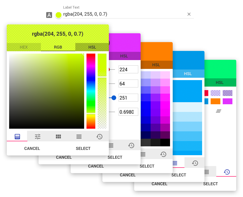
var app = angular.module('myApp', ['ngMaterial','ngCookies', 'mdColorPicker']);- Place the directive wherever it is needed. note: this breaks the old version 0.1 as it now uses ng-model instead of value
<div md-color-picker ng-model="valueObj"></div>Options may be set either by an options object on the md-color-picker attribute and/or using attributes. If an option is present on both the options object and as an attribute, the attribute will take precedence.
Setting options by scope object
// Controller
$scope.scopeVariable.options = {
    label: "Choose a color",
    icon: "brush",
    default: "#f00",
    genericPalette: false,
    history: false
};<div md-color-picker="scopeVariable.options" ng-model="scopeVariable.color"></div>Setting options by attribute
<div
    md-color-picker
    ng-model="scopeVariable.color"
    label="Choose a color"
    icon="brush"
    default="#f00"
    md-color-generic-palette="false"
    md-color-history="false"
></div>| Option Object name | Attribute Option name | Type | Default | Description |
|---|---|---|---|---|
| type | type | Int | 0 | Default output type. 0: hex, 1: rgb, 2: hsl |
| label | label | String | "" | The lable for the input. |
| icon | icon | String | "" | Material Icon name. https://design.google.com/icons/ |
| random | random | Boolean | false | Select a random color on open |
| default | default | Color | "rgb(255,255,255)" | Default color |
| openOnInput | open-on-input | Boolean | true | Open color picker when user clicks on the input field. If disabled, color picker will only open when clicking on the preview. |
| hasBackdrop | has-backdrop | Boolean | true | Dialog Backdrop. https://material.angularjs.org/latest/api/service/$mdDialog |
| clickOutsideToClose | click-outside-to-close | Boolean | true | Dialog click outside to close. https://material.angularjs.org/latest/api/service/$mdDialog |
| skipHide | skip-hide | Boolean | true | Allows for opening multiple dialogs. angular/material#7262 |
| preserveScope | preserve-scope | Boolean | true | Dialog preserveScope. https://material.angularjs.org/latest/api/service/$mdDialog |
| clearButton | md-color-clear-button | Boolean | true | Show the "clear" button inside of the input. |
| preview | md-color-preview | Boolean | true | Show the color preview circle next to the input. |
| alphaChannel | md-color-alpha-channel | Boolean | true | Enable alpha channel. |
| spectrum | md-color-spectrum | Boolean | true | Show the spectrum tab. |
| sliders | md-color-sliders | Boolean | true | Show the sliders tab. |
| genericPalette | md-color-generic-palette | Boolean | true | Show the generic palette tab. |
| materialPalette | md-color-material-palette | Boolean | true | Show the material colors palette tab. |
| history | md-color-history | Boolean | true | Show the history tab. |
| hex | md-color-hex | Boolean | true | Show the HEX values tab. |
| rgb | md-color-rgb | Boolean | true | Show the RGB values tab. |
| hsl | md-color-hsl | Boolean | true | Show the HSL values tab. |
| defaultTab | md-color-default-tab | String, Int | "spectrum" | Which tab should be selected when opening. Can either be a string or index. If the value is an index, do not count hidden/disabled tabs.
|
| customPalette | md-color-custom-palette | Array | [] | Add your own custom palette that will be displayed in the genericPalette tab. This needs to be one outer array with inner arrays representing the rows of the palette. For example [[ "rgb(255, 255, 255)", "rgb(130, 130, 130)", "rgb(0, 0, 0)"], ["rgb(150, 220, 20)", "rgb(10, 100, 223)", "rgb(70, 170, 165)"]] would display a custom palette with two rows each containg three colors |
This is still in a very early beta, and is rapidly changing (3 versions before initial commit). I am open to any and all help anyone is willing to put in. Will update as we go.
[ ] Break apart md-color-picker into other directives, md-color-picker-preview , input, etc. [ ] Add i18n support. [ ] Refactor LESS [ ] Add optional SASS file [ ] IE 11 Issues [ ] Inline dropdown mode [ ] Validation