![]()
The First Intelligent Color Management System for Python Visualization
Automatic • Consistent • Accessible • Smart


Good science shouldn't be ruined by bad colors.
Yet creating publication-quality visualizations in Python is still tedious:
- ❌ Inconsistent colors across matplotlib, seaborn, plotly...
- ❌ Manual tweaking for every single plot
- ❌ No intelligent tools - colormaps, accessibility checks all manual
- ❌ 8% of readers (colorblind) may misinterpret your results
pip install huezimport huez as hz
# 🎨 One line for screen, print, and presentation
hz.use("scheme-1") # Optimized colors for screen
hz.use("scheme-1", mode="print") # Grayscale-friendly for printing
hz.use("scheme-1", mode="presentation") # High contrast for projectors
# ✨ Huez automatically handles:
# • Intelligent color expansion (LAB interpolation)
# • Smart colormap detection (sequential/diverging)
# • Cross-library consistency (matplotlib, seaborn, plotly, altair, plotnine)Huez is the only tool that combines:
- 🧠 Intelligence - Smart colormap detection, LAB color interpolation, colorblind safety
- 🚀 Automation - One-line setup, automatic heatmap colormap injection
- 🎯 Unification - 5 libraries (matplotlib, seaborn, plotly, altair, plotnine) consistent
- 🖨️ Multi-Mode - Screen, print (grayscale-friendly), and presentation (high-contrast)
- ♿ Accessibility - Built-in colorblind simulation for 8% of population
- 🎨 Professional - Academic journal styles (Nature, Lancet, Science, JAMA, etc.)
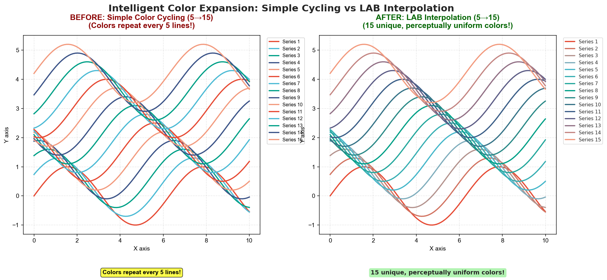
Problem: Default palettes have 5-10 colors → colors repeat when plotting 15+ categories Solution: Huez uses LAB space interpolation → generates 15 unique, perceptually distinct colors
Smooth color gradation with maximum distinguishability.
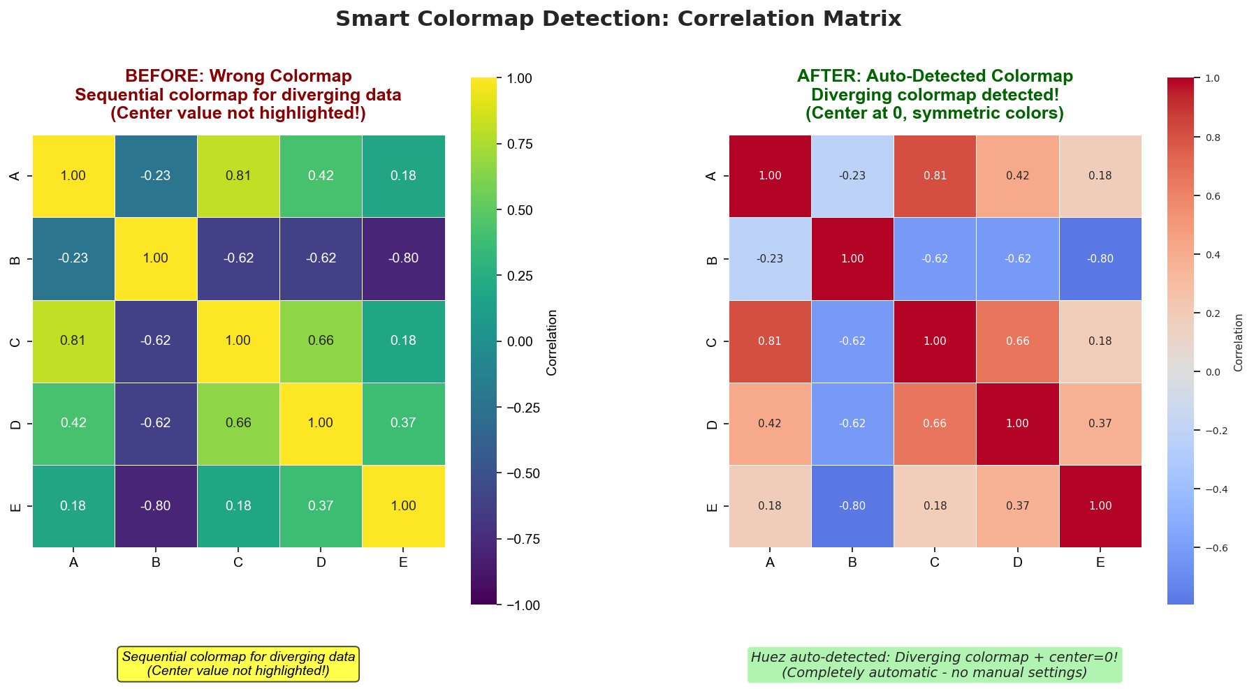
Problem (Left): Sequential colormap (viridis) on diverging data → center value (0) not highlighted
Solution (Right): Auto-detected diverging colormap (coolwarm) → center at 0, symmetric red-blue colors
Critical for correlation matrices, gene expression, and any data centered at zero.
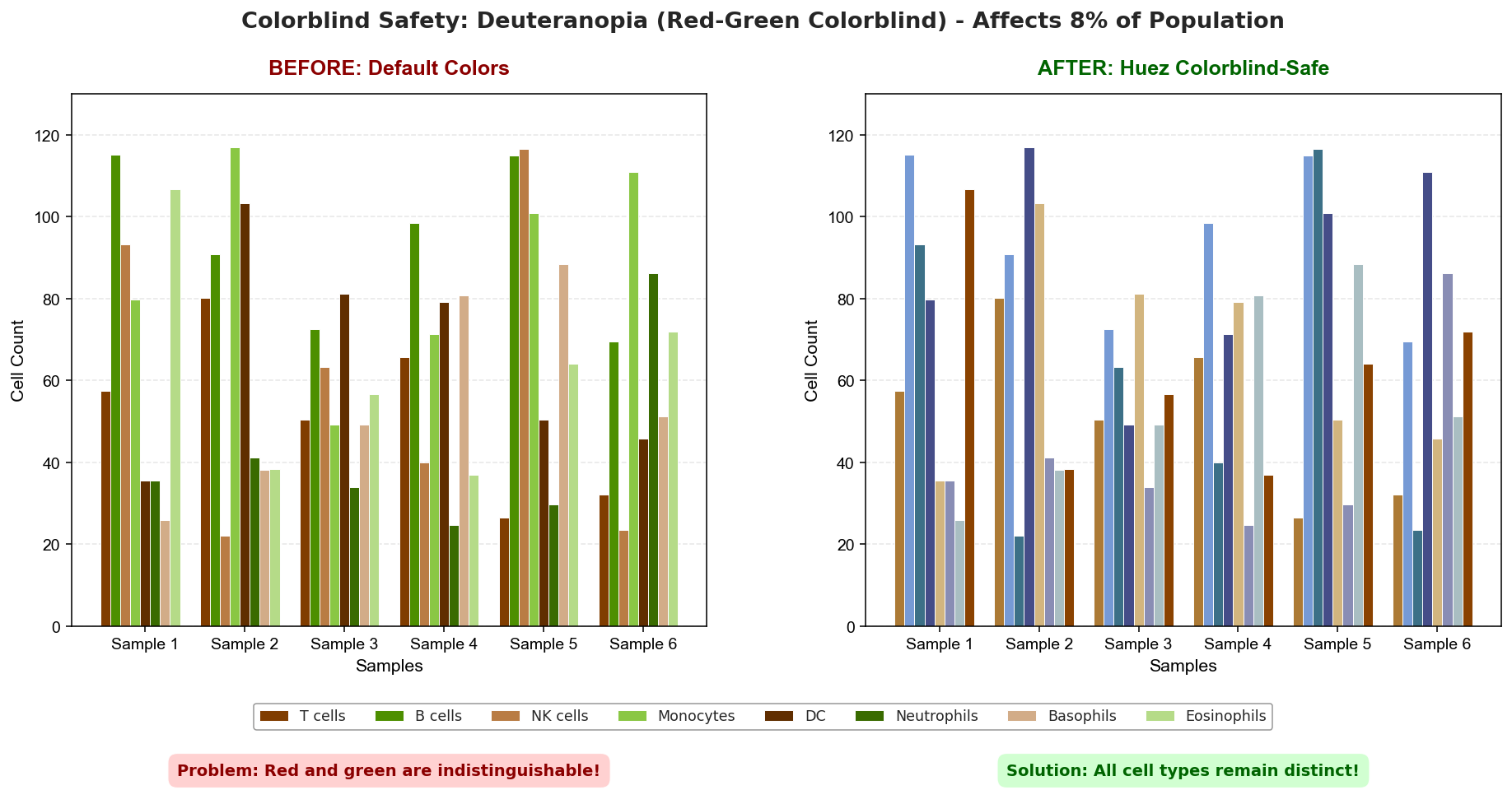
Simulated in Deuteranopia (red-green colorblindness):
- Before (Left): Default colors → red/green bars become indistinguishable
- After (Right): Huez colorblind-safe palette → all 8 cell types remain distinct
8% of males have red-green colorblindness. Huez ensures your research is accessible to all.
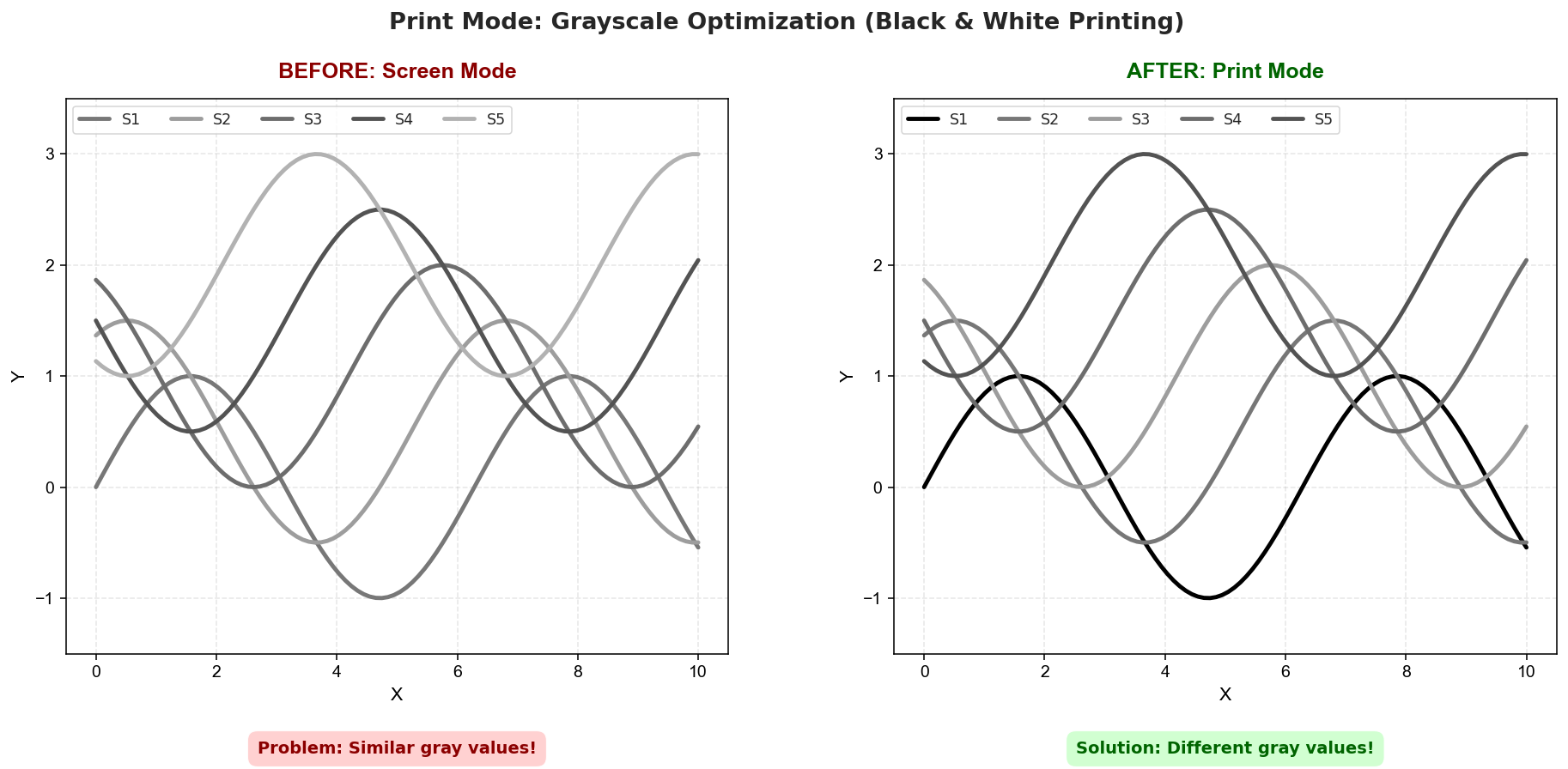
When printed in black & white:
- Before (Left): Screen colors → similar gray values (0.33-0.70) → lines merge together
- After (Right):
mode="print"→ optimized gray values (0.00-0.62) → clear separation
Perfect for journal submissions and B&W printing. Starting with pure black (0.00) ensures maximum contrast.
import huez as hz
import matplotlib.pyplot as plt
import seaborn as sns

hz.use("scheme-1")  # One line setup

# ✅ Line plots - automatic colors
plt.plot(x, y1, label='Series 1')
plt.plot(x, y2, label='Series 2')

# ✅ Heatmaps - automatic colormap detection
sns.heatmap(correlation_data)  # Diverging colormap (has negatives)
sns.heatmap(temperature_data) # Sequential colormap (all positive)# ❌ WRONG: Explicit parameters override Huez
plt.plot(x, y1, color='red') # Bypasses Huez
sns.heatmap(data, cmap='viridis') # Bypasses auto-detectionKey Principle: Let Huez handle colors automatically for optimal results.
Why this works: Huez intelligently adapts to your data—detecting data types, expanding colors when needed, and ensuring accessibility—all without any manual intervention.
# Preview any scheme before using
hz.preview("scheme-1")  # Interactive color preview
hz.preview("scheme-1", mode="print")  # Preview in print mode

# List all available schemes
schemes = hz.list_schemes()
print(schemes)  # ['scheme-1', 'scheme-2', 'scheme-3', 'lancet', 'nejm', ...]

# Optional: Ensure colorblind accessibility
hz.use("scheme-1", ensure_accessible=True)
📚 Supported Libraries (Click to expand)
import matplotlib.pyplot as plt
plt.plot(x, y1, label='Data 1')  # Auto-colored
plt.plot(x, y2, label='Data 2') # Auto-coloredimport seaborn as sns
sns.scatterplot(data=df, x='x', y='y', hue='category') # Auto-coloredfrom plotnine import *
(ggplot(df, aes('x', 'y', color='category')) + geom_point()) # Auto-coloredimport altair as alt
alt.Chart(df).mark_circle().encode(
x='x:Q', y='y:Q', color='category:N' # Auto-colored
)import plotly.graph_objects as go
fig = go.Figure()
fig.add_trace(go.Scatter(x=x, y=y, name='Data')) # Auto-colored🎨 Custom Schemes (Click to expand)
hz.use("lancet")     # Lancet journal style
hz.use("scheme-1")   # Default scheme 1
hz.use("scheme-2")   # Default scheme 2
Create my_config.yaml:
version: 1
default_scheme: my_custom_scheme
schemes:
  my_custom_scheme:
    title: "My Custom Style"
    fonts: { family: "DejaVu Sans", size: 10 }
    palettes:
      discrete: "npg"
      sequential: "viridis"
      diverging: "coolwarm"
      cyclic: "twilight"
    figure: { dpi: 300 }
    style: { grid: "y", legend_loc: "best", spine_top_right_off: true }
Load and use:
hz.load_config("my_config.yaml")
hz.use("my_custom_scheme")- Journals:
npg,aaas,nejm,lancet,jama,bmj - Colorblind-safe:
okabe-ito,paul-tol-bright,paul-tol-vibrant - Scientific:
viridis,plasma,inferno,cividis
📖 Complete Examples (Click to expand)
import matplotlib.pyplot as plt
import seaborn as sns
import huez as hz

# One line setup
hz.use("lancet")

# All libraries automatically use consistent colors
fig, axes = plt.subplots(1, 2, figsize=(12, 5))

# Matplotlib
axes[0].plot(x, y1, label='Series 1')
axes[0].plot(x, y2, label='Series 2')
axes[0].legend()

# Seaborn
sns.scatterplot(data=df, x='x', y='y', hue='category', ax=axes[1])

plt.show()import numpy as np
import matplotlib.pyplot as plt
import seaborn as sns
import huez as hz
# One line setup - auto_expand and smart_cmap are enabled by default
hz.use("scheme-1", ensure_accessible=True)
# ✅ Auto-expand: Plot 15 categories, Huez auto-generates 15 distinct colors
x = np.linspace(0, 10, 100)
for i in range(15):
plt.plot(x, np.sin(x + i * 0.5), label=f'Series {i+1}')
plt.legend()
plt.show()
# ✅ Smart colormap: Correlation matrix auto-detects diverging colormap
correlation_data = np.corrcoef(np.random.randn(10, 100))
sns.heatmap(correlation_data) # Automatically uses diverging colormap
plt.show()import huez as hz
# Temporarily use a different scheme
with hz.using("lancet"):
plt.plot(x, y1) # Uses lancet colors
plt.show()
# Back to previous scheme automatically🆚 Comparison with Other Tools (Click to expand)
| Feature | Huez | palettable | seaborn | plotly | colorcet |
|---|---|---|---|---|---|
| Cross-library unification | ✅ 5 libraries | ❌ None | ❌ None | ❌ None | ❌ None |
| Intelligent color expansion | ✅ LAB space | ❌ None | ❌ Simple cycle | ❌ Simple cycle | ❌ None |
| Smart colormap detection | ✅ Auto-detect | ❌ Manual | ❌ Manual | ❌ Manual | ❌ Manual |
| Colorblind safety check | ✅ 3 CVD types | ❌ None | ❌ None | ❌ None | ❌ None |
| One-line setup | ✅hz.use() |
❌ Per-plot | 🟡 Partial | 🟡 Partial | ❌ Per-plot |
| Academic journal styles | ✅ 6+ journals | 🟡 Some | ❌ None | ❌ None | ❌ None |
Huez is the only tool with built-in intelligence for automatic adaptation.
Contributions are welcome! Please feel free to submit a Pull Request.
This project is licensed under the MIT License - see the LICENSE file for details.