You signed in with another tab or window. Reload to refresh your session.You signed out in another tab or window. Reload to refresh your session.You switched accounts on another tab or window. Reload to refresh your session.Dismiss alert
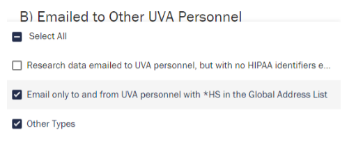
At one point we had a custom Formly component for multi-select that would provide a nicer display than the default. The major complaints with the default multi-select was that once selected, it compresses everything to one line for display with an ellipses - so you get a single text box with: "dogs, cats, arranga....". So you can't easily tell what items were selected until you click on it. The problem with showing everything is that it can get stupidly long, and causes it's own problems. Some of our mult-selects have sentence long items in them.
I'm for making this change ONLY if it can be accomplished simply. If you re-introduce a custom component BEWARE of the repeating section component, and how we render this information once you have completed the repeating section.
Beta feedback from Bugden / Documents for IRB / Question 2
DSP- I know I’m being picky, but in the pop up
when you are adding HIPAA identifiers, “check
each that apply”, it would be easier to read if
they were like this:
Original source data collection
Store long term at UVA
Instead of this:
Original source data collection, store long term at
UVA
Beta feedback from NS
It was difficult to find a place to click without choosing another selection inadvertently when choosing
where identifiers were stored.
Beta feedback from SClift:
Collection and Storage of Research Data at UVA – text is cut off. I think this is related to the
dimensions/proportions of my screen because it looks fine on a different screen. But the website should
probably be usable regardless of how people have their monitors setup.
The text was updated successfully, but these errors were encountered: