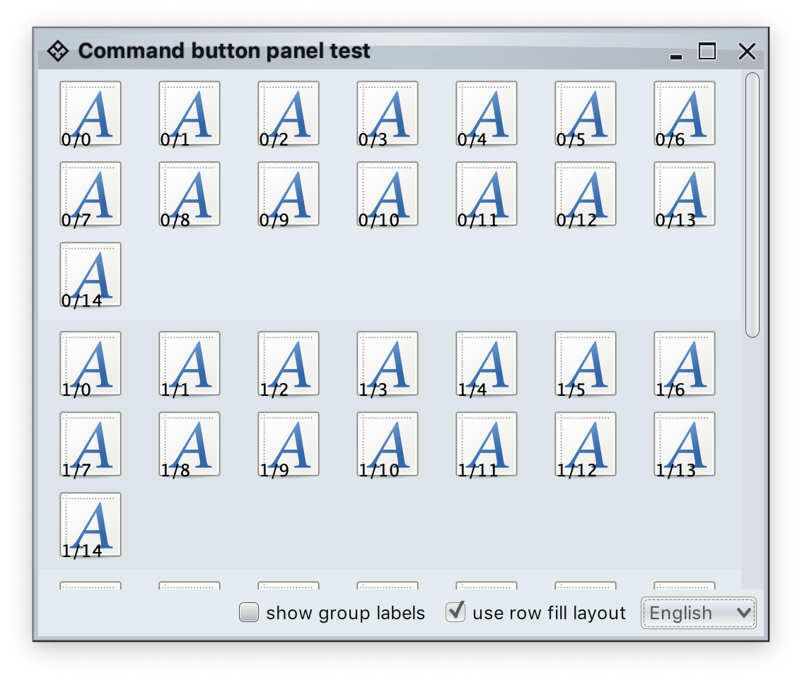
Command panel is a two-dimensional grid of logically and visually grouped commands (and their projections). In the screenshot above the commands are separated into multiple groups, each with its own title. In each group the projected buttons are laid out in rows, never exceeding the available container width and kicking vertical scrolling as necessary.
CommandPanelContentModel is the content model for command panels. It is constructed from a list of CommandGroup objects which effectively serve as content models for each individual command group. As with command strips, commands can be added to and removed from these individual command groups. In addition, command groups can be added to and removed from the overall command panel model.
The singleSelectionMode attribute can be used to mark all commands configured as toggle to belong to a single toggle group model.
CommandPanelPresentationModel and its Builder are the presentation model for command button panels.
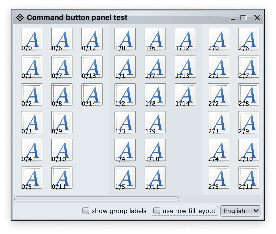
The layoutSpec attribute can be used to specify whether the button content of each group should be laid out horizontally or vertically. In the screenshot below the same content model is projected into a column-based layout:
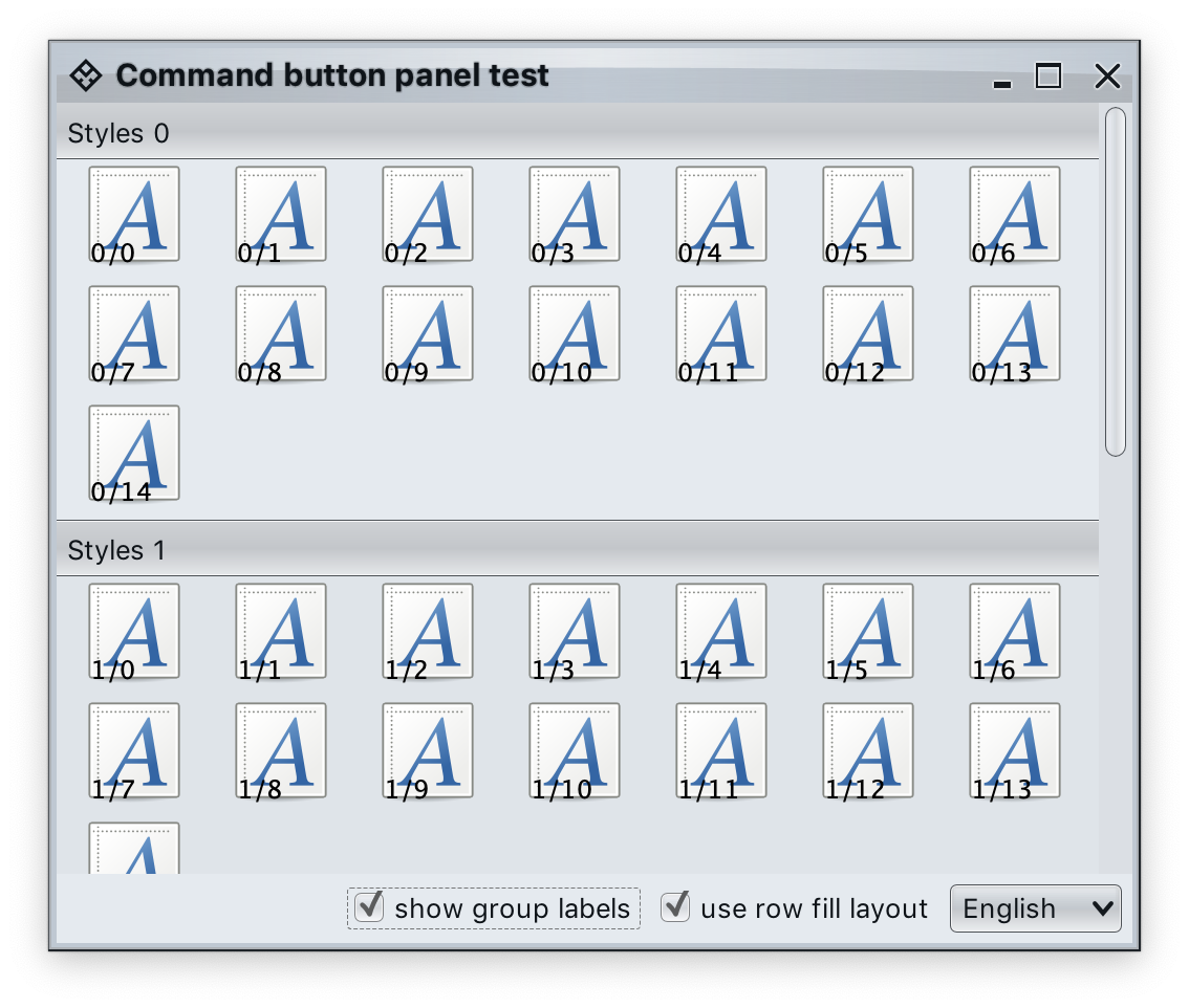
The toShowGroupLabels attribute is only relevant when layoutSpec is PanelLayoutSpec.RowFill. When set to true, button groups show titles:
The commandPresentationState attribute determines the visual presentation of the commands in the projected buttons. When the presentation state is set to FIT_TO_ICON, use commandIconDimension to control the icon size for the projected buttons.
CommandPanelProjection is the projection that combines CommandPanelContentModel content model and CommandPanelPresentationModel presentation model. The result of buildComponent is a Swing component of the JCommandButtonPanel class.
First we create a few command groups that are then combined together into a single-selection command panel model:
List<CommandGroup> commandGroups = new ArrayList<>();

MessageFormat mf = new MessageFormat(resourceBundle.getString("PanelStyles.text"));
mf.setLocale(locale);

for (int groupIndex = 0; groupIndex < 4; groupIndex++) {
    String commandGroupName = mf.format(new Object[] { groupIndex });
    List<Command> commands = new ArrayList<>();
    for (int i = 0; i < 15; i++) {
        final String deco = groupIndex + "/" + i;
        RadianceIcon.Factory iconFactory = DecoratedRadianceIcon.factory(
                Font_x_generic.factory(),
                ...
                });
        Command command = Command.builder()
                .setIconFactory(iconFactory)
                .setToggle()
                .setAction(commandActionEvent ->
                        System.out.println("Invoked action on " + deco))
                .build();
        commands.add(command);
    }

    commandGroups.add(new CommandGroup(commandGroupName, commands));
}

CommandPanelContentModel commandPanelContentModel =
        new CommandPanelContentModel(commandGroups);
commandPanelContentModel.setSingleSelectionMode(true);
Then we create a presentation model in the default PanelLayoutSpec.RowFill mode, with all projected buttons using FIT_TO_ICON layout and icons sized at 48 pixels:
CommandPanelPresentationModel commandPanelPresentationModel = CommandPanelPresentationModel.builder()
      .setToShowGroupLabels(false)
      .setCommandPresentationState(CommandButtonPresentationState.FIT_TO_ICON)
      .setCommandIconDimension(new Dimension(48, 48))
      .build()
Now we combine the CommandPanelContentModel content model and the CommandPanelPresentationModel presentation model into a CommandPanelProjection and then call buildComponent() to get a Swing component that can be added to the component hierarchy of our application (here, wrapped in a JScrollPane container):
CommandPanelProjection commandPanelProjection = new CommandPanelProjection(
    commandPanelContentModel, commandPanelPresentationModel);
contentPanel.add(new JScrollPane(commandPanelProjection.buildComponent());Continue to command popup menus.


