| title | excerpt | date | author | stacks | locale | |||
|---|---|---|---|---|---|---|---|---|
Curved Bottom Tab in React Native using SVG and D3-Shape |
Creating a curved bottomTab with a really cool deep effect. |
04/24/2021 |
Bruno Frigeri |
|
en |
At some point, every developer need to fulfill the desire of some design work in a application to built a curved bottom tab. With me wasn't so difference, I cross this path once my design team asks for it, my major difficult was trying to understand how to do it.
In this point I was searching and understanding two ways out: Doing with Views only (we can enter in this subject in another day) or using svg and d3-shape. Using just views is not easy but at the same time not some monster, but I found more easy and more clean building it with svg, so let's do it.
First and formals we need to create a react native app:
npx react-native init myExampleps: In my case you'll realize that I use typescript, but is not mandatory.
Now we'll need to install all the react-navigation dependencies, at this tutorial I'll be using react-navigation v5, so you'll track easily to move with me in that version.
Follow the react navigation Documentation to install all dependencies well
yarn add @react-navigation/native
yarn add react-native-reanimated react-native-gesture-handler react-native-screens react-native-safe-area-context @react-native-community/masked-view
yarn add @react-navigation/stack
yarn add @react-navigation/bottom-tabs
With all this dependencies installed as following the documentation we're ready to move forward.
Now, moving in to the code, we'll need to create a navigation file that I called navigation.js inside src/*.
import React from 'react';
import {NavigationContainer} from '@react-navigation/native';
import {createStackNavigator} from '@react-navigation/stack';
import {createBottomTabNavigator} from '@react-navigation/bottom-tabs';
import TabBar from './components/TabBar';
import First from './screens/First';
import Third from './screens/Third';
import Secondary from './screens/Secondary';
import TabBarButton from './components/TabBarButton';
const Stack = createStackNavigator();
const Tab = createBottomTabNavigator();
export function FirstStack() {
return (
<Stack.Navigator>
<Stack.Screen name={'First'} component={First} />
</Stack.Navigator>
);
}
export function SecondaryStack() {
return (
<Stack.Navigator>
<Stack.Screen name={'Secondary'} component={Secondary} />
</Stack.Navigator>
);
}
export function ThirdStack() {
return (
<Stack.Navigator>
<Stack.Screen name={'Third'} component={Third} />
</Stack.Navigator>
);
}
export default function Navigation() {
return (
<NavigationContainer>
<Tab.Navigator>
<Tab.Screen name={'First'} component={FirstStack} />
<Tab.Screen name={'Secondary'} component={SecondaryStack}/>
<Tab.Screen name={'Third'} component={ThirdStack} />
</Tab.Navigator>
</NavigationContainer>
);
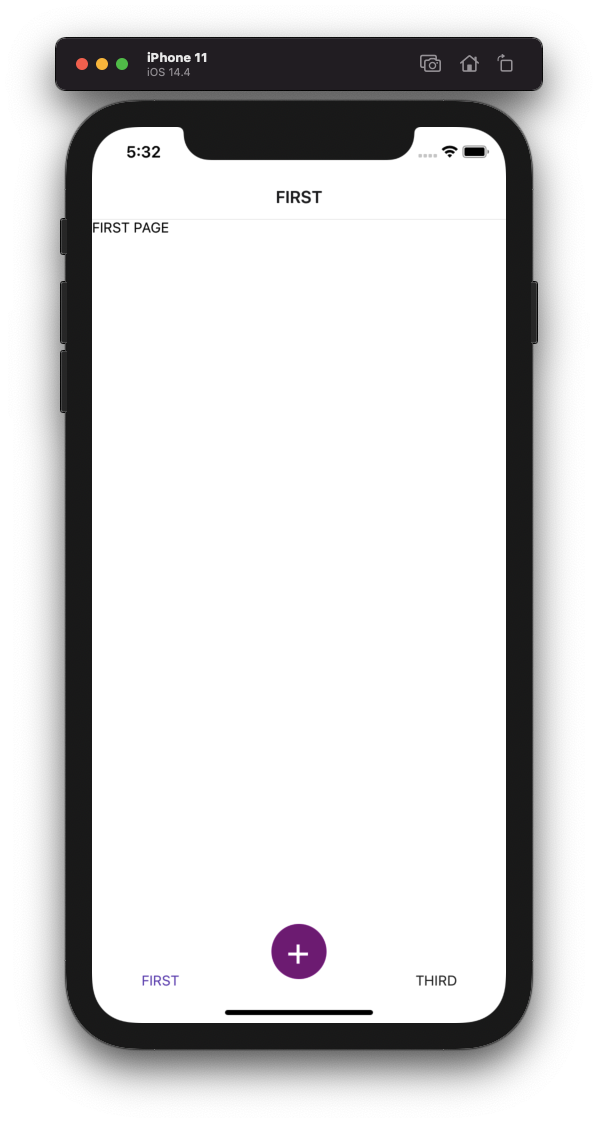
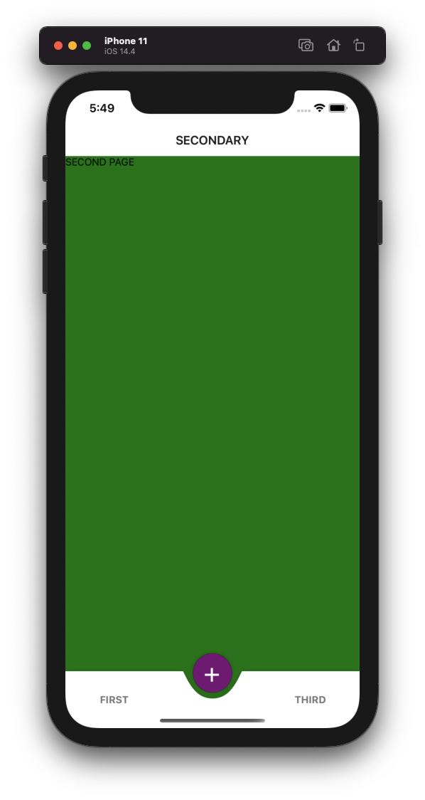
}In this file you can realize that I have already 3 screens: First, Secondary and Third. This three screens are only flex components with different colors to show the result. And at this point we have:

Here, we'll follow the react navigation documentation once again, for getting a implementation of a Custom TabBar:
import { View, Text, TouchableOpacity } from 'react-native';

function MyTabBar({ state, descriptors, navigation }) {
  const focusedOptions = descriptors[state.routes[state.index].key].options;

  if (focusedOptions.tabBarVisible === false) {
    return null;
  }

  return (
    <View style={{ flexDirection: 'row' }}>
      {state.routes.map((route, index) => {
        const { options } = descriptors[route.key];
        const label =
          options.tabBarLabel !== undefined
            ? options.tabBarLabel
            : options.title !== undefined
            ? options.title
            : route.name;

        const isFocused = state.index === index;

        const onPress = () => {
          const event = navigation.emit({
            type: 'tabPress',
            target: route.key,
            canPreventDefault: true,
          });

          if (!isFocused && !event.defaultPrevented) {
            navigation.navigate(route.name);
          }
        };

        const onLongPress = () => {
          navigation.emit({
            type: 'tabLongPress',
            target: route.key,
          });
        };

        return (
          <TouchableOpacity
            accessibilityRole="button"
            accessibilityState={isFocused ? { selected: true } : {}}
            accessibilityLabel={options.tabBarAccessibilityLabel}
            testID={options.tabBarTestID}
            onPress={onPress}
            onLongPress={onLongPress}
            style={{ flex: 1 }}
          >
            <Text style={{ color: isFocused ? '#673ab7' : '#222' }}>
              {label}
            </Text>
          </TouchableOpacity>
        );
      })}
    </View>
  );
}
Then in our src/navigation.js file, we have in the TabNavigator a prop named tabBar that we'll return our Custom TabBar the we created:
{...}

export default function Navigation() {
  return (
    <NavigationContainer>
      <Tab.Navigator tabBar={props => <MyTabBar {...props} />}>
        {...}
      </Tab.Navigator>
    </NavigationContainer>
  );
}Now we'll be creating a components/TabBarButton.js that will be responsible for having the style of our float button:
import React from 'react';
import {StyleSheet, Text, View} from 'react-native';

export default function TabBarButton() {
  return (
    <View style={styles.container}>
      <Text style={styles.text}>+</Text>
    </View>
  );
}

const styles = StyleSheet.create({
  container: {
    position: 'absolute',
    width: 55,
    height: 55,
    borderRadius: 999,
    bottom: 10,
    justifyContent: 'center',
    alignItems: 'center',
    backgroundColor: 'purple',
  },
  text: {
    fontSize: 40,
    color: 'white',
  },
});
Now we have to do 2 things to see the TabBarButton component in our CustomTabBar:
- First we need to add in our desired TabScreen component the prop named
options, in my case I want to add this in to my 'Secondary' screen:
      <Tab.Screen
        name={'Secondary'}
        options={{tabBarButton: () => <TabBarButton />}}
        component={SecondaryStack}
/>- Last but not least we need to do a ternary condition in our Custom TabBar to, if a options.tabBarButton exists show this component but otherwise show the default one:
import { View, Text, TouchableOpacity } from 'react-native';

function MyTabBar({ state, descriptors, navigation }) {
  const focusedOptions = descriptors[state.routes[state.index].key].options;

  if (focusedOptions.tabBarVisible === false) {
    return null;
  }

  return (
    <View style={{ flexDirection: 'row' }}>
      {state.routes.map((route, index) => {
        const { options } = descriptors[route.key];
        const label =
          options.tabBarLabel !== undefined
            ? options.tabBarLabel
            : options.title !== undefined
            ? options.title
            : route.name;

        const isFocused = state.index === index;

        const onPress = () => {
          const event = navigation.emit({
            type: 'tabPress',
            target: route.key,
            canPreventDefault: true,
          });

          if (!isFocused && !event.defaultPrevented) {
            navigation.navigate(route.name);
          }
        };

        const onLongPress = () => {
          navigation.emit({
            type: 'tabLongPress',
            target: route.key,
          });
        };

        return (
          <TouchableOpacity
            accessibilityRole="button"
            accessibilityState={isFocused ? {selected: true} : {}}
            accessibilityLabel={options.tabBarAccessibilityLabel}
            testID={options.tabBarTestID}
            onPress={onPress}
            onLongPress={onLongPress}
            style={{flex: 1, justifyContent: 'center', alignItems: 'center'}}>
            {options.tabBarButton ? (
              <TabBarButton />
            ) : (
              <Text style={{color: isFocused ? '#673ab7' : '#222'}}>
                {label}
              </Text>
            )}
          </TouchableOpacity>
        );
      })}
    </View>
  );
}
We have at this point:
Last and most important (and probably the reason that you're reading this article), we'll add the curve in our tabBar, for this we'll need to install two dependencies:
yarn add d3-shape react-native-svg
cd ios/ && pod install && cd ..
Let's built our component that will be responsible for having the curves, I'll name him TabShape:
import React from 'react';
import {Dimensions} from 'react-native';
import {curveBasis, line} from 'd3-shape';
import Svg, {Path} from 'react-native-svg';

const TAB_HEIGHT = 80;

const {width} = Dimensions.get('window');

const lineGenerator = line();

const rect = lineGenerator([
  [0, 0],
  [width / 2, 0],
  [width, 0],
  [width, TAB_HEIGHT],
  [0, TAB_HEIGHT],
  [0, 0],
]);

const center = lineGenerator.curve(curveBasis)([
  [(width / 5) * 2, 0],
  [(width / 5) * 2 + 20, TAB_HEIGHT * 0.5],
  [(width / 5) * 3 - 20, TAB_HEIGHT * 0.5],
  [(width / 5) * 3, 0],
]);

const d = `${center} ${rect}`;

export default function TabShape() {
  return (
    <Svg width={width} height={TAB_HEIGHT}>
      <Path fill={'white'} {...{d}} />
    </Svg>
  );
}
Okay, let's run in to this code so you can understand it:
First, we use a function named line of d3-shape, this function will be responsible for create lines based on coordinates that we give to it. In the rect we can do a basically calculation and realize that I just build a rectangle:
const rect = lineGenerator([
  [0, 0],
  [width / 2, 0],
  [width, 0],
  [width, TAB_HEIGHT],
  [0, TAB_HEIGHT],
  [0, 0],
]);

[0,0] --------- [width/2, 0] -------- [width, 0]
  |                  |                    |
  |                  |                    |
  |                  |                    |
  ---------------------------------- [width, TAB_HEIGHT]
The most difficult part is to understand the curve part, but follows the same path, the start of the curve, the deepness of it and then the end of the curve:
const center = lineGenerator.curve(curveBasis)([
  [(width / 5) * 2, 0],
  [(width / 5) * 2 + 20, HEIGHT_SIZE * 0.5],
  [(width / 5) * 3 - 20, HEIGHT_SIZE * 0.5],
  [(width / 5) * 3, 0],
]);
Now that we have our TabShape ready we need to do:
import TabShape from './TabShape'
const TAB_HEIGHT = 80;

const MyTabBar = ({...}) => {
{...}
return (
    <View style={{ position: 'absolute', height: TAB_HEIGHT, width: Dimensions.get('window').width, shadowOffset: {
      width: 0,
      height: 0,
    },
    shadowOpacity: 0.2,
    elevation: 5, }}>
      <TabShape />
      <View style={StyleSheet.absoluteFill}>
        <View style={{ flexDirection: 'row', flex: 1, alignItems: 'center', justifyContent: 'center' }}>
          {state.routes.map((route, index) => {
            const {options} = descriptors[route.key];
            const label =
              options.tabBarLabel !== undefined
                ? options.tabBarLabel
                : options.title !== undefined
                ? options.title
                : route.name;

            const isFocused = state.index === index;

            const onPress = () => {
              const event = navigation.emit({
                type: 'tabPress',
                target: route.key,
                canPreventDefault: true,
              });

              if (!isFocused && !event.defaultPrevented) {
                navigation.navigate(route.name);
              }
            };

            const onLongPress = () => {
              navigation.emit({
                type: 'tabLongPress',
                target: route.key,
              });
            };

            return (
              <TouchableOpacity
                key={index}
                accessibilityRole="button"
                accessibilityState={isFocused ? {selected: true} : {}}
                accessibilityLabel={options.tabBarAccessibilityLabel}
                testID={options.tabBarTestID}
                onPress={onPress}
                onLongPress={onLongPress}
                style={styles.button}>
                {options.tabBarButton ? (
                  <TabBarButton />
                ) : (
                  <Text style={isFocused ? styles.label : styles.inactiveLabel}>
                    {label}
                  </Text>
                )}
              </TouchableOpacity>
            );
          })}
        </View>
      </View>
    </View>
  );
}
And here we have:
Thanks for reading until here, I really appreciate. Any doubts or questions just reach me in my email or open a issue/PR in the github example: