A light weight vue plugin built groundup.


Code Sandbox: Link
npm i @vuesimple/vs-alert<template>
<vs-alert variant="success"> Success </vs-alert>
</template>
<script>
import VsAlert from '@vuesimple/vs-alert';
export default {
components: {
VsAlert,
},
};
</script><script src="https://unpkg.com/@vuesimple/vs-alert@<version>/dist/vs-alert.min.js"></script>// Main/Entry file
app.use(VsAlert.plugin);<template>
<vs-alert variant="success"> Success </vs-alert>
</template>
Nuxt Code Snippet
After installation,
-
Create a file
/plugins/vs-alert.jsimport Vue from 'vue'; import VsAlert from '@vuesimple/vs-alert'; Vue.component('vs-alert', VsAlert);
-
Update
nuxt.config.jsmodule.exports = { ... plugins: [ { src: '~plugins/vs-alert', mode: 'client' } ... ] }
-
In the page/ component
<template>
  <vs-alert variant="success"> Success </vs-alert>
</template>
Note
- For older Nuxt versions, use
<no-ssr>...</no-ssr>tag. - You can also do
import VsAlert from '@vuesimple/vs-alert'& add incomponent:{VsAlert}and use it within component, without globally installing in plugin folder.
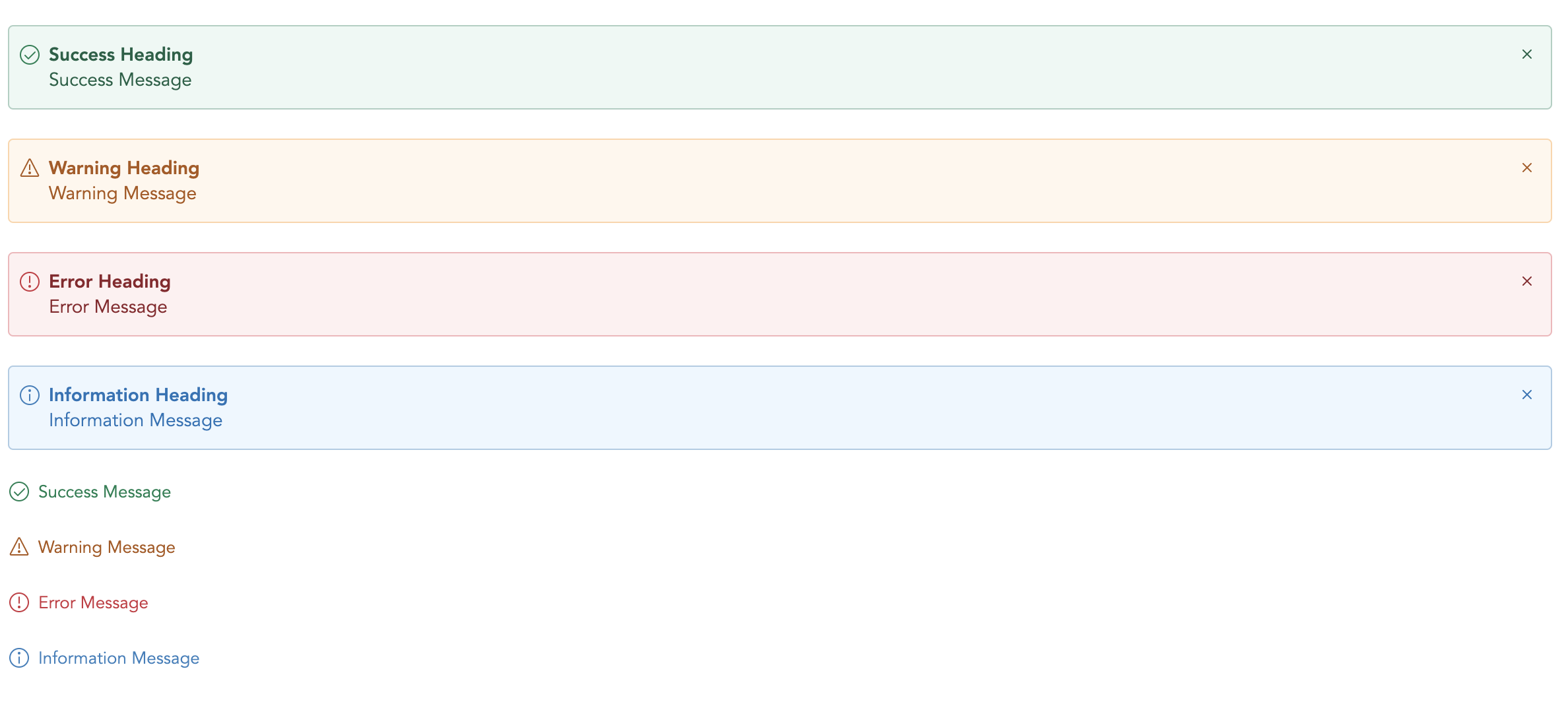
| Name | Type | Default | Description |
|---|---|---|---|
| variant | String | - | Type of alert to be shown. (success, warning, error, info, secondary) |
| title | String | - | The alert title (text only). For HTML, use the header slot. |
| showClose | Boolean | false | Show alert close icon |
| small | Boolean | false | Applies reduced padding |
| toast | Boolean | false | Applies toast design |
| noBg | Boolean | false | Remove background color |
| Name | Description |
|---|---|
| close | Emitted when the alert close icons is clicked. Listen for it using @close. |
You can define own item markup via slots:
| Name | Description |
|---|---|
| (default) | Holds the alert content and can contain HTML. |
| icon | Slot to add custom icon for type |
| title | Slot to add custom title |