You signed in with another tab or window. Reload to refresh your session.You signed out in another tab or window. Reload to refresh your session.You switched accounts on another tab or window. Reload to refresh your session.Dismiss alert
Is your feature request related to a problem? Please describe.
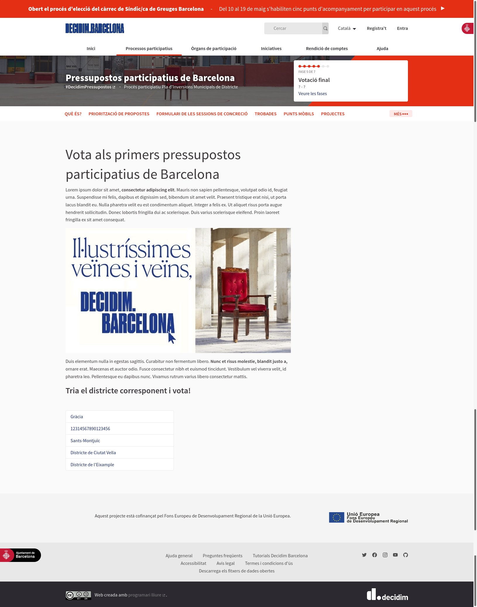
As a visitor, I miss some relevant information in the participatory budget component landing page.
Describe the solution you’d like
I want to see some relevant information on this home page:
Title
Short description
Calendar
How to participate
Describe alternatives you’ve considered
In the future this could be solved using the content block layout system. But for the moment this is a specific need for the Barcelona instance to be solved with HTML and CSS.
Additional context
Does this issue could impact on users private data?
No, it's about the landing page design.
Acceptance criteria
As a visitor, when I visit the Budgets landing page, I can see the following information: Title, Short description, Calendar, How to participate
The text was updated successfully, but these errors were encountered:
Ref: PB03 [BCN]
Is your feature request related to a problem? Please describe.
As a visitor, I miss some relevant information in the participatory budget component landing page.
Describe the solution you’d like
I want to see some relevant information on this home page:
Describe alternatives you’ve considered
In the future this could be solved using the content block layout system. But for the moment this is a specific need for the Barcelona instance to be solved with HTML and CSS.
Additional context

Does this issue could impact on users private data?
No, it's about the landing page design.
Acceptance criteria
The text was updated successfully, but these errors were encountered: